Okay I promise after this column I’ll try not to throw back to the 90’s so much.
But alas for this week, the 90’s are an important aspect to the book I looked at so they’ll be referenced a fair amount.
The comic in question is Image United.
As I have previously mentioned in other columns, I became a hardcore comic reader in the early 90’s and Image was definitely a strong figure during this period. My titles of choice were Youngblood and associated Liefeld titles (which was easy on the wallet as it only appeared every couple of months) and occasionally Spawn. I later would read Wildcats when Alan Moore wrote on the book.
Eventually between my tastes changing and getting fed up with ever late books (or in some cases never appearing like Youngblood: Year One), I dropped all the Image titles I read. But I would occasionally pop my head in from time to time (for instance the two issues of Youngblood that Alan Moore wrote are a really fun read and if you can find them today, they show a lot of what Moore would eventually put into the ABC line).
For the record, the only Image published book I currently read on any regular basis is Kirkman’s The Walking Dead.
So when I was looking for a column to do this week Image United kind of stood out. It had a lot of what I loved about the comics of the 90’s just by glancing at it. It also had an interesting idea in terms how the art was going to be handled. Let’s go through brick by brick.
The Art
We’ll start by looking at the art because let’s be honest, Image’s superhero line was never really known for it’s writing (back in the day). Now some people have labeled this as a gimmick but I think of it more as a really interesting experiment. For those of you who haven’t read about the series yet, each of the Image creators draw their own character in the book. So for example on any given page we will see Spawn (as drawn by Todd McFarlane) standing next to Shaft from Youngblood (Rob Liefeld) and the Savage Dragon (Erik Larsen).
If you have ever worked on a comic or know anything about doing art for a comic book, you will know how insane it sounds to try and get six artists all to draw on one page let alone an entire six issue series made up of twenty-plus page installments.
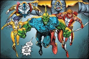 This is not the first time this idea has been done (the back of the comic points out Jack Kirby and Wally Wood once did something similar with a Fantastic Four / Daredevil team up) but it is the first time it has been attempted on as grand a scale.
The art is listed as being done by Larsen, Liefeld, McFarlane, Portacio, Silvestri and Valentino. No inker is listed but from what I understand, McFarlane is more or less the inker on the book and layout is under Rob Liefeld (the idea originally being that each creator would layout one issue but for technical reasons this was dropped after the first issue and all of the remaining issues will be layed out by Erik Larsen, I imagine in part due to his speed). Having one guy do the layouts and another guy do most of the inking was a speed and cohesion thing.
Now when the series was first announced, the comment was made by one of the Image guys that Image was the only place a project like this could work.
And to be honest, they are 100% correct.
Now the following may seem like a potshot but it isn’t.
The reason this experiment works in terms of art is because the artists have similar styles.
Hear that? That is a ton of Erik Larsen fans screaming at the screen that he is “nothing like Liefeld!”. I can already hear the Valentino fans picking up pitch forks.
But the fact of the matter is it’s true. The Image guys all have traits that are very similar to one another. That’s not saying they are exactly the same mind you. When you see an Image comic book from the 90’s by one of the original Image guys, you can tell right of the back that it’s an Image book.
It’s kind of like the painters from the Renaissance period.
…I can’t believe I just made that comparison…
But on closer inspection you can see the artists all have differences.
And that is true to this book. At first glance you could be forgiven for thinking one guy drew the entire book (I imagine due to the colors, inks, layout, although I’ll be honest, you can definitely tell the layout was done by Liefeld) but when you really look at it, it is easy to see that Larsen did draw Dragon, etc.
Now think about if Marvel tried something similar. Let’s take the guys who do all of the Avenger titles at the moment. All of those guys are as talented or more the Image founders.
Now put them all in a book where one guy is handling only Hawkeye and Another is doing Captain America..
It would look stupid.
Not because the Avengers artists are terrible artists but just due to the fact their styles are so far a part that it would not work.
Whereas with Image United, it works. In terms of art, this book delivers exactly what they promised.
The Writing
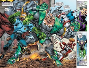 New Image partner Robert Kirkman is credit as “story”. I assume due to the nature of the art on this book that it was probably done in a manner similar to the Marvel method: Kirkman came up with the story. The artists drew the book and then Kirkman filled in the words.
To Robert’s credit, it is a really well written Image book. He obviously went back and read the original series or read them as they were coming out which helps to the comic’s cohesion. The characters sound like themselves but a bit wiser.
Is it good? I’ll be honest, it’s hard to say being that it’s only the first issue (it’s all set up for the next five issues) but so far I’ll be coming back for round two.
So there you have it. To be honest, I’ll probably stay mum about the series until it’s conclusion and then I’ll do another overall review but so far, the young man in me is a little excited for this book.
And to finish things off, this is the part of the column dedicated to Pete and will probably be a feature of my future review columns.
I present…
The List: Image United (all numbers are subject to human error)
Number of original Image creators involved: 6.5 out of 7 (Jim Lee will not be drawing in the book for obvious reasons but will do alt covers)
No of Panels Liefeld Characters Have Feet: 20
No of Panels Liefeld Characters Appear In: 35
No of Pages Spawn’s Cape Takes Up The Entire Page: 0
No of Pages Spawn Appears On: 4
No of Splash Pages: 4
Original Image Characters Appearing: Spawn (Al Simmons), Youngblood, Savage Dragon, Cyber Force.
New(er) Image Characters Appearing: Spawn (Jim Downing), Shadowhawk (Eddie Collins), Fortress.
Original Image Characters MIA (as of #1): Wildcats, Wetworks
Lamest Name in Image Comics still being used: Cougar
