Matt Fraction has been doing some amazing work on Iron Man. He’s taken him from the lowest the character has ever been in comics (Everyone loves a drunk – no one loves a Nazi) and brought him back – not only in terms of sales and accolades, but to making him a vital part of the Marvel U.
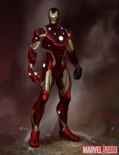
Now, Fraction and Ryan Meinerding, designer on the “Iron Man” and “Thor” films has redesigned the classic Iron Man armour. We’ll be talking about Shellhead’s various suits of red and gold next week in closer detail, but for right now all I’ll say is this: “What’s up with the LED lights?”
Fraction had this to say about the design:
“The inspiration for the new design came from thinking about a sleeker, leaner, tougher Iron Man,” revealed Fraction. “If technology is increasingly getting smaller and lighter it seems like the Iron Man should do the same: ergonomic and aerodynamic. We were looking for something that felt as sleek and glossy as a sports car Tony Stark would covet. I love what we’ve come up with. It feels like the next evolutionary step in the Iron Man’s design.”
You have to respect any writer who talks about a fictional costume redesign as if they were worried what a fictional character would think about it. It shows dedication.
I’ve enjoyed the ‘current’ incarnation of the Iron Man Armor.. I think it works fine and it works in terms of believability in the Marvel Universe (No, this isn’t a ‘core Marvel Universe.. discussion) while the newest incarnation looks very sleek and almost too smooth. Throw some Kirby-tech in there!


