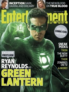
By now, I’m going to assume that most of you have seen Ryan reynolds in the Green Lantern movie costume on the cover of Entertainment Weekly or elsewhere.
I’m not a huge fan. I can tolerate it but based on the limited imagery I’ve got a few things to nitpick about. The whole constant energy pulsing throughout the costume doesn’t really do it for me. The path they trace makes it seems like they are glowing veins on his body. It sort of gives the effect that he’s not wearing a uniform but some kind of paint that covers his body, as it looks like his skin is gone and it’s just muscle tissue and veins. That, or it’s really that tight. This could be the effect that they are going for though. The uniform is generated by the ring and is meant to be a mental projection, so maybe the clothing isn’t real, which makes it much better for combat, since there is nothing to grab onto. Of course, this might be also the reason all the pictures show Reynolds from the waist up, as they aren’t sure how their skin tight/muscle vein suit would look on his package.
This leads us to the domino mask he’s wearing. To be honest, it looks larger than I ever envisioned it, it sort of looks like the mask Kyle Rayner wears, the brow is sloped down more while it’s much wider on the edges. Plus, it just looks really weird on his nose. That might be a result of noses not exactly being a prominent part of comic book art in the first place. In my opinion, it sort of looks painted on at the same time.
Overall, I find the costume adequate, but I just don’t really like the whole electric vein thing they got going on, it seems like it relies far too heavily on CG effects.
David Diep is a News Editor for ComicBookDaily and is not a snazzy dresser himself, so he doesn’t really have much room to complain about other’s fashion choices.


