I’m jumping on the bandwagon for those of you who haven’t seen it yet, but if this is true and not just a bunch of comic fans really looking at something too much, it’s pretty damned cool.
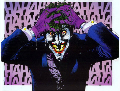
So, here’s the classic panel of the Alan Moore/Brian Bolland Batman Classic The Killing Joke.
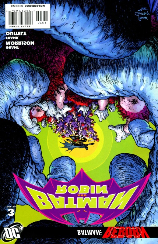
And now, here’s the cover to the absolutely brilliant Batman and Robin #3 by Frank Quitely
and Here it is flipped? See anything kind of cool?
Now compare that to the first image of this post. Look at the staring eyes. Look at the red hair. Look at the grasping gloves with the fingers in more-or-less the right position. Look at the green titles, forming a double-set of menacing teeth in the purple grin.
Now Rich Johnson says that he’s contacted Frank and he says “He tells me that any resemblance was not deliberate. However, he is tempted to now fashion such a cover at some point in the future if the opportunity arises…”
So it’s not all bad news if we get another cool Neal Adamsesque type cover!
Addendum: I will say this though – the lack of Joker in Batman and Robin thus far really is felt. The fact that we haven’t seen hyde nor hair of him thus far in any other title definitely makes me think that Morrison is going to be setting up something fairly epic with Joker in mind. Just think how important Joker was in R.I.P – He was practically teaming up with Batman to take out the Black Glove.
Pete DeCourcy is the Editor In Chief of ComicBookDaily.com and the manager of Blue Beetle Comics in Barrie, Ontario.

