Team Whole Grains with the combined might of Chaff Smasher and Wheatie.
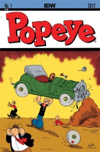
- A new Popeye series from Roger Langridge and Bruce Ozella courtesy of IDW.
[quote]Ever since I was a kid, the two cartoonists who have had the biggest influence on me have been Carl Barks and E.C. Segar, so getting a chance to write Popeye is quite a thrill. I’m especially pleased that IDW have decided to go with a Segar-flavored interpretation. As much as I like some of the later versions of the character, for me, it’s those early strips where the magic really happened. Just as well Segar drew everybody with big feet, because Bruce and I have some enormous shoes to fill![/quote]
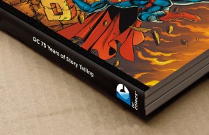
- DC releases their new logo “identity”. Hmm.
[quote]It was our goal to capture DC Entertainment in a dynamic and provocative identity. Our solution is a living expression which changes and adapts to the characters, story lines and the ways fans are consuming content,” explains Nicolas Aparicio, Executive Creative Director at Landor’s San Francisco office. “The new identity is built for the digital age, and can easily be animated and customized to take full advantage of the interactivity offered across all media platforms.[/quote]
- The Comic Book Legal Defense Fund has a new retailer advisory: How to manage a media attack.
[quote] They’ve been plaguing comics since the very beginning, whether it was massive public comic book burnings in the 1940s, Frederic Wertham’s attacks in the 1950s, or the retailer stings of the 1980s that led to the CBLDF being formed. While we’ve seen this type of story arise time and again, it should never be taken lightly. Below we offer some tips on how to deal with hostile cameras if they come to your store.[/quote]
- David Brothers takes a look at what makes IDW’s Parker series so great.
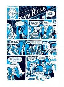 [quote]Cooke, however, kept the Parker name and stayed true to The Hunter in his graphic novel adaptation. Other than a very short sequence or two, Cooke let the original text speak for itself. Rather than loading the book down with caption boxes, he simply shows the action and lets us fill in the blanks. Stark didn’t make a habit of getting into Parker’s head, and Cooke doesn’t, either. We come to understand Parker by his actions, whether they are smooth, as in the way he effortlessly acquires cash and a new identity, or ugly, which is just one way to describe how he tears through the people that wronged him.[/quote]
- Mike Romo has a good op-ed up at iFanboy: Can Marvel Win Me Back? Alone the lines of Reading To Enjoy, Not Complete.
[quote]Let’s face it: once you stop paying $4 for a 20-something page comic you only read once, and you stop doing so for a few months in a row, your brain chemistry changes to the point that trying to do so again just sounds dumb. This is not about Marvel getting its act together in March and finally offering the majority of their titles digitally, with the hopes that now they have finally figured out how I want my comics will somehow fulfill the why I want to buy them.[/quote]
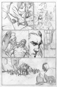
- The newly relaunched Valiant announces it’s first book, X-O Manowar by writer Robert Venditti and artist Cary Nord.
[quote]Neither of the creators have a rofessional past with Valiant, but the X-O Manowar armor is going to a barbarian under the Roman Empire; Nord’s run on Conan certainly comes to mind as some strong preparation for those scenes.[/quote]
- DC has released their April 2012 solicitations; first DC 52 collected editions.

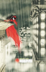

The first new 52 Collected Editions announced were in the March solicitations — including hardcover volumes for Batman, JLA, Wonder Woman and Green Lantern. They are also coming out in May along with the .
(incomplete thought) the majority of the trades in the April catalog.
When I first saw the new DC mark a couple of days ago… I was restraint but skeptical about how this cold, static mark could work with colourful, dynamic imagery.
Landor is the premier branding company in the world. I was lucky enough to have worked in their Hong Kong office many years ago… but San Francisco is their flag ship office. In other words, DC is going full tilt… because Landor is not cheap.
So, if Landor is behind this new brand initiative, I have to take the logo more seriously because it means there has been a lot of thought and energy put into this effort. So have I changed my mind and do I now eat crow for having offered up my share of criticism on all those design blogs? Yes… and no.
This is not a “traditional” logo ala IBM, Nike or Coke. This is an adaptable logo based on context:
http://www.comicbookresources.com/prev_img.php?disp=img&pid=1326990406
So, although I see what they are trying to do… if you remove the slick rendering… the logo in it’s primary form still remains cold and static. I like to think that the rendering could be applied to a more interesting form… but without having gone through the process… I’m just second guessing.
Aside from being a “dream” project for someone like me… what’s also interesting is the depth of DCs effort. It’s one thing to relaunch a bunch of titles simultaneously, but a rebrand signals change at the core of DC. Whether they can follow through with actions remains to be seen but I hope they’ll continue to be disruptive and surprise us in ways that we haven’t thought of.
It’s early days still and a great time to be sitting in the DC boardroom.