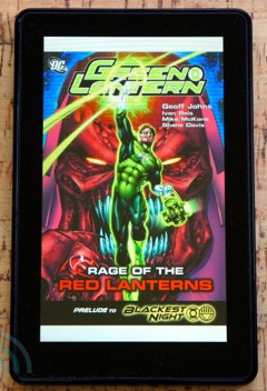
The Amazon Kindle Fire has been reviewed across the interwebs today: I found the Engadget review most enlightening when looking at this as a digital comic reader.
 [quote]Amazon made a big deal about its partnership with graphic novel publishers for the launch of the Fire, and rightfully so. Comics have tried to go digital many times in the past and have yet to find a solid following — at least among those willing to pay money for them. So, what’s the reading experience like here on the Fire? Occasionally great, but it can’t shake the occasional clumsiness that muddies things here.
As with magazines, text is often squashed too small to be read — even if its drawn in bold, sure penstrokes. Shockingly, though, you can’t pinch-zoom to get a closer look! You have to double-tap on whatever section of the screen you want a closer look at. You then get a popup window with a closer view of that section and, from there, you can tap or swipe your way from one panel to the next. This is a little annoying if you just want to zoom in on one section and then zoom back out again, but it sure beats not being able to read the text.
Other than that annoyance comics are a great addition. The Fire’s screen does a great job recreating the bold colors and simple lines that make them such a joy to read.[/quote]
Take a good long look at that image. The Kindle Fire is 7.5″ x 4.7″, so calculating for the bezel around the device and the dead space top and bottom because of the screen dimensions a full-page comic will be about 5.75″x3.75″, while a standard print comic is 10.25″x6.5″. That’s small. Going panel by panel may be the most practical way to read a comic at this size. Any 7″ device will be about the same, so don’t expect any miracles from this new generation of digital readers.


