Once upon a time I didn’t really care about over-sized hardcovers, collected editions, or trade paperback anthologies. I really just bought issues, and only issues, and liked it. I also possibly walked to the comic book store through ten feet of snow. Uphill. Both ways. But since those halcyon days of yesteryear I have come to enjoy a collected edition. Especially when it is a well thought out product. When you are creating a graphic novel every aspect of the work, including the packaging and cover, contribute to the product as a whole. There are literally hundreds of artists working for a publishing company at any given moment, so it is surprising to me that we don’t see better covers on trade paperbacks or hardcovers.
This might seem nit-picky but really, shouldn’t a collected edition have some sort of cover that draws you in? That is cool or interesting? That is more than a pin-up of whatever superhero resides within those coloured pages of fisticuffs and stretchy pants? Please don’t read this wrong. I am not criticizing the art found on these covers. They are done by excellent artists. A cover to a comic book issue should say something about the comic and the story found inside. Ergo a cover to a trade paperback or collected hardcover should say something about the entire story arc.
If we approach this in a Marshall McLuhan medium is the message way (Canadians love doing that), then the work is saying something dependent on the presentation. A hardcover treatment with a specific cover legitimizes the work as a whole, and a cover can draw in new readers who might otherwise have passed the book in the aisle.
The cover of a comic book or trade paperback has a very specific purpose. It needs to capture the essence of the story while at the same time giving the reader interesting visual cue designed to instigate purchase. The cover is trying to lure in a potential reader by catching their eye. This is not an easy task given the myriad of funny books that hit the shelves each week and I do not envy the work of a cover artist.
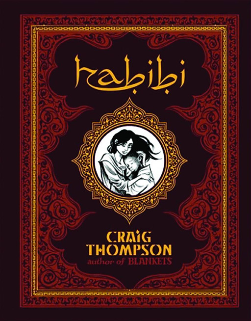
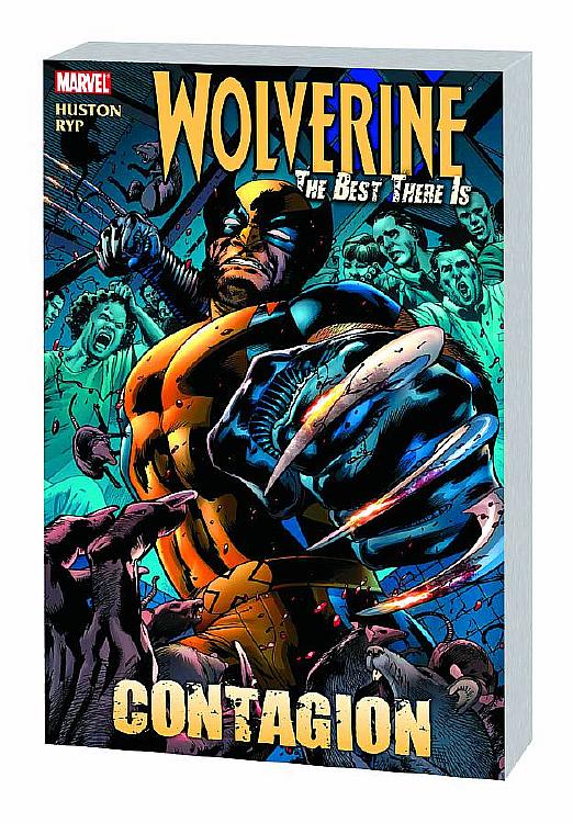
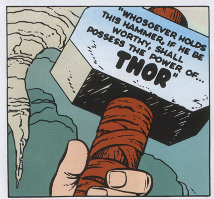
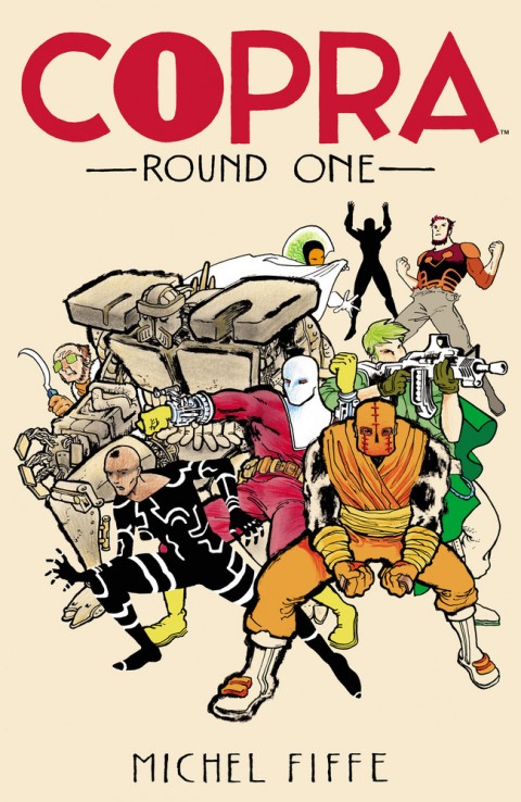
Look at the 4 examples I added to the article. The Parker Martini Edition and Habibi had covers designed specifically for the product. And yes, I know that Habibi was a single story and wasn’t issues first, but it still illustrates how a great cover draws you in and catches your eye. Both of these covers are visually stunning and convey a message about the story told within. In contrast the Catwoman and Wolverine collected editions are just reusing issue covers. Let me reiterate, I am not criticizing the art, but I feel that these covers do very little to explain what the story is about, and they are really just pictures of the respective characters. This works fine for issue #1 of a series (though I still don’t think it’s great) but a collected product needs more.
What I am surprised about is how if covers are celebrated for their composition, design, and ingenuity then why aren’t more covers like those which have received critical acclaim? In a medium where you are working with talented, creative, and visual artists why don’t more covers have that wow factor? And if the cover of an issue is supposed give a snapshot of the story within then why doesn’t a collected edition have a cover which speaks to the entire story held within? The majority of trade paperbacks seem to simply be a picture of the character, but shouldn’t I know more about any given story other than which superhero is the protagonist?
I understand that paying people extra to draw or design new covers would eat into profits, but I feel that it would elevate and legitimize the product in a way that would increase sales in the long term. I also don’t necessary believe that the extra cost is a barrier; the smaller companies have a far better track record for giving us vibrant covers that reflect the collected work or graphic novel.


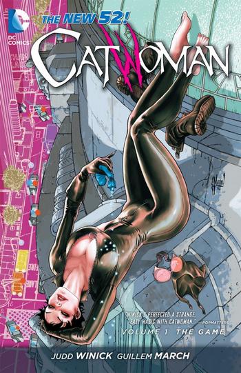

I never thought about it until you mentioned it. The collections that reuse a regular issue cover is easy to pass by on the shelf. There isn’t anything that makes it stand out, especially if something like a #1 is used for the cover. Using the Catwoman issue for example, that #1 cover has been seen a million times. Volume 2 will stand out because it will be using a cover the general public may not be familiar with.
Now if it is a really cool kick-ass cover, I wouldn’t mind it being reused on a collected edition.
I’m not against reusing good covers per se, but they were created for a different purpose (to sell the issue and explain what was inside). Think of it this way, what if a Star Wars trilogy box set just had the poster for Return of the Jedi on the front? That would be a little weird right? So a new package is created to speak to the work as a whole.