The new re-launch of Amazing Spider-Man had a gangbuster first issue with over 500,000 copies sold. Spinning out of that blockbuster is the mini series Spider-Man: Learning to Crawl that looks at Spidey’s first 60 days as a superhero.
I recently had the opportunity to sit down with series artist Ramon Perez and chat a bit about everyone’s favourite wall crawler, new villains, and what it’s like revisiting a seminal time in comic book history.
CBD: Re-examining Amazing Fantasy 15 is a pretty bold move. How was the idea pitched to you?
RP: I was approached by (then Spidey editor) Stephen Wacker at Thought Bubble (Leeds Comic Art Festival) in 2013 about working with Dan Slott on a Year One Spider-Man story. We would create a story that fills in the gaps between the panels that fleshes out the story of Peter Parker’s growth. Staring from the end of Amazing Fantasy 15 where he lost his uncle due to his own actions, how does Peter go from there to becoming the happy-go-lucky, joking, friendly neighbourbood spider-man that we all know and love? This isn’t a retcon. I was told that we were going to have Peter with the big googly glasses and the sweater vest along with the rest of the cast, Flash Thompson, Liz Allen, and the early villains are all there. We aren’t changing anything but we are expanding on what happens during the time period of Amazing Fantasy 15 to Amazing Spider-Man 1-6.
CBD: Once you got the script and knew the entire story arc what was your first step in tackling the project?
RP: My first step was going back to the source material. In this case AF 15 and ASM1-6, which I had actually never read before. Beyond that it was taking a look at how Ditko drew Spidey and Peter. There is an interesting transition and a slight change in his style as the issues progress. I paid attention to his awkward creepy poses; early Spider-Man isn’t the elastic Todd Mcfarlane acrobat from the nineties. I wasn’t trying to copy what Ditko did but I wanted to create an echo of his work.
CBD: When dealing with such an iconic work as source material did you approach your creative process differently?
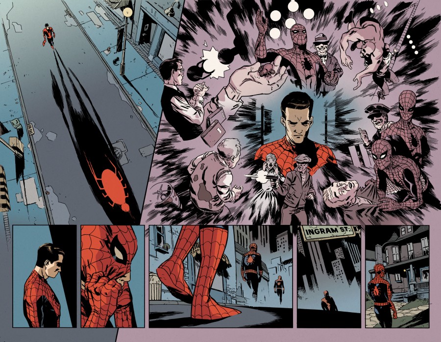
RP: Inadvertently, I did. This was the first time that I had done full digital pencils. I don’t think it was because it was Spider-Man, but it was a different approach that allowed me to play with my pencils. Working digitally has allowed me to experiment with a freer style. I did give myself parameters though, because I use a 9-panel grid just like Ditko. He created a flavour in those early stories and I didn’t want my work to stick out like a sore thumb. Sometimes I would break away from that since I was approaching from a modern fashion but I thought the 9 panel grid would ground it in the source material.
CBD: Research is important, but how did you ensure that you weren’t relying too heaving on Ditko’s work?
RP: I don’t tend to reference a lot of other artists work. Too much reference can be a danger in this industry. I use reference material but then I close the book and put it away. I don’t keep it out for constant reference while drawing.
I wanted to give a feel of Ditko, his composition, poses, his awkward line-work. Man, I hope that doesn’t get any Ditko fans angry with me. But once he got a few issues in his work improved. He changes his style and I would guess that he probably was changing tools from quill to brush. There is an increased confidence in his pencils each issue and that nicely mirrors the increased confidence that Peter feels as Spider-Man. I wanted to play with that as well. I didn’t worry about wobbly lines or imperfections because I found that original work was imperfect.
CBD: In this series you had the opportunity to design a new villain, Clash. What is your process for character design?
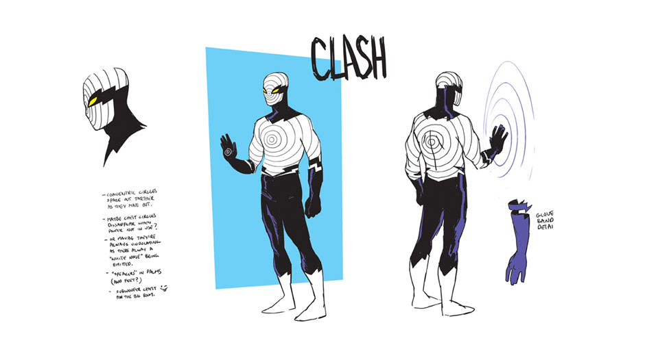
RP: Usually I design on the fly, on the page as I draw, but as we were creating a new character for Spider-Man’s rogues gallery we did it all before the series. Dan gave me the breakdown and backstory of the character. This was the first character that was Peter’s age. He is inspired by Spidey and thinks that any time Spidey is fighting a villain the outcome is predetermined, like in a wrestling match. A hero and foe fight in public for the fame and spectacle. So, with this idea in mind Clash decides to be a villain. His costume is inspired by Spidey. Dan (Slott) was very specific that he wanted something that mimics Spider-Man’s look.
Clash is a sound based villain and I looked at Ditko’s designs for characters from the 60s. Back then there was such wonderful simplicity in the costumes. Nothing flashy. One or two colours. So I took all these guidelines and was sketching in a café one morning. The overall design plays on sound waves and I used those sound lines to mirror the web on Spidey’s mask. I also wanted to play off the name Clash so originally I also chose yellow and purple for the colour scheme. This way even the colours on his costume would clash but the concern was that yellow would look too close to Electro, so we settled on white, which is a bit of a nod to an ipod.
I then came up with another 4 costumes, but after submitting all the different designs Dan and Nick (Lowe, currently Spidey editor) liked the initial design with some minor refinements. There were slight changes to the eyes and some minor tweaks to the costume, but essentially what you see is the original design. Ultimately, I wanted to create something that I thought would be a Ditko design from the 60s.
CBD: In comics we often talk about the white space between panels as part of the story, that is, as readers we fill in the story between panels, but for this project you have created a world that exists in between the panels from the original story. How are your visual design choices and panel composition shaped by the original work?
RP: Aside from 9 panel grid I am trying to go my own route. Sometimes Dan will reference a panel from the original work as a jumping on point. So I use that panel to give the fans a touchstone to the source material and hopefully they get a kick out of seeing Ditko’s panels, which was originally 1/9th of the page stretched out to be a third of the page. This way I break down the 9 panels and make then interconnected or change the flow while I use my own design sense to go beyond what Ditko did originally.
CBD: What advice would you have for other artists who are taking on an adaptation/expansion of such a well-known work?
RP: In the industry, especially working for Marvel, DC, or Darkhorse, we work on properties owned by others. One of the great things about that is that I bring my own elements to the source material, whether it is Wolverine, or Spider-Man, or Star Wars. I want readers to be excited about seeing my own interpretation. I will always respect the source material but that work has already been done. You need to expand on it and create something that is your own.
