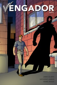
So an area I haven’t wandered into is webcomics doing what print comics have all sealed up. Superheroes. It’s a tough area, when you have a whole industry that is focused in on that one genre. You are putting yourself out there up against work that is done by very talented professionals who do this for a living. And anyone doing a superhero webcomic is quite probably doing it with an eye to making the switchover to ACTUALLY drawing their favourite hero. It’s like an audition piece. With that in mind, let’s take a look at Vengador.
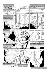
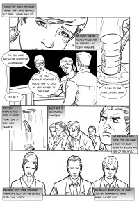
The story is broken up into issues, 22 pages at a go, currently he’s just starting Issue 4. The first 3 issues are largely focused on setting up our hero Eric Martin, and the court case that drives him to take the law into his own hands. The first issue is the proceedings of the trial with a series of flashbacks setting up the history of the molestation of his sister at the hands of Sydney Shaw. The issue ends with the verdict and Eric set on what he now must do. As well as a number of flashbacks, there is ongoing narration by Eric.
It can get a bit overwhelming and feels familiar. The mean world viewpoint, the grim voiceover narration and the vengeance origin are all staples of a certain type of story. The Punisher, Batman any of the anti-hero types. And that’s fine, they are a popular sub genre. The challenge is doing something really new with it.
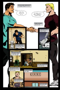
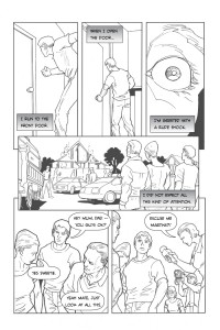
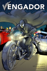
James Gilarte is the writer of Vengador, but I think he has also at times been the artist. It’s hard to tell, the newer ‘issues’ list Rowel Roque as the artist, and it looks like he has gone back and done part of the first issue as well. But there are pages not done by Rowel that I’m guessing are James’. these are in colour. They are simply put, rough.
Rowel on the other hand has a really interesting style. It’s almost as if every panel was a photo he has traced in Adobe Illustrator. It’s a bit like clip art images. But the line work is quite nice, even with the flat line weight. If I had to guess, I’d say it’s done digitally. It’s also all but begging for colour. Again, it all seems a bit like an audition piece. The lettering is noted as being by Katherine Lambos and would improve with less leading between lines of text and some better spacing within the word balloons.
All in all, it’s beginner work. There is some promise, and just the fact that they’ve done as many pages as they have is good. Many never get past that first 24. And that’s the real thing I want to say about Vengador. Given a couple years and a dozen more issues, it could become something. It may be that Gilarte has a grand dream for the story that will prove to be quite unique.

