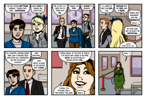
Quirky is the only word I can use to describe Mary Elizabeth’s Sock. Odd sounds negative. Weird sounds both negative and more like something from EC in the sixties. It’s not zany or screwball. It’s just, quirky.
I don’t want this to sound negative, but MESS, as it’s known to it’s fans, took me a long while to get through. Partially because it’s got a decent archive, but more because I had to do it in short chunks. It’s not a slog, or hard to digest or anything. It just couldn’t be plowed through. and I can’t even really explain why.
So what is this quirky slow to read comic? Well it’s sorta a mystery. But it’s more stories about quirky characters that have connections that tie them to mysteries. Hmmm. See, this is why it has vexed me. I mean, read the author’s own About piece, “Mary Elizabeth’s Sock is a comic adventure about a girl and her pet private eye, both of whom are quite possibly insane.” While that does kinda explain it, it doesn’t cover the elf reporter. Or the robot boyfriend. Or the tone of the story. Or John Troutman’s humour. Let alone his readers who comment on the comic.
What if I said it was Twin Peaks, but without the dark and disturbing? That might be close. And I took a long time to watch Twin Peaks.
So there’s this freelance PI Basil Flint. He has a habit of stumbling onto dead bodies. And he seems to be quite good at spotting small details and clues. Mary Elizabeth Flaherty is the titular Mary and she’s a teacher who takes to Basil after he hits her with a pop tart. You see what I’m getting at here?
Amanda Beaumont is a reporter. She might also be a fairy. For sure she is crazy skinny tall.
And so on.
Okay, so so far, the story has been broken up in two parts. The second part is sort of a soft relaunch. The first part is made up of a lot of short pieces, many of which don’t seem connected at first. It’s kind of disjointed to read, but mostly in that, ‘huge cast and lots to set up I promise it will all make sense eventually’ sort of way. With the start of the second part, Troutman has stated he wants to streamline things and focus on only a few key characters and not jump around as before. But all the stuff in part one still stands.
If it sounds like I’m coming down on the comic, I really don’t want that. I actually like it. Wait, let me talk about Troutman’s art. then you’ll really be unsure of what I think.
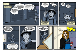
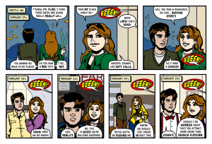
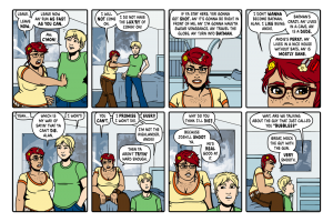
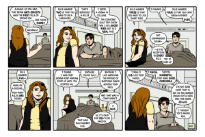
See the art is quirky as well. It’s simple and cartoony and yet there is real definition to the characters. And they are visually quite diverse and there are shapes and sizes galore. The settings are functional, and generally do what backgrounds should, fade into the background. The colours are flat with limited rendering. Overall the art is good, you can get a wonky face here or an odd hand there, but you also get great expressions or clever details. And the variety of view point and camera position keeps it visually interesting and enjoyable to read.
See! I sound like I’m saying bad stuff but the overall is just somehow better than any little flaws. He’s got something here, it might have rough edges, but like a good portrait, it’s the slight blemishes and imperfections that give it character. The little quirks that make the whole more interesting. And that makes for a fine MESS.


