The English idiom “don’t judge a book by its cover” is a metaphorical phrase which means “you shouldn’t prejudge the worth or value of something by its outward appearance alone”. Thanks Wikipedia.
Now you may be thinking that this doesn’t apply to comics, but I have just finished the pencils and inks to my sequel to “Splashdown”, which if you don’t know is the 97-page graphic novel that I finished over a year ago (available here http://www.comicdenn.com/splashdown-dowload). I know, I know. “He’s not very prolific”! I do this in my spare time folks, as I have to work to pay for, oh I don’t know, frivolities like food and my mortgage…and comic books, and oh yeah, comic art.
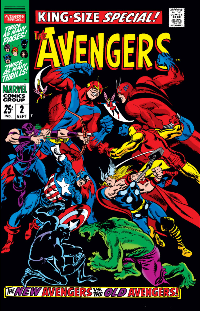
Now there are many great artists but they aren’t all necessarily great cover artists. The Silver Age greats of John Buscema, John Romita, Gil Kane really jump out at me and were the creators of many a fine cover. Big John Buscema had the great “squaring off covers!” i.e. Sub-Mariner #8, Avengers Annual #2 and Fantastic Four #112.
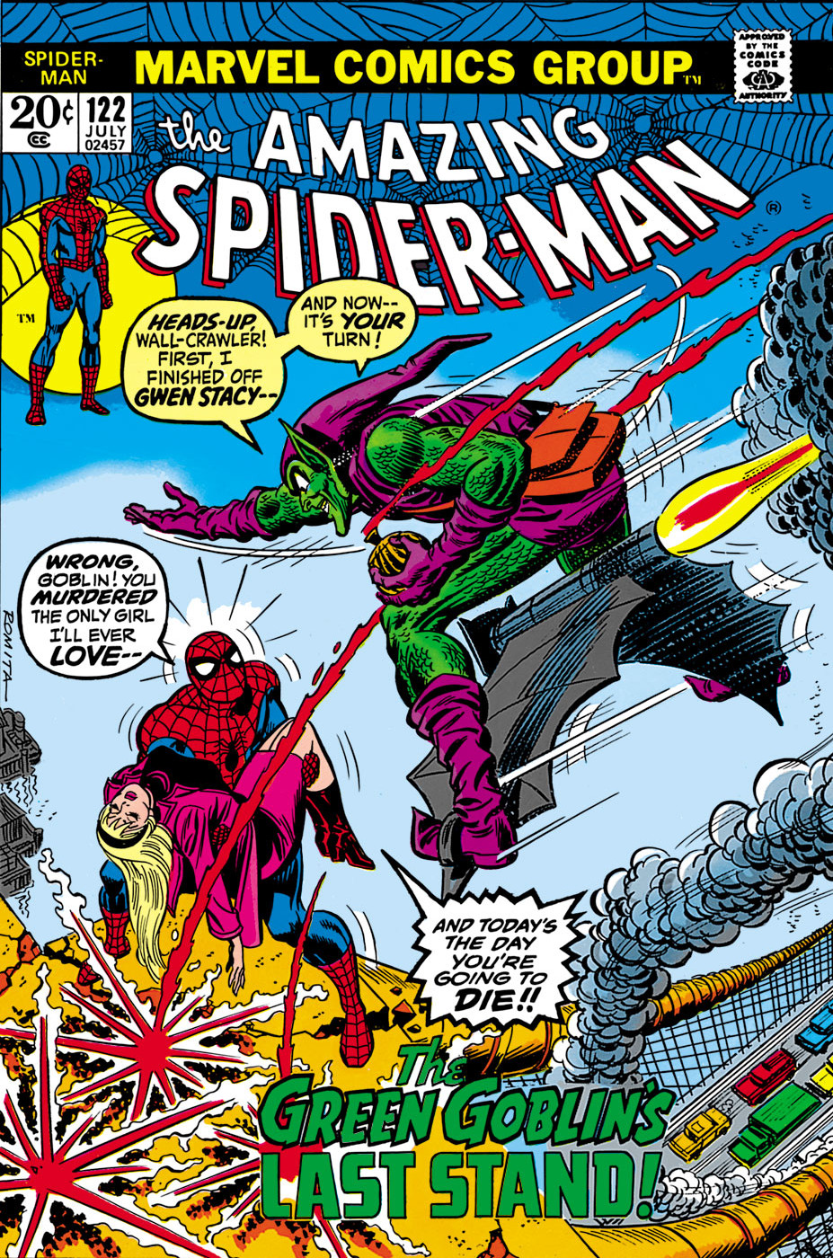
John Romita had the Iconic Amazing Spider-Man #39, 47 and 122, while Gil Kane had the interesting team-ups such as, well all the Bronze Age covers he did!
There are more than these three. Carmine Infantino, Murphy Anderson, Neal Adams, and of course the King! Jack Kirby!
So I think I am going to take another crack at another couple ideas and see what comes of that exercise.
So what do you think makes a great cover? Is it that the cover directly relates to a scene in the story? Encompasses a jumble of the stories ideas into a composite of the story or is it just to grab your attention and make you lay down your hard earned 12 cents…er $4 or $5 dollars per book
Let me know your thoughts!
Continued Happy Collecting!

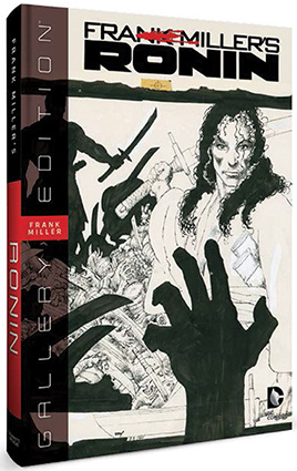

A great cover captures and summarizes the great Conflict within. With great art,color and drama