So being firmly bitten by the comic book bug at age 10, and thoroughly exhausting my friends and family getting any back issues, I began to take note of the little ads that offered back issues. For some reason the ad by Robert Bell and Michael J. Rogofsky stood out to me more than most. I sent my request, plus 25 cents (Cdn) to far off New York.
On Fridays when my Dad would go to the bank he would empty his pockets of change and I would be off to Hazelwoods Pharmacy in Port Rowan, a small lakeside community of a few hundred people on the north shore of Lake Erie, and I would go to the magazine section. At the bottom right was where they displayed their comics. I distinctly remember buying Silver Surfer #1 as well as the 35 cent Spectacular Spider-man #1! That was as far as the pocket change would take me.
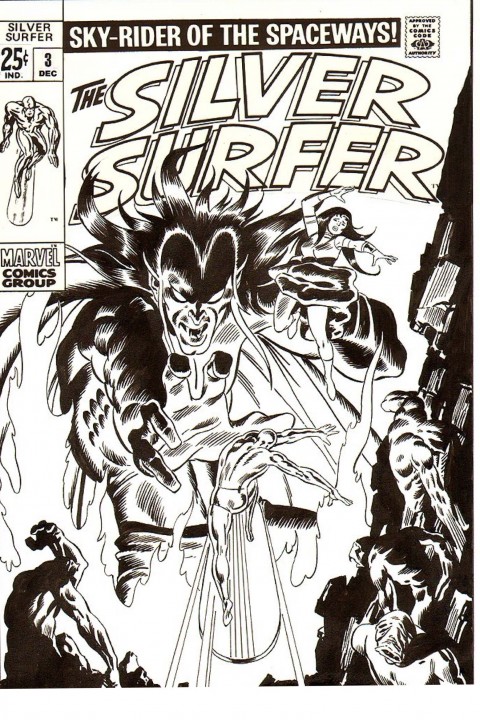
The Surfer took me to the far off world of Zenn La and introduced me to the beauteous Shalla Bal. I was immediately drawn into the world that Big John Buscema created and have been a life long fan ever since. The original Silver Surfer run has always held a special place in my heart from not only a nostalgic direction but as an inspiration artistically to the work I do today. If you haven’t read the original run, especially the first 7 Giant Size issues, I highly recommend it. Surfer # 3 introduced Mephisto, and I can remember the actual fear, yes fear, that I felt for the Surfer. Stan Lee had written a story where there was such a real life parallel between the decade of the sixties and that storyline. Check it out and you’ll see what I mean. It is still as relevant today as it was then. And oh that cover!
I have in recent years also discovered the Original Comic Art Market, and this article is accompanied by one of my favorite pieces of my collection, a John Buscema recreation of the cover of Silver Surfer # 3.
We will talk a bit in length about Spectacular Spider-Man #1 next time as well as whatever happened to those lists I sent away for anyway ?


Very good story. Agree 100% with the Silver Surfer run #1-7. I look foward to your take on Spectacular Spider-Man #1, my kid reaction was not good! Port Rowan must have been a special place to grow up in. I had my nephew down to boat houses fishing about a month ago. alot of people in the new subdivision.
Thanks Mike.I actually lived about 1/2 hour to the west by the Sand Hill Park farm.Quite literally to most people that would have been the middle of nowhere.Taking this walk down memory lane and seeing how those childhood experiences shape us as we get older and how very much nostalgia is a huge part of this hobby becomes very apparent.A common thread seems to be that your all time favorites coincide with the 10 year old inside us then , and now as well.
I also suggest you check out the hardcover Marvel Masterworks volume by John Buscema. It highlights many of his supurb Silver Surfer stories. I also think his brother Sal did an excellent run in the Incredible Hulk in the 70’s.
The Marvel Masterworks volumes are a much more affordable way to enjoy these stories and to introduce them to a new audience as well.The four issues (#’s 4-7) that were inked by brother Sal Buscema are truly my favorite of the series.
Just a quick thought from another Silver Surfer and silver age aficionado: over here in the UK in the early 70s Marvel sold a Marvel Weekly containing reprints of the Surfer, Conan, Avengers, Dr Strange, MOKF and others. However, the magazine was black and white. I think this actually contributed to my love affair with Marvel, although I bought the original colour comics themselves soon afterwards, because of the purity and elegance of the images.
If you look at the Marvel Essentials TPB series (also in black and white), I find them much more satisfying than the oversaturated Masterworks and graphics novels. I think also you are seeing what the artist and inker saw. Mass production printing in those days could do a pretty good job in B&W (look at the Buscema/Alcala Savage Sword of Conan) but color was always the weakest part of the process, with Lichtenstien-style zippertone and slightly misaligned edges quite common and definitely at odds with the original art. Gene Colan’s moody, shadowed facial portraits in Tomb of Dracula, for example, or even Gil Kane’s clean and sinuous anatomies. In B&W, Buscema’s very lightly muscled and balletic surfer gave the stories pathos and depth.
Later on, V for Vendetta started as a serial in Warrior and was entirely B&W, a masterpiece of noir chiaroscuro, more like woodcuts or etchings than comic. Am I the only one that thinks the art often looks better this way?
I couldn’t agree with you more.I am also a big fan of the B&W artwork.The Marvel magazines( and Warren for that matter)were artistically some of my all time favorites ,and still are.The wash and zip a tones were highly motivational to me and inspired me to emulate the different techniques myself.
It is also one of the driving forces that got me collecting original artwork.
So I am definitely in agreement with you !