I read a lot of reprints, from golden and silver age superheroes to classic comic strips and everything in between. How the material is presented is as important as the contents itself. Unless published after 1990 most comics were printed on newsprint, a horrible medium that prohibited decent colour reproduction. Yes I’m Canadian and have used the proper spelling for colour throughout.
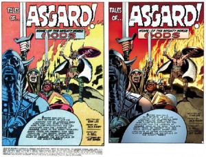
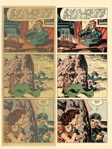
There seems to be two schools of thought on reproducing this material: keep it as close as possible to the original or go hog-wild and give the best that’s possible today. Two examples: Tales Of Asgard with modern colourization and Young Romance keeping to the original colours.
As you can see the difference is ridiculous and these two are the best examples I could locate of the polar extremes. The Tales Of Asgard re-colour ignores the original and treats the inked page as a new foundation for modern colours. The Young Romance page keeps the colours as true to the original as possible while removing the newsprint “haze”. The former could be a comic from this week while the latter is clearly an older work.
Check out both links to get a nice overall of each project. Here’s a quote from Michel Gagne who is working on Young Romance as a solo project.
[quote]After experimenting with various techniques for several months, I finally developed my own methods. The goal was to preserve 100% of the line art from the comics, and clean everything up so that it looked like each page was scanned from a mint, right off the press comic. If I did my work well, the restoration would be nearly invisible.[/quote]
There was similar furor over DC Jack Kirby Omnibus line: they went as true as possible to the originals and received a lot of badmouthing for it. Is the goal of a reprint to faithfully reproduce the original in its entirety or to present the material in the best light possible?
Fantagraphics has a line of Prince Valiant books that reprint the classic strip. Here’s a comparison of three different reprints of the same material. 1960s, 1980s and current reprints compared.
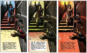 [quote]Prince Valiant benefits from an extra stroke of good luck: The availability of a nearly full set of pristine color engraver’s proof sheets of almost the entire Prince Valiant run, carefully preserved by Foster and donated to Syracuse University, who has generously provided scans of these pages for our use.[/quote]
And that’s where the line seems to be drawn: can publishers get access to the original colours via proof sheets or original art? Otherwise how can we tell today what the artist had in mind at the time of the material’s original printing.
Food for thought. Should reprinted material look like a reprint slightly gussied up or a new work with no ties to its former self. Which do you prefer; chime in below.

If you’ve read my comments and articles, you know I’ve been working through the Thor Walter Simonson Omnibus. This omnibus was recoloured. I enjoy the reading experience more with the recoloured pages. While at Fan Expo I flipped through a couple Thor collections and compared the original pages to some that I recently read. I prefer the restored work.
It is still Walter Simonson’s artwork but with today’s paper quality and colouring technology.
I enjoy reading the restored version, but if I want to see the original (and sometimes blurry) artwork I can easily find previous publication releases.
Another great topic! And one that hits close to home.
No matter how good the art or the story, I wont buy a book unless it’s printed right. Which is why I always seek out 1st print editions and I usually don’t buy reprints of older books.
Older books are reprinted by scanning the printed book and the publishers just don’t produce them right. Even if they spent the time and money, it’s still one generation off and it’s very difficult get around moire patterns caused by line screens (little colour dots).
Newer books are produced digitally, ie; Photoshop and publishers are intent on reproducing them as trades so they usually save all the files. Which means, in theory, the second print can be just as good as the first.
My personal feeling is, that when printing older books, they should not print the flaws, like creases or the yellowing of the paper because they were never intended to be there in the first place. Give the reprint a chance to age on it’s own.
As for paper, I love the pulp feel. Newsprint absorbs ink which gives older books that faded look but these days, print technology has vastly improved and the ink sits on top of the paper so even on newsprint or uncoated stock, the colours feel rich.
I would prefer if all comics were printed on newsprint and made cheaper so they could be more accessible. My vote is for authenticity and re-producing books as they were intended to appear.
Couldn’t agree more Charlie – should a Rembrandt painting be recolored just because we can do it?? The flat colors and newsprint of earlier comics are part of their charm, and changing that rarely has any benefit. If the artist him or herself makes the changes that can be good (Bolland on Killing Joke for example) but the limits and potential for color printing in different eras has shaped how artists drew their books – with a simpler palette they had to rely more on line, action, composition, etc. Pre-code horror has very simple coloring but the pages are often spectacular. You can’t separate the color from the rest of the art…
In the context of paintings the comparison would be should paintings be cleaned to show their true colours, as was done in the Sistine Chapel and Rembrandt’s The Night Watch.
Comics printed on newsprint had muted colours because of the limited pallete available at the time and don’t really represent what the artist wanted, but what could be done. Who knows how the artists of those eras would be colouring those books today.
I’m not sure that’s a fair comparison. Cleaning paintings are a form of restoration. Reprinting a comic is reproduction. The flaws are not a part of the comic but a by-product of age and handling which is why I don’t think they should be reproduced.
Also, commercial endeavours are usually a team effort. No doubt each team member would have an opinion but there is a larger “corporate” vision that they usually adhere to.
Even as an artist, they can envision what ever, but can only be produced based on the technology of the times. Both print and digital comics can be vastly improved… but for what it is, it’s not worth the effort since it takes moolah.
I’m surprised there isn’t more interest in this topic. It touches on so many aspects of the medium and there is a direct correlation with the enjoyment of comics. Consider as well that print is or was a form of art… What about the tactile quality of paper or the character that age brings to the experience like static does with vinyl records. As well, current digital is a form of reprinting and so even with digital, I prefer first generation over scans. What about 1st editions versus 1st prints?
This topic is a gold mine of interest… and yet, it seems to turn women off when I bring it up as a first date conversation. Perhaps it’s more of a second date kind of topic…