Welcome to the final installment of my little fan-art post.
The aim here was to show the journey of an idea as it evolves from the murky depths of my frenzied fanboy brain, through my mildly capable fingertips and onto a page that will (no doubt) be greeted by a mixture of “who cares” and “that’s not bad.”
Because we’re all critics, us nerds.
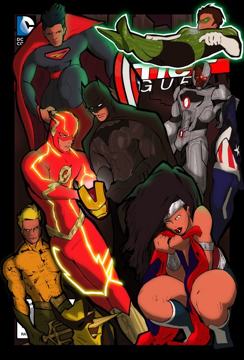
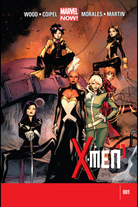
Anyway, the story idea was to suggest a catastrophe in New York City causing the entire population to vanish completely, including the Marvel headliners. The Justice League have arrived in town as a result of some serious — and probably quite cheap — framing device, say… following the undisclosed event in Marvel’s NYC, the President puts in a call to his advisers at Area 51 to confirm that the ‘gateway’ is still active. In make-believe land, the ‘gateway’ is a wormhole discovered in domestic space that allows access to the DCU and its caped comrades. The bottom line is, for whatever reason, the Justice League arrive in Marvel’s NYC only to be greeted by the discarded costumes of a – currently missing – band of beaten Marvel heroes. Weird.
The story inside this book would be told non-linearly with flashbacks revealing what may have caused NYC to shut down completely. The detectives among the JLA (Bats, Flash) would grow impatient at the other members as they gather clues and piece together an answer to the question “what the **** happened?”
The story would be largely conversational and character based in the beginning and the cover on a book like that should be very generous with that tone from the jump.
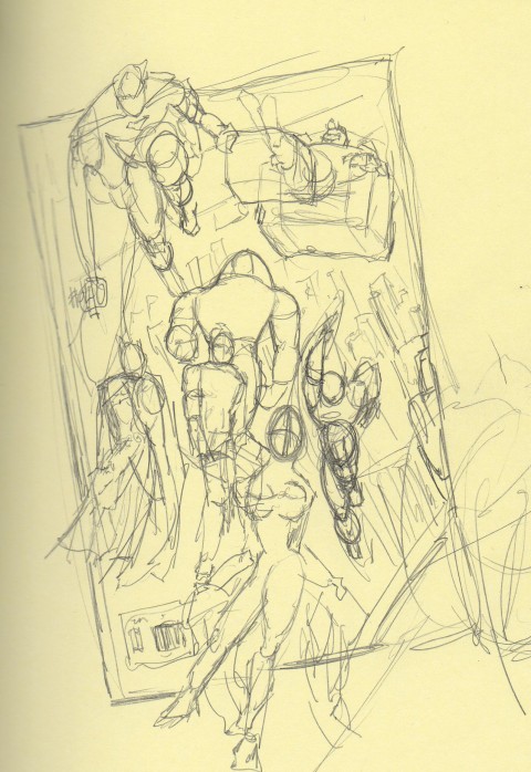
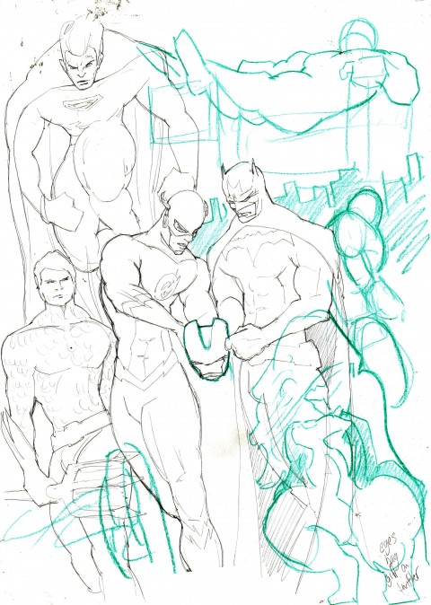
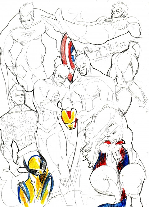
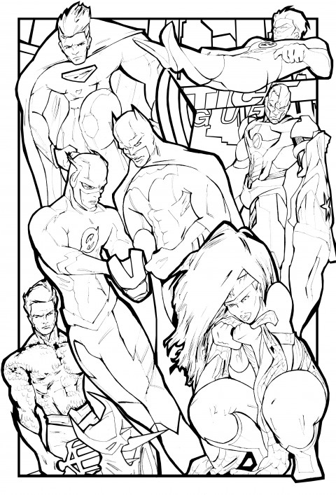
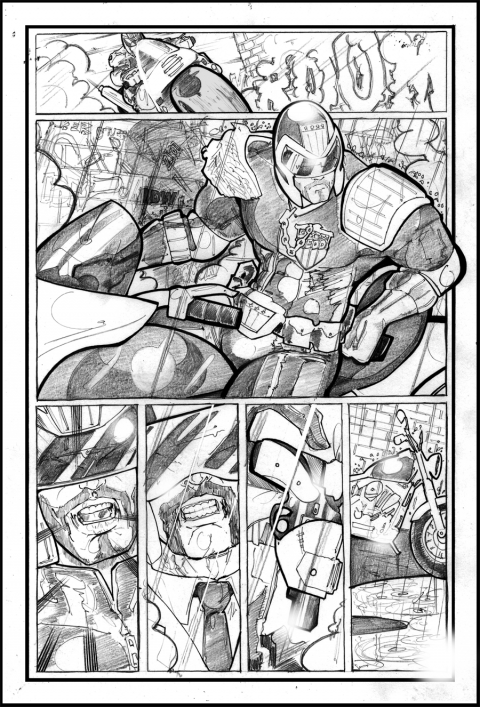
Please find below the journey of this cover from the concept sketch (in the back of a sketchbook that never leaves my side), through to a mock-up cover that’s almost exactly what I wanted. I did want it a bit more ‘serious’ than it turned out, but hey.
The one thing I’m missing in my process is a traditional inking phase with a pen or brush. Inking pencil-art for comic books is a changing skill. Just like when photography became something entirely different in the midst of a digital revolution, for the people whom earned their living in a dark room, frantically dunking their work into actual tubs full of acid and alkali for the exact amount of time required to develop the image followed by the exact amount of exposure to light… that process sadly became extinct due to technology. These days they just click on ‘Brightness and Contrast’ and move a sliding volume control. Done. It is however still a skill, and as a creator you should learn how to do it the old way in the interests of trying to understand the reason why.
You can teach someone how to use a computer, you cannot teach them how to compose an interesting an successful image of an interesting and successful subject. You still need to be an artist to make art. The inks phase in my process has become an experimental piece of the puzzle. Once I’ve prepared the pencil lines for colour, I like to go in with texture (not something I’ve done in this case) often using watercolours, pastels, chalk, spray, colouring pencils, oil paints etc… all of which can be scanned into a computer, coloured over and prepared for printing without losing any clarity or artistry. With technology developing as quickly as it is, the production and printing of images is opening up massively as a process, and while it is important to maintain the very classic look-and-feel of comics, we are increasingly more free to produce a piece of art as we want it, as opposed to how a printer needs it. In most cases, technology is both convenient and… a bit of a shame, as it’s usually replacing an established item or process. Hatching and cross-hatching still appears in printed illustrations mostly because we like the look of it, not because the printer needs a well-defined area of solid black. It’s graphic and bold and pleasingly crisp.
This is just a mock-up and I wanted to throw the overall tone back to classic JLA covers of old. It’s turned out a little more cartoony than I’d hoped but it was fun to do.
JLA does Vegas next.
