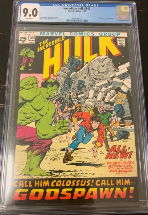
I had a nice visit from Mike Huddleston a few days back. It’s always nice when Mike drops by, we talk fishing, girls, donuts and we even find some time to talk comics. In the words of the great Fred Flintstone, Mike is “one of the good ones”. Mike was kind enough to help my November 1971 collection by bringing in a Hulk #145. Mike knows the lay of the land and in his polite way said “Walt, I know you want 9.2s but this is a Hulk #146, take the 9.0 and rejoice”. It’s a beautiful copy and Mike is right, of the mainstream titles the Hulk #145 might just be the toughest. While we were talking about the November 71 set, we noted that the issues both before and after are special in their own way. The issue prior had that really nice 15 cents in a circle, and the first 20 cent copy just after had that unique round 20 cent motif. In the words of the just as great Foghorn Leghorn “of course you know this means war!” and indeed we decided then and there that the collection will not be complete unless we add all the round 15 centers and all the round 20 centers. The good news is this will keep me busy collecting and off the streets.
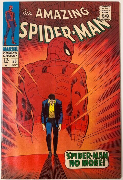
Let’s stay with Mike’s visit for a little longer. He also brought in this gorgeous copy of Amazing Spider-Man #50 you see below, I thought it was stunning until I saw the water stain at the bottom corner of the back cover. “Still”, I said, “this has to be at least a 7.0”. When Mike told me it was graded by CGC as a 5.0 I was surprised. We got to talking about how two books in the same grade are not always created equal. I’ve seen some terrible looking 5.0s and I’ve seen some stellar looking 5.0s, like the one pictured below. I guess for the patient among us there are opportunities to look for stellar examples of a certain grade, remember CVA? CVA would give a sticker to a book graded by CGC and the sticker would basically say “this is a stellar example of this grade”, the way the market would read that is “hey! this is under graded, buy it, crack it open, press it and resubmit it for the grade bump”.
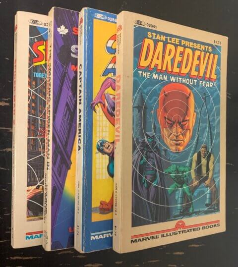
I found these hiding in a box and I think I’m going to run them on our weekly eBay auction. These came out in the late 1970s and I’m not sure what the market will be like for them, one way to find out, I guess. The comic book format condensed down into a pocketbook size doesn’t work for me, the design of pocket books is for reading text, the art can’t be properly viewed unless you pretty well crack the spine by flattening out the book with every page you turn, and then everything is still too small. Nice try guys but it just didn’t work.
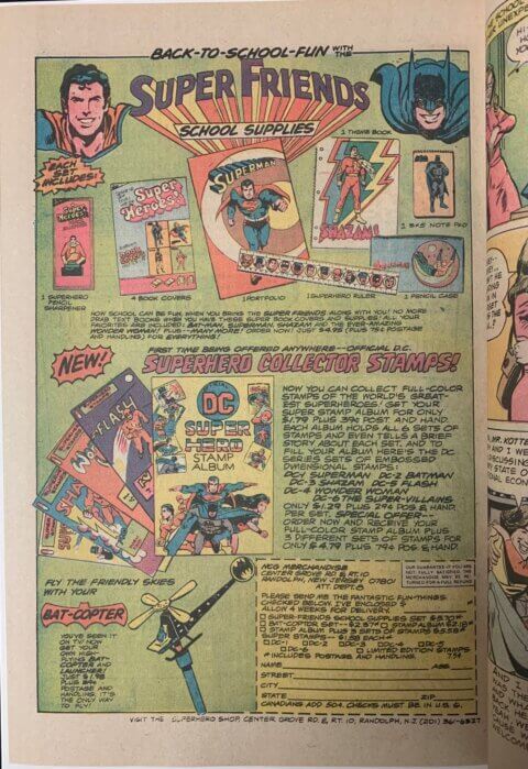
Our ad of the week comes from the pages of DC’s Welcome Back Kotter #1, 1976. I don’t think I’ve ever actually seen a DC Collectors Stamps album; I don’t even remember knowing they had one. We all know and mostly loath Marvel’s value stamp program because of all the kids that actually did clip ’em and collect ’em. With the DC book, you ordered the stickers separate which sounds SOOO boring, which is probably why most of us don’t know about the program.
Our weekly icecollectibles eBay auction finished with a flurry last night. I thought our Mary Marvel #14 did well and that it was another example of the strong Golden Age market at the moment, that cool cover didn’t hurt it, it went for $367.62 USD.

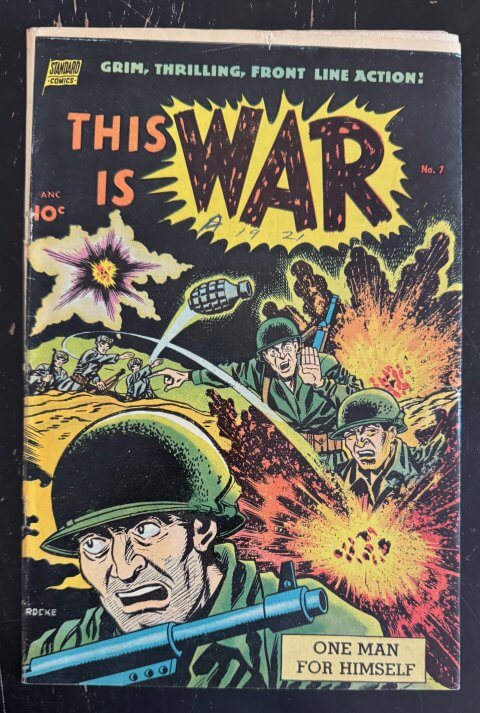
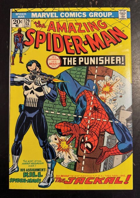
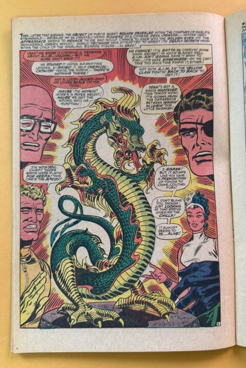
I get the 25 cent collection – that is a cool idea and there are a lot of good issues from that month – but I can’t get enthused about the circles. I think the market probably sees it the same way.
The water stains are killers, especially when they are small and almost unnoticeable. Those are probably the main reason I won’t touch raw books of any value (unless they are already clearly 4.0 or below).
The pocket book of Green Lantern/Green Arrow was my first exposure to the series, and the rest is history. (My main collecting strain.) I agree the format is terrible, but because of its life-altering impact I have a soft spot for it. Not soft enough to get me to bid…
Walt, CBCS used to have a little tick above the grade to indicate ‘visually attractive example of the grade’ – I reached out to Steve Borock and he confirmed they did it since inception of the company. The way I thought of it was a 8.9 gets graded 8.5 with a tick! you’re not going to get that 9.0 for it, but its a very nice 8.5!
Chris, that’s the OCD kicking in, as long as I don’t add the square 20 cent box issues consider me contained, and I hope you have a at least the paperback of the GL/GA, it should hold a special place in your collection.
I remember that checkmark, it was their answer to CVA. CGC never did it though and I do think it belongs to a third parky to decide, the CBCS check mark is like a “sorry we only graded it an 8.5, we added a checkmark to make you feel better.