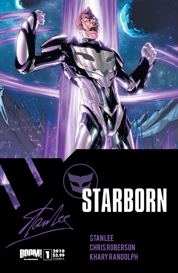
The Grand Poobah: Stan Lee
Writer: Chris Roberson
Artist: Khary Randolph
Colours: Mitch Gerads
Letters: Ed Dukeshire
Covers: Gene Ha with Nei Ruffino (A), Humberto Ramos with Edgar Delgado (B), Khary Randolph with Etienne St. Laurent (C)
Publisher: Boom! Studios
Here we are, true believers. With this issue, we are three series deep into the partnership between Stan Lee and his Pow! entertainment with Boom! Studios. Where does this sit between the other recent Stan Lee creations? Is a new star born?
Synopsis
A down on his luck aspiring science fiction writer named Benjamin Warner attempts to get his writing published, but is attacked by a horde of aliens known as the Hive; they just so happen to be characters from his manuscripts.
Deep in the heart of the galaxy far across the stars, The Human Civilization fights against a group of colonists that evolved its collective consciousness into a hive mind. Known simply as the Hive, the forces of civilization move into attack them, but they repel them with a rallying cry; “You shall not take our land!”
Benjamin is interrupted by a co-worker, quietly having walked in on Ben as he worked away on his manuscript in his office building cubicle. The two talk a while, bringing us up to speed with Ben’s writing aspirations and his disdain for his office work. The issue takes us through the criticisms heaped onto his work by both published writers and a publishing company. Interspersed are scenes of the war in space between Human Civilization and the Hive. After his final rejection one morning, Benjamin goes to work at his office job, but sees his old childhood sweetheart Tara Takamoto in the lobby. The two had known each other from pre-school through college. She was the girl of his dreams. Arriving upstairs to his cubicle, Benjamin begins his work. Not long after though, he’s interrupted by a co-worker again. Only this time, he realizes there’s something very wrong. His co-workers stand in unison and attack him, only to be saved by Tara who helps him escape to the top of the building, leaping from it straight into issue two.
The Pretty, Pretty Pictures
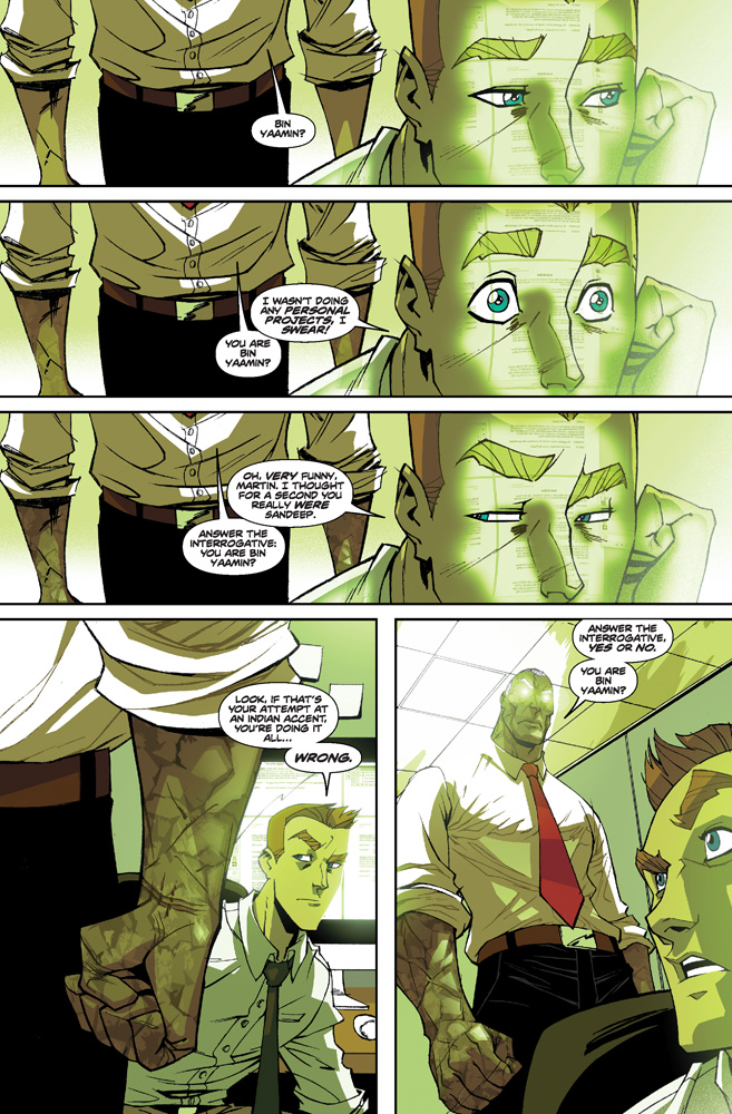
Randolph’s art is consistently well done throughout the issue. He weaves in and out seamlessly between larger than life battles in deep space, unassuming inter-office conversations and grainy flashback sequences that help tell the potentially expansive story but personalize it equally through Benjamin’s emotional struggles. He captures the wonder of space with blistering sunspots from suns to too many stars to count, while the warring factions mingle in an epic clash of civilizations. Similarly he characterizes office work as a bland and featureless existence mirroring the emptiness of the main character.
The panel arrangements are largely formulaic and straightforward until the final pages where Randolph starts to play with the depth perception of the panels. He starts to angle the characters in more dynamic ways, primarily during the later office space scenes where Benjamin is being attacked. Many of the panels force your eye to follow the action from one corner to the next through the enlargement of the characters’ background posture and then moving their bodies closer to the reader’s eye in the foreground.
One of the nice touches with the artwork are how Gerads’ colours differentiate between space battles, office work and flashbacks. During the space scenes, Gerad’s colours are largely vibrant and well done. In contrast, the florescent lighting of the office creates a more somber, dull tone that’s perfectly attune to the office atmosphere with the resonating green hue from the lights and computer screens. Additionally, the flashback scenes are faded into varying blue tones to properly differentiate it from the rest of the scenes and clearly define it in contrast.
Of the three latest Stan Lee creations, I feel Starborn delivered the best of the three stories up front. Where Soldier Zero felt very pieced together from a handful of character concepts and The Traveler didn’t really capture my imagination like I thought it would despite its potential, Starborn was the one which captured my interest the most of the three stories. Soldier Zero and The Traveler both did some things well; Soldier Zero did a great job characterizing Stewart, but doesn’t really expand its concept even after two issues, and I’m less captivated with where the story can go despite it being a good take on the physically disabled and the very real fact of their ability to care for themselves. It created a very personal story though. Where The Travler is concerned, I felt like it fell short of establishing a personal connection immediately with the reader, forcing us to question why we should care for the character at all. Yet, we got a better understanding of the character’s power set and what kinds of stories we can expect from the team. With Starborn, Roberson found a balance between making us sympathetic to the character, while creating a sense of wonder about the larger story and where it’s headed. The story has the potential to be an inter-space epic where Benjamin seems primed to be a fixture in a space operatic war between technologically advanced civilizations.
Having held lofty expectations for The Traveler and being ultimately let down, while Soldier Zero felt a little too ripped off in its story structure and character premise, Starborn comes out as the best of the three Stan Lee creations. Of the three, this is the one I would recommend to readers. It has the best story, the more dynamic art and holds the most potential as an overall story without the worry of cumbersome time traveling elements like The Traveler. I think this is the one to watch.
