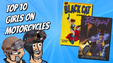
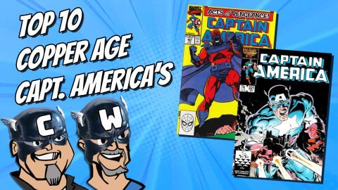
This week Chris and Walt talk about how covers can possibly help entice more people to pick up a new comic and read it.
Please let us know what you thought of the show, leave your comments in the comments field below and as always let’s please keep it civil.
Do you read new comics? Will you try a new comic to read if a cover grabs your attention?
Listen on Apple Podcasts, Google Podcasts


Covers are comics’ ultimate lie/misdirect/shell game. I can’t count how many times as a young collector I bought a comic based on the cover only to discover when I got home that the cover artist was not the interior artist. This seems to get more prevalent every year. I understand the practice is as old as comics (and pulps before that); Leo O’Mealia had a great cover run on Action Comics starting with issue 2.
The cover should feature an aspect of the story to sell the book on its merits. Thumbing through the book before buying can be a strong selling point to a comic and is one of the primary benefits of a local comic shop.
Scott, I forgot to mention on the show but often when I am pricing up some old Silver Age, even Bronze Age, I’ll get lured into the book by the cover. Back then you would start telling the story of the book right on the cover, lots of text to let you know what will be going down inside and why you want to read it.
I actually miss the captions and word balloons on covers.
Well… as Walt just admitted… he buys old comics for covers…. and we have talked about covers selling vintage comics soooo many times before… my question is: Whats the difference?
I collect vintage Archies ( thanks Walt….) but I also bought in the last year Adam Hughs covers on modern Betty and Veronica… which I have never read… bought them for the covers because I know the interiors do not have classic art… its the only way I would read an Archie comic. I have Worlds of Fear 10…. Bought it for the cover… not really interested in the interior stories… same difference! So maybe I am the guy you don’t like… but… am I different from Walt? Dome comics … despite a great cover I will read… because I might be invested in the characters stories… so sometimes I am in the 5%… really depends.
I like word balloons and captions on covers as well Chris!
Gerald
Even though I can understand why those Adam Hughes covers on Betty and Veronica might have sucked you in initially (I have actually never, ever bought an Archie comic before), the interiors do have “classic” art. And!!! The interiors are a rare treat from Adam Hughes. Let’s face it, the guy is actually better known for his covers than any full issues. But! This is a yet more rare example of Hughes’ work, because it includes cover and interior art, as well as the script!!! They are all brilliant by any definition of the word, and you certainly owe it to yourself to dive into them and savour a wonderful amalgam of witty and truly funny dialogue with the joy of seeing Hughes’ visual interpretation of classic characters. He really does them so proud you wonder why they haven’t always looked that way! Promise me, you’ll crack that book and actually read it. Trust me on this one. As a longtime Archie fan, you have to “see” this. Okay, now I’m just gushing. Sorry.
cheers, mel
P.S. Okay, now I’ve caught myself in a lie. I do own two Canadian “Whites” or “WECA” books from the ’40s that feature Archie reprints, so I guess I have actually bought a couple of Archie books. No that there’s anything wrong with that!
Thanks for the tip Mel and I am not judging you on your Archie ‘indiscretion’!
Thanks Gerald. My “indiscretion” falls no further than a couple of issues of Super Comics from F.E.Howard. These Canadian reprint books from the ’40s are probably among the scarcest Archies known. With a Canadian market one tenth the size of the American books, you know you won’t find too many of these babies. I’m actually surprised that more Archie fans are not pursuing these hens’ teeth to grace their collections. I’m also thinking the FECA period Canadian reprints of Yankee comics will only rise in value, largely based on key covers and genuine scarcity)! With the advent of CGC, covers have become one of the most sought after aspects of our comic fixation. I just want people to remember that, between those covers, lie some of the most impressive examples of 20th century culture just waiting to be enjoyed. So, If you buy CGC…crack it! Read it! It goes way beyond the cover my friends!
It’s kinda like walking into a comic store or going to a comic show… only to find mostly toys. In the same way that the movie going experience is a real estate business, in that it’s about renting a seat for 2 hours… Comic book content is primarily about separating you from your cash. If you understand this basic principle, things begin to make more sense. If a book turns out to be “artistic”… that’s just a bonus, which is why success is often described as happy accidents. This was made clear by the creators themselves in various interviews.
Ditto on Scott’s first sentences. I am now back to collecting that Adams covers that disappointed me when I first bought them.
I don’t think there is any “should” for comics, and as is somewhat unusual, I agree with Charlie. But of course a comic is a consumer product, so why should we expect otherwise?
Walt, I think you were mostly off base in this one and maybe you should dial back on the hard stuff. You might find yourself trying to emulate the UFC guy and I bet the outcome wouldn’t be epic. As Chris said, the idea that the artist is going to coast and then knowingly deliver a stunner is pretty hard to swallow. Compare the Adams covers I’m talking about above to say Dick Dillin covers from the same era. The artist is generally doing the best he can (under a deadline), and some artists have it and others don’t. Secondly, grousing about the cover not tying to the story – like you finally concluded, it’s about owning the book. I’d rather have a good unrelated cover than a bad related one, so in the end I’m more likely to have the former to read. HOWEVER, I will say that as a collector’s item, I think a key book with a related cover is much preferable. Think about, say, Tales to Astonish #27 vs. Strange Tales #110. To the unwashed, there’s nothing about the latter that points to Dr. Strange.
Also as Walt was complaining about unrelated covers, all I could think of was Schomburg. His covers are at the top of the hobby, and (nearly?) none of them ties to the interior content in any direct way.
For modern books I do agree that the variant covers, even when they are beautiful, are too much of a blatant money grab to get me interested. Especially with being able to look at these on the web – I can’t afford to shell out $5 for a nice cover that is going to go into a box, from which I might take it out for a minute or two a year to admire it.
In Schomburg’s case, was it possible that he was commissioned to do up a bunch of war-related covers featuring Timely heroes fighting the Axis and that the editors would just go through the piles of covers he submitted and picked whatever ones they wanted on their comics?
In the sixties, DC and Marvel would produce a cover then have a writer concoct a story about it. Jack Kirby, Carmine Infantino and Neal Adams were superstar artists that created house styles for the “Bigs”. Jack Kirby and Stan Lee produced covers that better promoted the interior story and Kirby covers became the house style for Marvel. He was so prolific that one of the reasons Steve Ditko moved to Charlton was to be able to draw and create a house style for them. Readers of this period could flip through an interesting book on the newsstand and discover a new character.
Now in the 2020s covers are still produced by superstars – Artgerm or Momoko; covers still promote a house style – Francavilla for Archie or Aja for Marvel. The difference is that local comic stores seals their new and old books in plastic, slabs the more expensive books and mounts valuable books out of reach of the public. Not very inviting! Luckily there are other avenues – Comixology, local libraries and friend’s collections to expand your knowledge.
Schomburg! We can loop him in with ArtGerm and Hughes, I still say a cover can still be used to sell the inside of the book better but in doing so may lose a chance to impress aesthetically.
I tried to be a cover guy this year; I bought a nice Hulk #340 with Wolverine on the front, read it, and was horrified at lack of quality of the interior art & writing, then promptly sold it. The book has to be readable for me. I’ve started referring to my collection as a library, as they must be readable.
I hear you Spider. I had the same reaction to Amazing Spider-man #300 and Spider-man #1. McFarlane’s art was just busy without any real substance, and his scripts were lamer than Kirby’s Fourth World material (As much as I have idolized the man most of my life, that has to be said. Sorry.). Mind you, I bought all of Jack’s DC work just for the art, since he had finally found inkers who inked his pencils more accurately, instead of smoothing out the rough edges like Joe Sinnot. Again, no slight intended to the greatest of Jack’s, and, maybe, Marvel’s, inkers, bar none (Well…Karl Kesel comes to mind, as does Terry Austin.) Great covers do not make a great book. Action #1 has an eye-catching cover…and the interior looks like a talented 10-year-old drew it. And, let’s face it, if you are buying that Action #1…it’s probably in a plastic coffin, so the only thing that matters is the cover!
I have to add that I am delighted to know there are still people out there who buy comics just to read them. That’s what I call a library!
so long for now, mel
Hey! Lets dust off the old saying – you can’t judge a book by its cover – !