Week 34 already !!! Time is flying folks, lets try and slow it down a bit by taking our sweet old time to enjoy some great comic book splash pages.
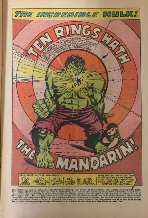
Incredible Hulk #107 was on my eBay auction pile for next week, there was actually a small run of 12 cent Hulks but Herb Trimpe’s splash to #107 was the one that hit the bullseye. September 1968.
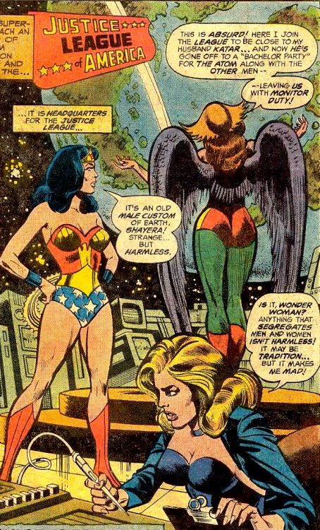
Some of the girls are pretty peeved that the boys are out hanging at some Bachelor Party while they get stuck on watch, Dick Dillin lays out the scene in Justice League of America #151 from February 1978.
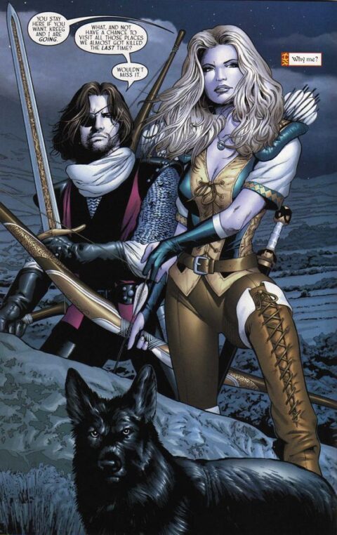
Sojourn was the only CrossGen book I read when the company was pushing out titles, I always liked Greg Land’s art, from Sojourn #11, June 2002.
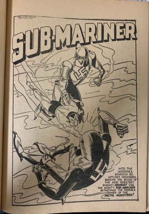
I had a great day today, it’s not often a guy gets to leaf through a copy of Marvel Mystery Comics Annual #nn. The 132 page black and white annual is almost mythical in its scarcity and here I was just leafing through it like I picked it up off the New This Week rack. I had a good mind to share a few of the splash pages like this ridiculous Nazi Robots Subby splash – does it get any better? Originally in Marvel Mystery Comics #41 with art by Carl Pfeufer. No date is given on the Annual but it was after the March 1943 release of Marvel Mystery #41.
Ed Winiarski gets credit for this great Cap splash page that first appeared in Captain America #22, January 1943.
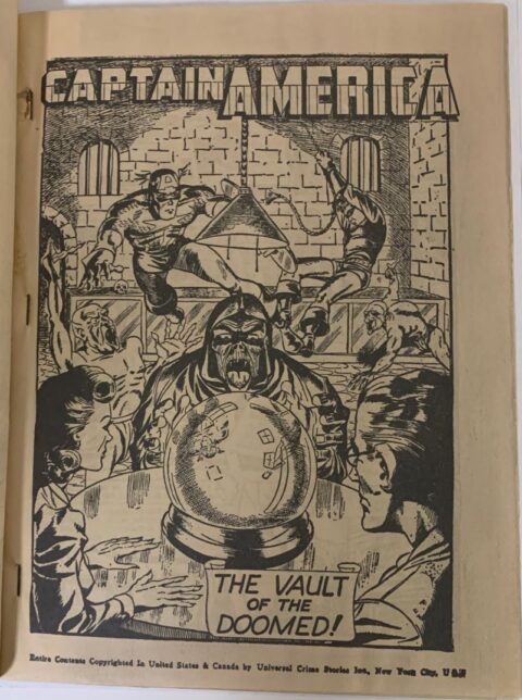
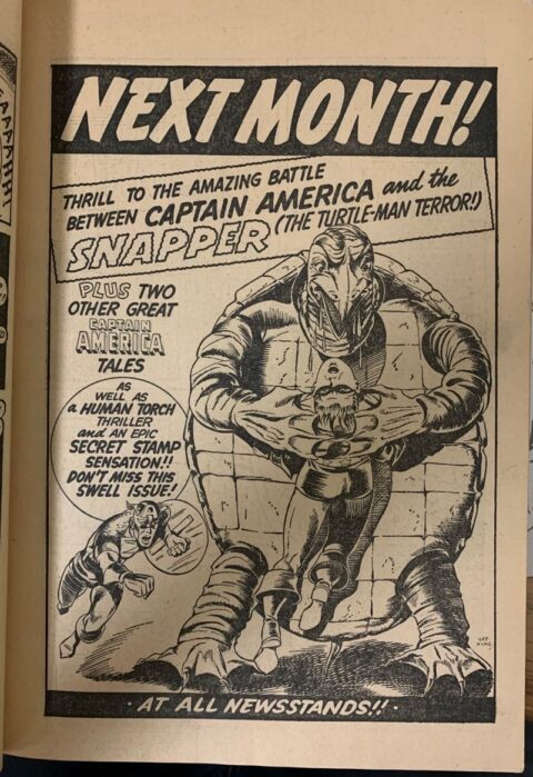
And as a bonus I’ll throw in this Captain America ad page, looks like Ed Winiarski?

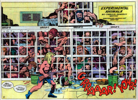
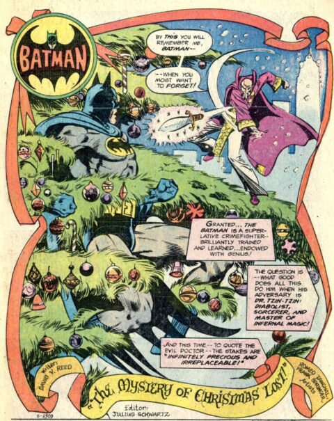
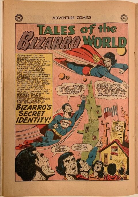
If I didn’t already own a JLA 151, it would be now. Fantastic splash page.
I agree that Dick Dillin splash is great! The Sojourn is very nicely rendered as well. Of course I am most impressed by the Timley Annual…all three are great splashes! What was the cover like?
Snapper, The Turtle Man! Makes me want to go read that story. Imagine hauling around a shell like that, he’s probably as pissed off as The Hulk or The Thing. Winiarski is not an artist I can recognize, but the ad does have that same heavily detailed ink style as the Cap splash. I wonder if Syd Shores had anything to do with it?
And for your next project…or more asides sometimes…great in-house ads like this one. Another untapped source of fun material. Timely had some of the best, they promoted their books well, with that slightly rough-at-the-edges Timely style. DC was slicker but but less memorable in the forties.
But once they got designer Ira Schnapp on board, theirs were the best. Even ads for the early fifties Romance titles are noteworthy, but then what he did with Strange Adventures, Mystery in Space, the entire Superman line, nothing like it… Some day there will be a book on him, his Arlen Schumer has it written, but he needs a brave publisher (in more ways than one, if you know Arlen’s faux pauxs…) to take it on.
I have mentioned Schnapp before, but he deserves no end of praise, here’s the start of his Wikipedia entry:
Superman logo redesign (1940), DC Comics house style in logos, cover lettering and in-house advertising (1950-1967). Ira Schnapp (October 10, 1894 – July 24, 1969) was a logo designer and letterer who brought….
That Marvel Mystery Annual, man, I have never had a copy of that. Not a a big fan of reprint/remainder books, I’d rather put the money into the original appearances. But that said, I find something magical about the Fawcett giants, Xmas, Holiday…so giant, filled with four or five 64-pagers, and with cool new covers of Captain Marvel and the crew. Even Santa. So I can see the MM appeal, interesting to see that work in b&w, too.
I really like that Greg Land piece, too. The coloring and detail is outstanding. I wonder what he’s doing these days?
Yes, Snapper the Turtle Man, I saw that ad page and wanted to find out more! Bud, you are on to something with the ad pages and you certainly talked them up to the point where I now have to consider it. Such a fantastic idea!
I’m not sure what Greg is up to, I know he contributed to the Captain Canuck relaunch back in 2015 and he was a regular at Fan Expo, talented guy so I’m sure he’s doing something productive.
Gerald, I don’t know how to put a pic in the comments, google it and I’m sure you’ll find a pic.
Found it Walt! What a great book to be able to page through!
Wonderful examples all round Walt. Nice work.
When you can make a snapping turtle into a credible villain, you know you have a talented artist. Unbelievable
SWELL items, Walter, thanks! House ad pages is a great idea but more work for the W guy. I wish I didn’t miss that swell issue with the swell Turtle-Man Terror but I wasn’t born yet. And Marvel never brought him back, or did they?