A lot has happened since I started this 26 weeks ago, lets all stay positive and lets all help others in any way we can.
I’m continuing my sharing of great splash pages I find while preparing listings for sale on eBay with the first two entries.
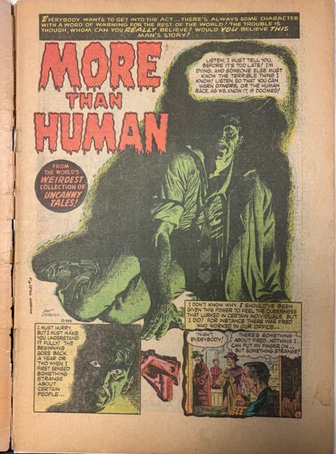
Artist Mort Lawrence is an artist making his first appearance in Making a Splash and boy does he ever make a splash. The “More Than Human” splash is from Uncanny Tales #19, April 1954.
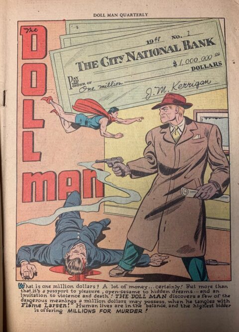
Alex Kotzky also makes his first appearance in Making a Splash, he gives us a very nasty and maybe too topical splash to Doll Man #16, Spring 1948.
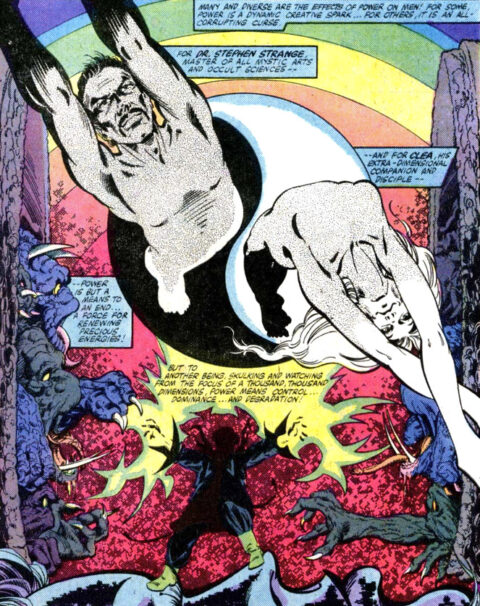
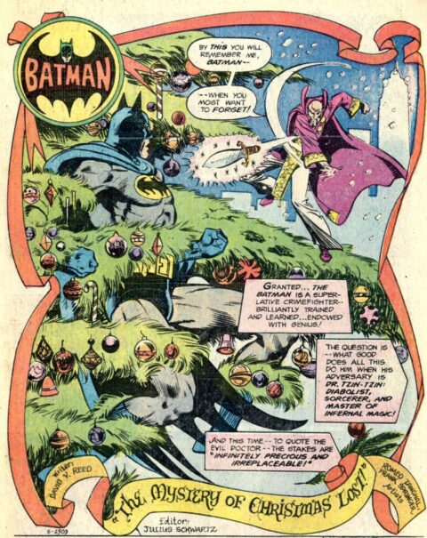
I’m liking what Marshall Rogers did with this splash page from Doctor Strange #49, 1981. Rogers does a great job channeling some of Steve Ditko trippy vibes into his piece.
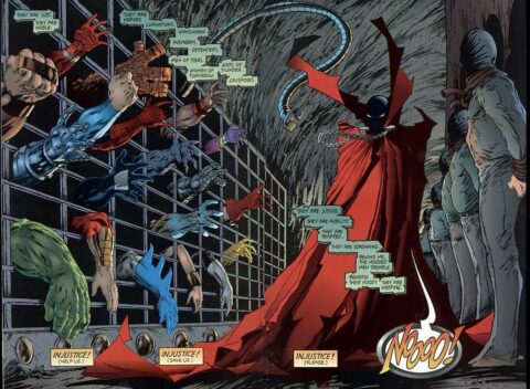
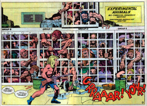
I get the feeling I might have thrown this one up already but I also get the feeling I didn’t and since I need it to set up the next pic I’ll go with I didn’t. Todd McFarlane gives us a great splash page in Spawn #10, this issue was written my Dave Sim and has Cerebus on the cover though I’ll be the first to say that this splash blows away the cover.
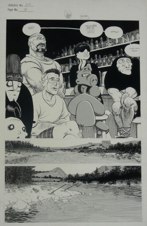
Speaking of Dave Sim, he’s a local boy not even an hour down the road from me. Dave hasn’t signed at the shop yet but I’m hopeful he will soon. Mr. Sim is famous for his Cerebus run and below is a nice splash page from Cerebus #210, Gerhard is credited with backgrounds. I’m not sure why but I really like this page.

1
Sorry, I meant to do a higher star rating but hit the wrong button and couldn’t change it. Loved those splash pages, enjoyed seeing the Marshall Rogers. Miss him.
5
That Lawrence is something else! Makes me wonder what the page rate then was. All that creativity probably didn’t translate to a very good wage back then! A bloody Dollman splash…wow! There is a bit of Ditko in the Rogers piece but it doesn’t quite do it for me. McFarland I feel excelled with his own creation but this splash feels a but static to me.
What’s you’re ebay moniker, Walt? I’d like to check out your offerings. Great splashes, I like seeing the ones from before my time.
Beautiful work by Mort Lawrence. He did a lot of good work for Orbit/Story also, but you may be seeing him at his best here at Altas. Do you wonder how much the coloring adds to this? Some poor unsung colorist, too.
This particular Alex Kotsky, I dunno. He did much better work than this. It seems pedestrian to me. I collect Dollman, and to me this is not our little guy at his best. Look for earlier work by Crandall, Al Bryant, even Lou Fine in early Feature appearances. I like Kotsky best in Air Fighters, before the title changed to Airboy. I think Kotsky did Airboys also, he might have been a major contributor there.
I like the Spawn piece, and the Cerebus is nice too. I had an original once, I think it was a the splash to #16…should have kept it. Lovely masquerade party— I pay special attention to stories with masquerade parties, even romance stories, artists seem to have fun with themes with costumes. Dave did some amazing work in those early issues, He got the best out of mere black and white repro.
Tim it’s internationalcollectiblesexchange
Colorists and inkers – thankless jobs Bud.
Walt: Is that: international collectible sex change?
I saw that as well… but my interpretation was changing one from a citizen of the USA to a Canadian! If it wasn’t for the cold….
Klaus, my eBay guy noticed that after we chose it and said “Walt, should I change it?” and I said “hell no !” People will talk about it and make fun of it but they will always remember it !!
Colorists…another topic, has it been addressed? Immediately I think of Atlas westerns. I really think someone very good was doing these, when you look at covers by Joe Maneely, John Severin, there is something very special there in the mid to late 1950s. Not sure if it was still there when Kirby came on board, ot maybe his work was not as suitable for color play.
Marie Severin’s work on the original EC’s was up and down, but mostly that was the fault of poor printing. A lot of EC’s had dark, muddy, and off-register repro. But she reprised that work for the Cochran reprints and the Complete EC slipcased sets…She even was doing limited hand-colored EC covers that Cochran sold, like sci-fi covers by Frazetta/Williamson, and I think Graham Ingles’ best horror covers. I have a couple of these, which are numbered.
I have to give it some thought, but I think there is much unsung color work out there in the Gold and Silver Age. As you point out, Walter.
I am curious what comes to mind for you guys. Its can be subtle and become just another part of the overall art that appeals to us.
Eisner’s Spirit sections, might be another example. When you see those in Tablod size it helps drive home what someone there in the studio was working hard on…
I bet Steranko either supervised it or did his own coloring on Nick Fury #1-7 and those magical Caps c.#110-113. That’d be like him.
Hey, totally off subject, but you guys must catch Adventureman #1 from Image, just out, by Matt Fraction and the Dodsons. It is stunningly good, and for $3.99 you get a whopping 64-page comic, all story, aside from an Afterword by the creators. The art is just fabulous. I don’t normally handle comics (too low priced) in my business, I wait for them to become a graphic novel or archive, but this puppy, I want to break my own rule.
Rules are made to be broken Bud, and as for colorists I think we’re conditioned to really notice it on covers with their high gloss as it was their job to grab out attention. Interior color work does go unsung, is it because the color is muted and matted? We need a list of the best colorists ever. Do certain colorists work better with certain inkers and peicilers?
It would be interesting to research what artists have to say on the subject. Some of these guys surely have recorded their thoughts on the subject. Now I am picturing Neal Adam’s first few years…again, to me, I am wondering if those wonderful covers, and stories, were enhanced with superior coloring. Anyone know more about this?
Thanks Walt! And yes I had to look twice, that is funny.
In my recent binge reading of various comics I was thinking about inkers – man, they did a lot of work not only working on the penciller’s art deciphering pencil lines but also straightening and inking all the panel lines and sometimes the large lettering titles or sound effects. Did they erase all the errant pencil lines too? I’ve never tried inking another artist’s pencils, wonder if I would have the urge to change things.
Speaking of Cerebus, I have the Bud Plant catalog to thank for introducing me to the character back in the early 80s, along with Captain Canuck and Jack Katz’s First Kingdom. Amazing stuff to a teenager who only knew DC and Marvel and Charlton at the time. I guess some rules really do need to be broken, at least occasionally.