I’m really enjoying this dive into splash pages but again I want to say that I’m not keeping records of what I’ve posted to date so I may double dip, please let me know when I do and I’ll throw an extra splash in the next week.
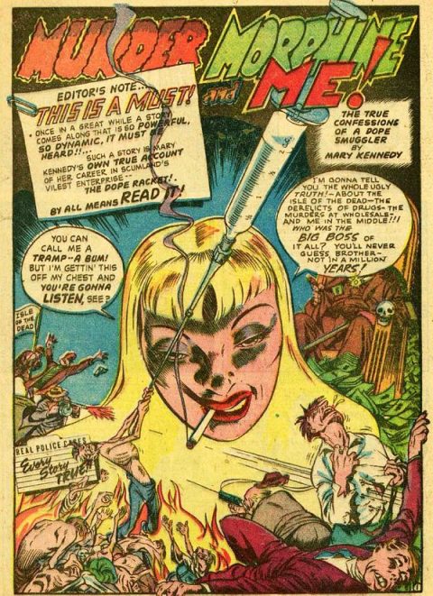
This is an absolute monster, Jack Cole’s splash from True Crime Comics #1, from May 1948.
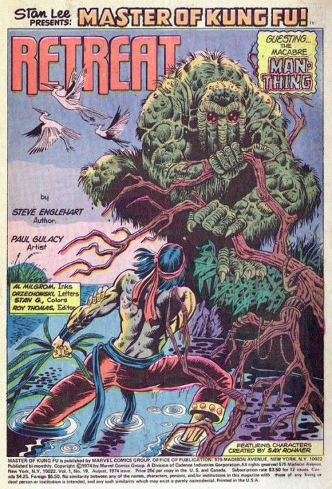
Paul Gulacy gives us a great splash page in Master of Kung Fu #19, from 1974.
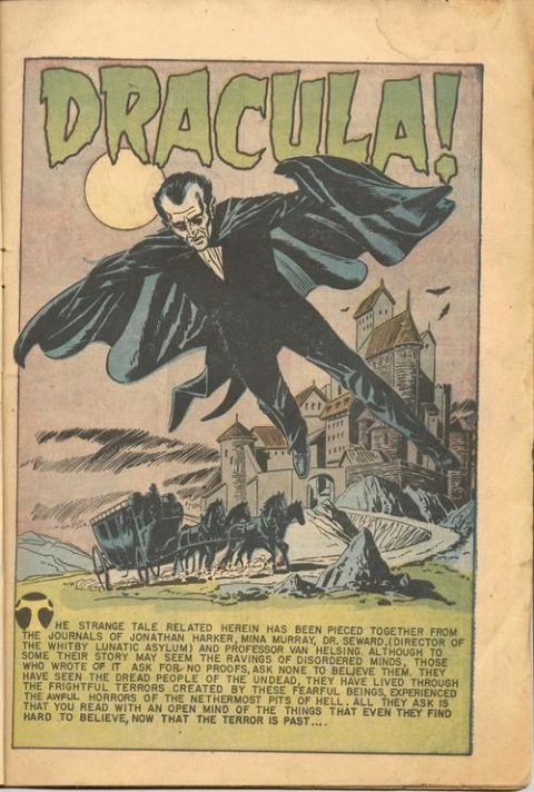
I actually own a copy of Eerie #12, Dracula’s first comic book appearance. I’ve never heard of Gene Fawcette but he’s the man that gave us this splash page, the art is OK and I will say I like the splash better than the cover.
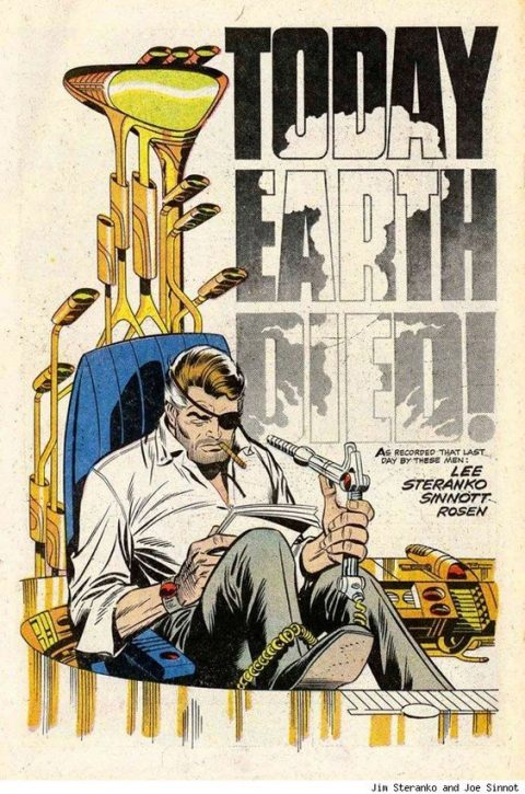
We can never have enough Jim Steranko, check out that cool set of golf clubs behind Fury’s chair. From Strange Tales #168, from 1968.
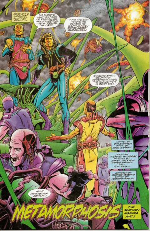
I get cold sweats when I see a guy bring a long box full of Warriors of Plasm #1s into the shop, I can’t remember ever selling one of these though I do remember taking some to the dump. I tell you I do like David Lapham’s splash page, maybe I should have opened one.

Well that is some Jack Cole you picked out! Cole was such an amazing creator you could do a spotlight on his splash pages alone!
The Gulacy is also right up there! That depiction of Man Thing is about as good as it gets for the character! I envy you on owning that particular Eerie issue Walt, its one I am missing in my run! I agree the splash is better then the cover but pales next to some of your other entries!
That Steranko, done in one story, was one of my favorite Strange Tales issues and a fitting way to end the series before the characters moved on to their solo issues!
Your final entry however does not motivate me to look up issues of Warriors of Plasm. I find the splash busy and garish! Even the name of the title just doesn’t roll off the tongue that easily… guess it did for Shooter tho….
David Lapham, no offense to him, I find kind of stiff, it looks like George Perez on a bad day. The coloring is nice though.
When I think of Gene Fawcette, I see his stiff (again) but working-man covers for Avon sci-fi titles, and some work early on for Planet Comics. But he had a far greater range, here’s more on him from the Lambiek website:
Gene Fawcette was a comic book artist who worked through the Eisner/Iger Studio in the early 1940s. His early work includes features like ‘Fero’, ‘Buzz Crandall’, ‘Captain Wings’, ‘Wing Tips’, as well as covers, support art and model pages for Fiction House. Then in the second half of the 1940s and in the 1950s, he was working on several features for Better Publications, like ‘Princess Pantha’, ‘Out of the Shadows’, ‘Dennis the Menace’, ‘Adventures into Darkness’, ‘Supermouse’ and ‘Tara’. He was also present at Avon Comics with western, horror and science fiction stories and covers.
Fawcette additionally drew ‘Sally O’Neil’ for Quality Comics (1945-47) and horror stories for Toby Press, Marvel and Ziff-Davis (1950s). He then became a magazine artist, among others for Famous Fantastic Mysteries and Amazing Stories. He was managing editor and artist for the Picture World Encyclopedia between 1959 and 1961. By 1961 he became the artist of the Sunday feature and later also of the daily version of ‘Our New Age’, a newspaper comic on science and technology by Dr. Athelstan Spilhaus. In the late 1970s he returned to comic books and drew covers with Warner Bros characters for Western Publishing, as well as ‘Flash Gordon’ and ‘Tweety and Silvester’ stories.
….More than I knew about him. There are a couple fabulous sci-fi strips, speaking of “Our New Age,” that came about the the early sixties that are true lost works. Like “Closer than you Think,” which needs to be collected:
https://paleofuture.com/blog/2007/9/11/closer-than-we-think-magic-beam-highway-1961.html
Gulacy suffered at time from being photo-realistic, but he could nail it too, like here. Clearly he was a fine, polished inker, reminds me of Dan Adkins, who got a lot of flack for his swipes, but the guy could ink like Wally Wood, his mentor…
Love the Steranko, he was the most exciting artist in comics (for us sixties kids) when he was doing The SHIELD run and those great couple-three Captain America issues we’ve talked about in other columns, #110, 111 and 113.
Jack Cole…his Plastic Man was wild stuff, I have always loved and collected it. But the pre-code crime and horror strips like this took things to a new level. Demented and great too! It was like he was suddenly on steroids. We know he was an unhappy guy, and maybe I read it, or just imagined it, he may have come to regret his comics book work like this. But he was giving us everything here!
On the Plasm comic…painted by Janet Jackson and James Brown? Was that a joke?
As for Fawcette, I’ve seen a lot of his work over the years…not bad and by 40s and 50s standards, pretty good.
Bud you are an absolute treasure, great to learn more about Fawcette.
Gerald, I like my copy if the Eerie, its a 3.0 I think but I just like having the book.
I saw James Brown at Lulu’s Bar in Kitchener, Ontario in the late 90s – best concert I’ve been to.
I have never been a fan of David Lapham. There is something odd about his art that I just can’t put my finger on. It’s like it’s a cross between Barry-Windsor Smith and George Perez. Two great artists but together…?
Awesome Jack Cole art. Wow. That guy was amazing.
Bud, I love your history lessons. I had never heard of Fawcette before. Thank you!
I agree with Gerald here. No reason to go out and look for Warriors of Plasm. This was a terrible time for Jim Shooter. He was trying to create yet another comic universe, to which, you have to give the guy credit. But sadly, Warriors of Plasm and The Good Guys, just didn’t make the cut for his newly formed and aptly named Defiant Comics.
I always thought Gulacy was over rated. However this splash may change my mind.
Say, not to be picky, but isn’t that terrific Jack Cole splash page from True Crime #2 (albeit the first issue of the title), and isn’t it from 1947?
I love that Jack Cole splash but its hard to find in the Canadian version. Still looking for an affordable copy to scan
I agree with Owen! This website is a real real treasure and you’re input Bud takes it to another level! Anyone who isn’t reading it is missing out!
Thanks Gerald, Chris O. and Walter, for the kind words. It’s fun to share. I keep learning from you guys too.
Mike Weng – you are right, it was issue #2, my mistake pal – thanks for getting it right.