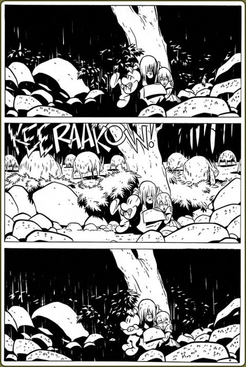
Bone was one of the best comics I’ve ever read, I highly recommend it for all ages. Jeff Smith amazes with this page below using that lightning strike to great effect.
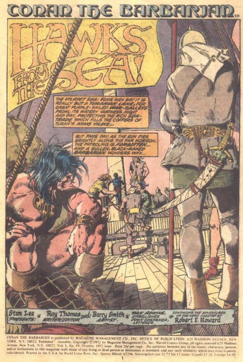
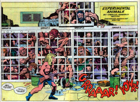
One Smith deserves another, Barry Windsor-Smith does stellar work on the splash page to Conan #23, the page has such a great feel to it like you are there living it.
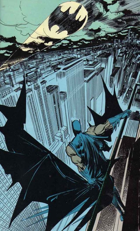
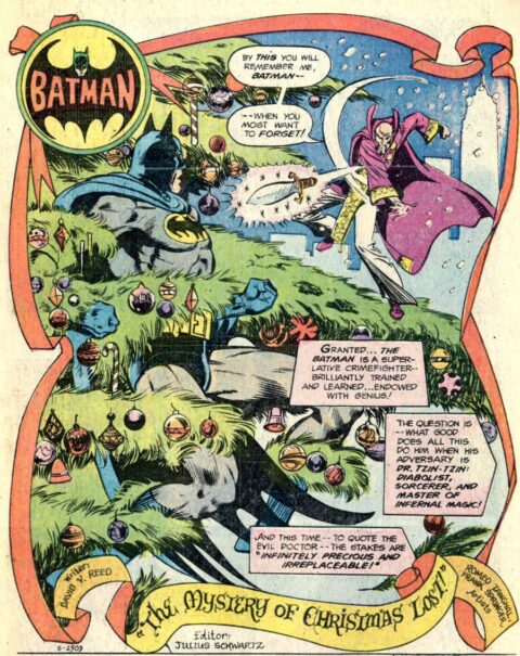
Klaus Janson’s page 25 splash from Legends of the Dark Knight #6 sets the right mood, it captures Gotham so well, the Bat Signal, the Batman, this is a good one.
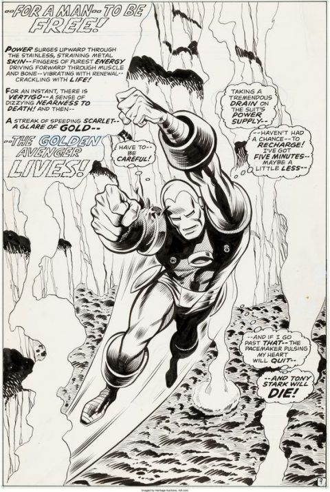
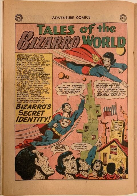
I love this George Tuska art from Iron Man #43, a great splash page.
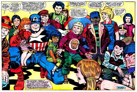
Sorry but I couldn’t help give a nod to this week’s Time To Collect post, pretty cheesy stuff from Kirby but it was 1976 and the USA was celebrating, from Captain America Bicentennial Battles.

While many years ago (now!) I had read about Bone in the old weekly Comic Buyers Guide, it wasn’t until my youngest daughter requested some of the graphic novels did I actually read any and was immediately a fan!
When I was a young teen I thought no one could do a better comic book Conan then Smith… and as good as Buscema is and as big a fan of HIM that I am… I still prefer Barry! (* note I will still take Big John as second tho!)
I think that Janson did a knock out job on that Batman!
I am glad you showed us the B&W version of that Tuska so we could really admire the dynamic layout and detail! Guys like Tuska were great but were standing in the shadows if even greater artists! Damn the silver and bronze ages had some great talent!
Yes the Kirby is a bit cheesy… but its fun! Kirby did a lot if fun but cheesy splashes throughout his career but I am ok with it! Jack after all was a big fan of Life of Riley… an endearingly cheesy radio show that was popular in the late 40’s and early 50’s! What a revoltin’ development! Hopefully that choice of splash isn’t as controversial as your Monday column was!
I think the Smith displays the most talent but I can’t help but love the Janson the most. Again I am loath to say anything against The King, but the rest are just “eh” for me. I have never read Bone so maybe that would increase my admiration, but the additional light doesn’t say lightning to me. The Tuska is good for Tuska but still doesn’t grab me – I always hated the way Tuska drew Iron Man’s head – like he has a big jaw and a little brain. I found most Kirby drawings of kids creepy when I was a kid, and that effect still lingers.
I’m seeing nightmares in your future over the kid with The Thing shirt on….
Actually Walt, just in case anybody decides to track down a copy, that splash page is from Conan #19, not #23.