I hope everyone is doing well, staying healthy and staying sane. I thought I’d try a visualized tour of our current plight.
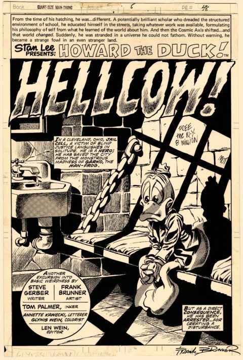
With his beyond excellent splash to Giant-Size Man-Thing #5 Frank Brunner sums up the way most of us have been feeling lately. At least the duck is safe. Check out that light and dark work!
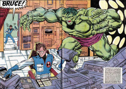
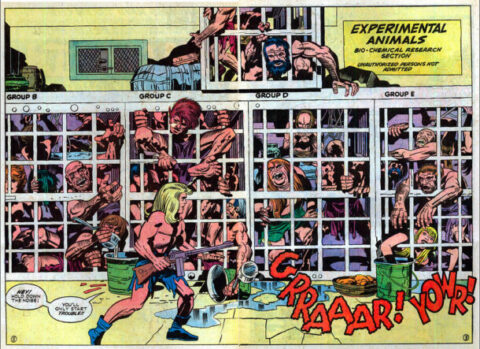
Being alone too much can sometimes turn us against ourselves, we have to stay sane and keep the Hulks and Hydes at bay, keep calm and play with computers according to John Byrne’s splash scenario from Hulk #315. I think Byrne draws a great Hulk, I mentioned before that you can make or break Hulk by how you as an artist stylize him, Byrne did it right.
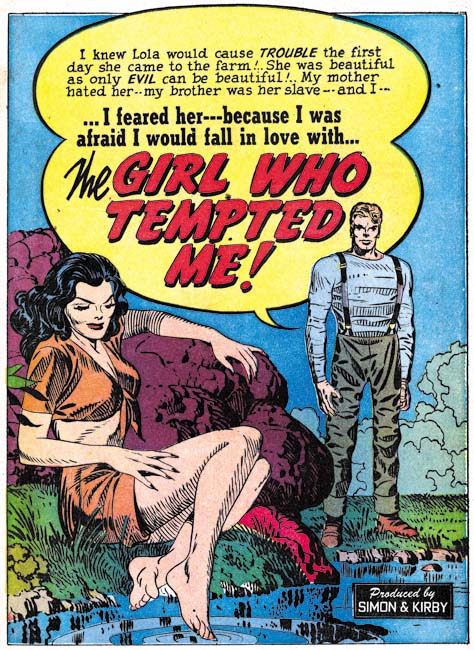
Jack Kirby reminds us that when we do go out its important to practice social distancing no matter how badly we are tempted. This lovely splash page from Young Romance #17.
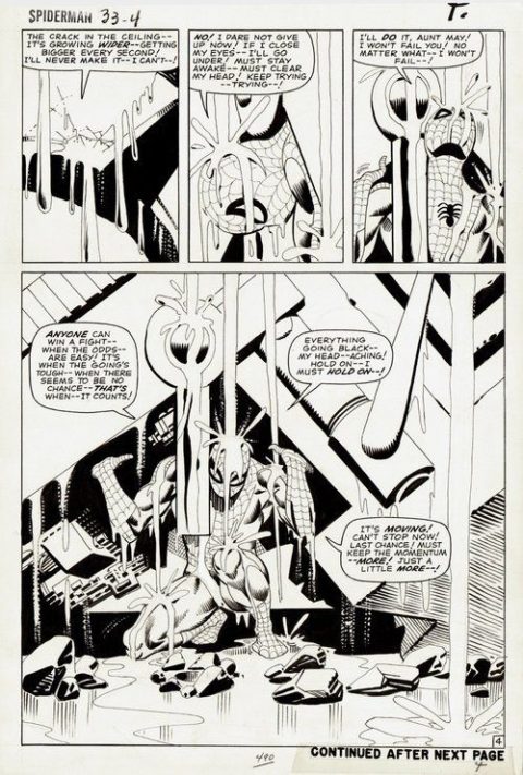
It’s only fitting that Steve Ditko reminds up never to give up, to keep striving, keep fighting the good fight, we’ll get ourselves out of this. This great Steve Ditko page from Amazing Spider-Man #33.
Social distancing? hahaha great theme today Walt.
Simon and Kirby also show us how they were selling millions of issues of their new Romance comics genre. Ditko’s art looks like his art was morphed with Romita’s art…clearly a motivated Ditko.
John Byrne’s work is lovely too. But because he had greatest success on others Creations, Superman, FF, Namor and so on, is this why he is seemingly less loved? Even his Xmen stuff was largely based and benefited from Cockrum. Did John ever create a great series, comic character that was his alone and that was a great seller? I dont think the Next Men qualifies…?
Nice to see the S&K romance stuff getting a little love. On the Howard the Duck page, there’s no way to know without seeing Brunner’s pencils, but I suspect some of the light and dark stuff that you admire is inker Tom Palmer’s contribution.
Thanks Dave, Byrne took established titles and gave them great quality and consistency, nothing wrong with contributions like that.
Bob, thanks for mentioning Tom Palmer, I’m always guilty of overlooking the inkers, sometimes they can make or break the art.
I remember way back when…I was at the first comic shop I had discovered and all the talk was about Howard the Duck… correct me if I make an error…but I believe it was issue 3 that shot up to a whopping $35 because of low distribution! Great collaboration on that splash!
The only criticism I have on the Hulk is Banner’s arm seems excessively long!
Kirby and Ditko…classics!
My point being Wat is that John Byrne stood on the shoulders of Giants, but was he a giant himself? Do you recall the controversies?
Wiki cut and paste reminder?
Over the years, Byrne has gained a reputation as a controversial figure, and has himself noted that “as the people who have figured me out have said, I just don’t suffer fools gladly.”[71]
In 1981, Jack Kirby began speaking publicly about his belief that he’d been deprived of fair credit and money while creating the majority of Marvel’s top characters. Byrne wrote an editorial declaring himself “proud” to be a “company man,” and arguing that all creators should “live within the rules while they’re around.” Steve Gerber and Kirby lampooned Byrne’s position in Destroyer Duck, drawing him as a character called Booster Cogburn, possessing a removable spine and existing only to serve as a cog in the mammoth corporation that owned him.[72] Erik Larsen created a villain in the 1990s for his Savage Dragon and the Freak Force series’ Johnny Redbeard/the Creator, who parodies Byrne; a massive cranium with atrophied appendages, he can bestow superpowers indiscriminately.[73]
In 1982, during a panel discussion at the Dallas Fantasy Fair, Byrne made disparaging comments about longtime comics writer and one-time Marvel Comics editor-in-chief Roy Thomas that were published in The Comics Journal #75 (Sept. 1982), Thomas threatened a libel suit if Byrne did not apologize. In a letter printed in The Comics Journal #82 (July 1983), Byrne retracted his statements, claiming he was only repeating information from others, writing, “I acted only in the office of a parrot.”
Gail Simone, who worked with Byrne on The All New Atom in 2006, described Byrne as “very opinionated; a lot of artists are opinionated, and I’m okay with that. Actually, I think John Byrne is brilliant and his forceful personality is part of that
I love Byrne Walt. But dont consider him a great. Whats his best CGC investment type comic?
I was also under the impression he was Canadian. It says here (wiki) that he was British. I didnt know that
Byrne is a great. ‘Nuff said. The highest value “normal” book of his that I can think of is X-Men #120, first Alpha Flight, last CGC 9.8 sale $2500.
Not really fair to judge him on value as his work started later, so people were already saving a lot of mint copies by then. His books aren’t worth a lot in general precisely because everybody collected them because they were so good.
Anyway, the b/w splashes rule this week. Agree that the Howard inks are key, and the Spidey is ultra-classic and rather un-Ditko-ish. Actually that Byrne splash would be fairly low on my list. I always loved the earlier cover of Hulk Annual #7 because (again with the inkers) the Bob Layton inks, and of course the giant hand.
I hesitate to say anything disparaging about The King, but if I didn’t know it was him I would take a pass on that romance splash. If anything it’s the text balloon that makes it.
The Byrne Hulk isn’t the best but it gave me the words for that part of my poem Chris.