This week I thought I’d double the fun by highlighting a comic book with two great splash pages by two great artists.
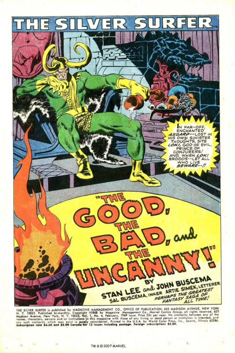
Silver Surfer #4, Page 3 – John Buscema. I’m gonna come out and say that this is one of the finest issues ever drawn by a comic book artist – ever. What John Buscema does on the interior 39 pages is beyond good.
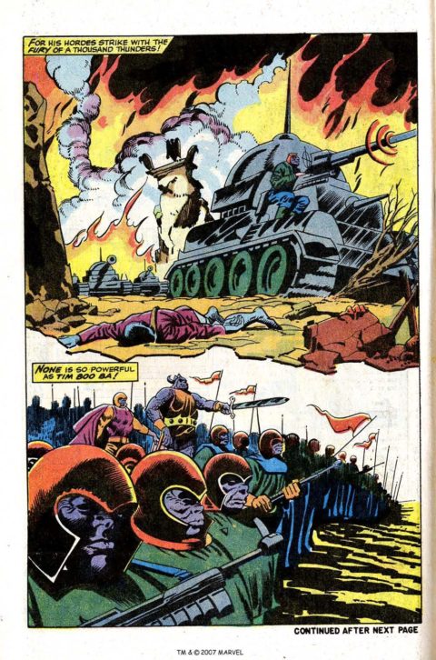
Silver Surfer #4 – Page 52, Howard Purcell actually gives us at least three juicy splash pages in his 10 page Watcher story.
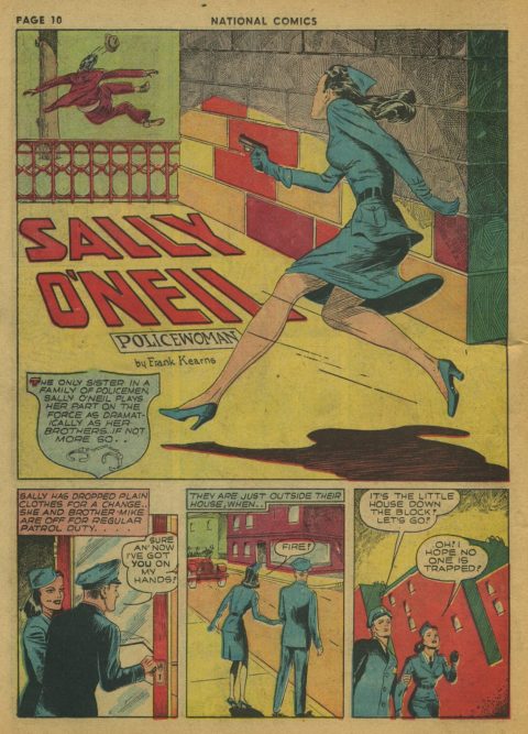
National Comics #13 had some great splash pages in it; it was hard picking my top two.
My favorites included this Mort Leav piece on page 12 for Sally O’Neil.
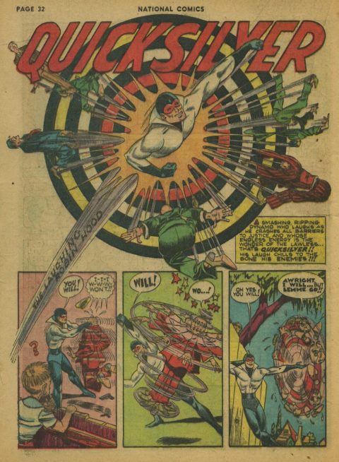
The best Splash Page in National Comics #13 has to be Jack Cole’s ridiculously good piece for Quicksilver on page 32.
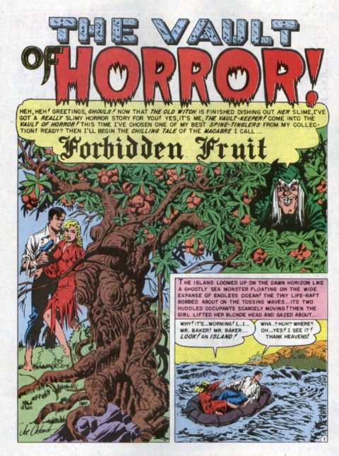
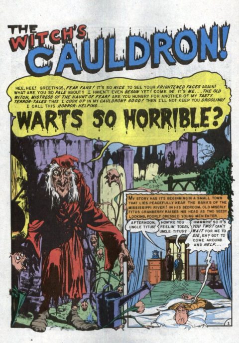
Here’s two great splash pagers from EC’s Haunt of Fear #9.
First we have Joe Orlando’s unsettling Splash to Forbidden Fruit – Page 12
And then there’s Graham Ingels’ nice moody work on The Witch’s Cauldron on page 4.
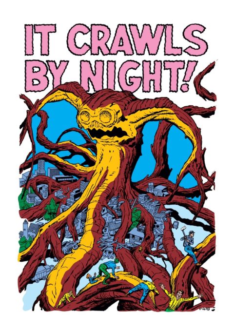
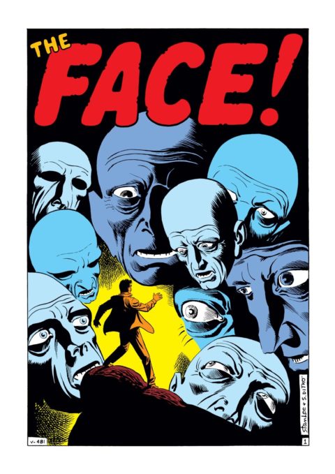
Tales of Suspense #26 gives us two great splash pages from the two giants of Silver Age Marvel.
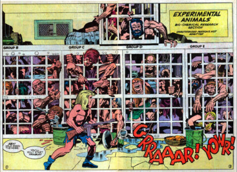
First we have Jack Kirby creating the chaos that only Jack Kirby can.
Then you have Steve Ditko messing with our minds like only Steve Ditko can.

You outdid yourself this week. What a great selection! As a Quality fan since the sixties—they were the first Golden Age line I concentrated on—love to se their lesser-known characters here. So to see Quicksilver, Sally O’Neill—really!— is great fun. Quality did a number of heroic but non-super-powered woman like Sally. Perhaps inspired by Myra North, who’d been in the papers since the thirties. And maybe by Connie, Frank Godwin’s amazing adventure strip, after it graduated from light humor.
The Jack Cole could easily be mistaken for Paul Gustavson. Best known for his work on Timely’s Angel, Paul came into his own at Quality and did amazing work in Feature, National, Crack Western, lots of their line. etc. I think he drew Quicksilver also, every bit as good as Cole.
Gustavson also did some isolated but absolutely amazing romance comics for Quality in the very early 1950s, when Bill Ward was also doing some incredible work. Including great splashes. Sadly, the average Quality romance is…average. But every so often…
That Bucema splash IS truly classic. He was superb with anatomy, even in repose, like this. Those .25 Silver Surfer issues were so great, some the best Marvel work after you get past the first years of their core titles.
And great picks from EC….good to see Orlando, an artist eclipsed by his studio mate Wood, but who could still do some great stuff. I have the original art for one of his EC stories that just sparkles, about Conquistadors in South America.
And nice but unique Kirby, a bit different but it workd. And Ditk, eow, I had not seen this in a long time…at his finest here.
Did I say you outdid yourself today? Nice choices Walter, thanks for sharing!
Love the tanks & “Warts So Horrible” title. Bud clued me in on this. I’m his older evil sister, we have another sister, Nancy in between us. I have signed up & look forward to more good stuff! Cjm
I agree with Bud ( and frankly I would be crazy not to)! When I saw the masthead I thought “ Jack Cole Plastic Man” but you surprised me with a different Cole splash!
Great Buscema at the top of his form on the Surfer! The only thing marring the Kirby and Ditko is the coloring which I attribute to them being book reprints otherwise great!
Welcome Carolyn !! I’m glad we can make this a family affair, now lets work on Nancy.
Gerald, I was thinking the same thing when I posted the Ditko and Kirby pics, there were pics on line of the original non mastered pages but they were small and blurry – I really do hate the “new and improved” colors.
Solid analysis Bud, I’m glad you liked this week’s offerings. My mission is Gustavson for the coming weeks!
A great post and I’m very glad you mentioned Howard Purcell. He seems to be mostly forgotten these days and that is a pity. I want to know more about him and see more of his work.
I see that the Silver Surfer Omnibus is finally being reprinted with scheduled release in May. We’ll see if it makes it by then. I’ve seen some of this work in reprints but never had the opportunity to read it all, so this is on my list – will be a real treat to immerse myself in Buscema at the top of his game. Agreed a fabulous splash.
I am going to be brutally honest as usual and say that the Purcell and the Leav don’t do much for me. The Cole is really fun even though I know you just picked it for the concentric circles.
“A” for effort to Orlando for the Forbidden Fruit but it’s just too detailed for me – similar to my complaint about the TMNT last post. I like the Ingels a lot more – it is also very detailed but it is pretty easy to distinguish different objects.
The Kirby is fun but I don’t think it makes the grade. I am wondering if the coloring is even in line with the original. In situations like these the DC b/w reprints start to look more attractive. The Ditko doesn’t suffer as much from this, and that one is a worthy inclusion.
Looking forward to next time…
Ditko offends Walt, as the face is attached to a bald head. Shame on him 😉
Big John Buscema was as good as Kirby, when Interested. Silver Surfer 1 to 5, some Thors, and a few early Conan support this.
But his month to month stuff often was water downed, clearly mailed in,and didn’t meet his high standards. His brother Sal Buscema, in my opinion, produced better month to month story/storytelling art, but his highs, never achieved Johns Highs. But Sals Avengers, Submariner, Team ups and so many more are wonderous in their consistency. His 1960’s and 1970’s covers are the best in my mind, even better then Kanes, Romitas or brother Johns.
On another note was reading Challengers of the unknown #4 last night. The villain was the Wizard of Time with a suspension beam and also cross over time travel abilities like Kang. He looks like the Wizard of the frightful four.
It makes me wonder, Just how little creation did Stan Lee have in any of his collaborations with Kirby. The more I read pre 1961 Creation Kirby, the less I see of post 1961 Stan.
Jack truly was the story Teller and artist. Stan was an editor and promoter, and spruced up Jacks Dialogue