This week I’m paying tribute to St. Patrick’s Day and to the spirit of the Fighting Irish. I only know one Irish song and it goes something like this; “we drink and we fight – and we drink and we fight – and we drink and we fight – and we drink and we fight – and then we go home to the wife – ….wheeeeeeerrrre – we drink and we fight and we drink and we fight…
I’m thinking some good fight scene splash pages are in order.
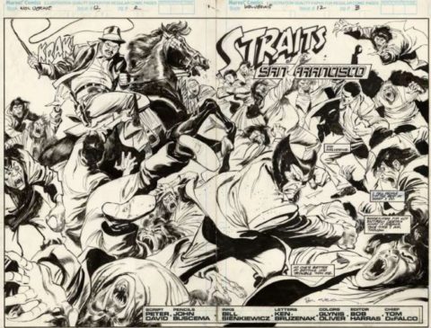
John Buscema is a titan and one of my faves; this great battle scene is from Wolverine #12, 1989.
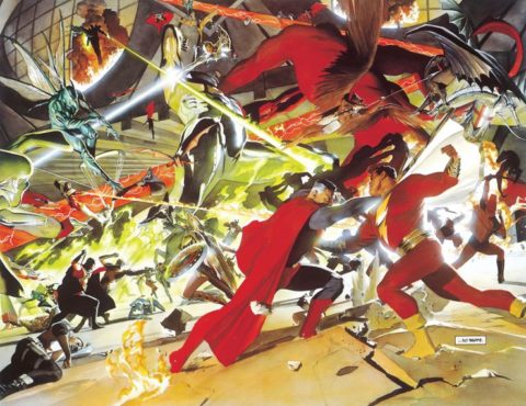
Alex Ross’ Kingdom Come was epic in every way, check out this great Superman – Shazam battle framed by an even bigger battle.
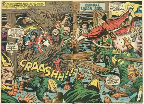
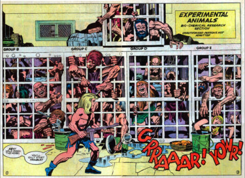
Jack Kirby again showing us why he is King, so much movement on this page from his first Captain America and Falcon run.
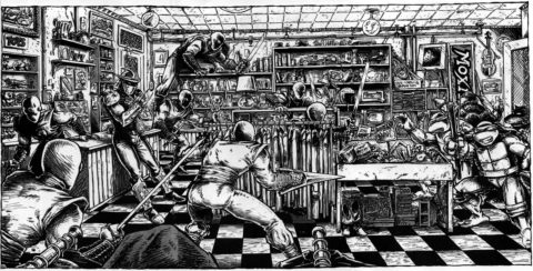
I love the heavy inks on this Kevin Eastman TMNT splash.
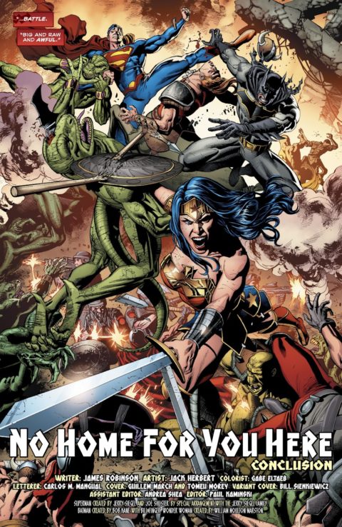
I love the energy in this strong battle splash by Jack Herbert, from Trinity #19, 2017.
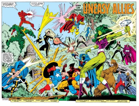
This Marc Silvestri battle scene from X-Men vs Avengers #2 is too stylized for me, lots of posing and posturing, not enough fighting!!

I loves me some good fight splashes. Thanks Walter.
Great set Walt! I was especially impressed by the Eastman as I was one of those in the 80’s who thought TMNT were a flash in the pan!
A mixed bag for me.
I have to put the Ross on top. As discussed elsewhere, his work generally has a static quality, but this one has so much mayhem that it manages to avoid this for the most part. I loved Kingdom Come.
The Kirby is pure late Kirby craziness and I dig it. His faces are pretty much generic good guy/bad guy at this point, but he makes up for this with a perfect depiction of everything coming off the rails.
I love the Buscema except the faces – with Kirby I’m like shaking my head, “There he goes again!”, but with Buscema I feel like it was a bit more laziness than limitation.
There’s a lot to like in the Herbert, but it just doesn’t feel like those are “my” DC heroes. If you tell me they are from Earth-7 or something I can buy it.
That Eastman is a poster child for why I would never even look at that stuff. It looks like a really, really well-done fanzine or underground piece (which I guess it is anyway). I don’t care for that style at all.
The Silvestri was ruined by the inking and the coloring, but at root it wouldn’t have been too good anyway for the reason you give.
just reading my first Alex Ross book Kingdom Come so this is appropriate. His pages can be very busy but somehow pulls it off.
Never liked Turtles, Superman in the Trinity seems to have a weird, overly long leg but the battle composition is great.