A great comic book cover matching each day of the year, 1 through 365. Please chime in with your favourite corresponding cover, from any era.
Day 9 – Boy Comics #9, Artist – Charles Biro.
I’m trying hard not to use past Spotlight picks just to keep things fresh but it’s hard to deny this one. Check out the text in the torch glow and those Swastika eyeballs, jeez!
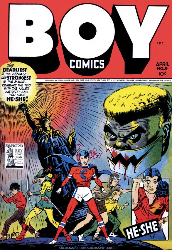
One of my criteria for choosing suggestions for this feature is action, and there is little action here. At this point I have reviewed a few thousand covers, and it is kind of surprising to me how many quasi-still-life covers there are for a genre based on action. “Full frontal” is an extremely common theme, and here we have it with the hero and the new villain. Another very common theme is “floating evil head”, again displayed here. These are definitely eye-catching themes, but generally they don’t show much originality. I agree that the Statue of Liberty is great in a lot of ways and the swastika pupils are a nice touch, but otherwise I can only give this one an “above average” grade.
The #10s that I was able to come up with:
The Atom
Capt. Storm
Jumbo
The Rifleman (sorry, but simply undeniable)
U.S.A.
I am not putting Boy #10 on my list, but it was on the long list and I think it is stronger than Boy #9 according to my criteria.
Action should be only one of many criteria. Shock factor, general aesthetics, innuendo, gravitas, general composition and a bunch of other factors can all influence a decision. This enables us to broaden our horizons – and it gives us more to choose from. The ultimate reaction to each post should be – I Want One !
I am not arguing so much for action as a necessity, but my appreciation of the cover increases with communication of a story via the art, and with originality. Action helps because it _is_ a story: “these guys have a fight”; “this guy jumps out a window”; “this car crashes”. In this cover there isn’t so much a story as a situation: “Crimebuster is a good guy”; “Iron Jaw and HeShe are bad guys/part girl/whatever”. That is too common a situation, so in that case you have to make up for it with really superior/original art. I was about to end that sentence with “like…” and then I realized that most of the great covers by the great artists _aren’t_ still lifes. Adams, Fine, Frazetta, etc. – generally there is something going on (with the exception of cheesecake, which generally doesn’t make for a “great” cover, and when it does it is because your innuendo factor is so high). So in my mind this sets a very high bar for covers like Boy #9, and I don’t think it clears the bar.
The only still lifes that I can think of that really get to me are the Adams DC 100 Page Super Spectaculars #6 and #8. This is probably mostly nostalgia as I can recall the feeling of seeing these on the newsstand and the potential they represented (one hundred pages!!!). It isn’t completely nostalgia as I also bought #14, #17, etc., and at this point these hold only a sliver of the attraction – the other factor is Adams’s artistic dominance at that point combined with the wrap-around real estate provided. (Superman #252 holds the same attraction for me, but you could argue that it is technically not a still life.)