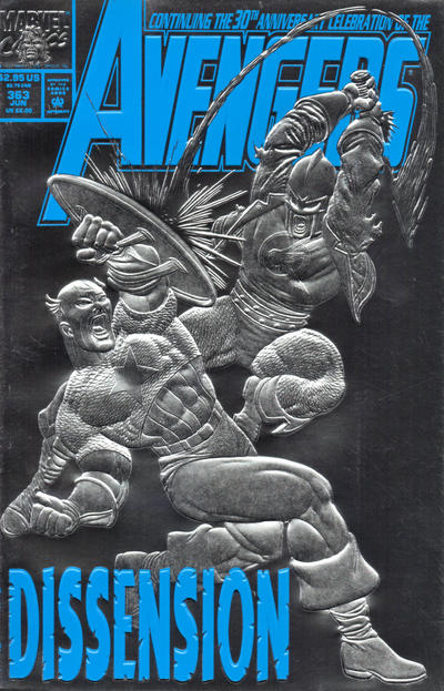
Avengers #363, Marvel Comics, June 1993. Artist: Steve Epting.
A great comic book cover matching each day of the year, 1 through 365. Please chime in with your favourite corresponding cover, from any era.
What a great day for covers! Its Day 363 and there were only 21 covers to choose from but there were so many good ones I picked 7 to show off.
The whole effect of Steve Epting’s cover to Avengers #363 very bold and striking, it is a unique cover that stands out like a freshly minted coin. I think it’s a great cover.
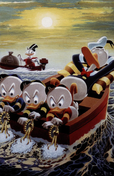
I probably should have picked Carl Barks’ fantastic Retailer Incentive cover to Donald Duck #363 but I’m thinking this is probably a reprint of some old art that Barks did long ago so I couldn’t give it the win.
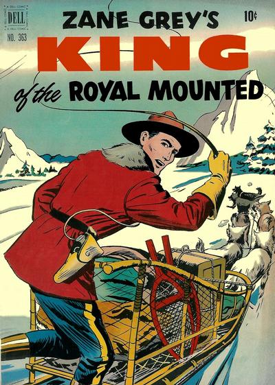
I don’t think anybody could have blamed me if I picked Jim Gary’s excellent cover to Four Color #363, no need to hide behind the Canadian patriot mask on this one it easily stands on its own merit.
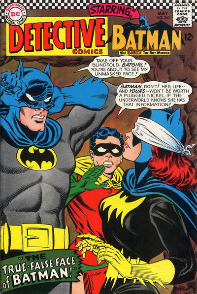
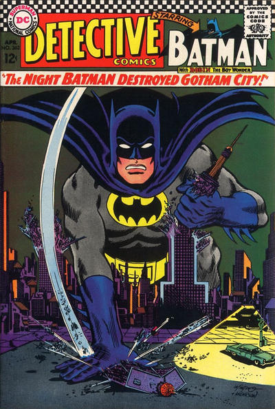
I probably could have gotten away with picking Carmine Infantino’s cover to Detective #363 as well, Infantino was producing some super clean and vibrant covers in 1966 and 1967, his Detective run stands out.
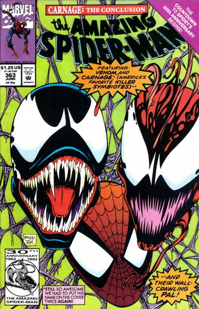
I think Mark Bagley was getting lazy by his 3rd Carnage cover, floating heads only for this cover!
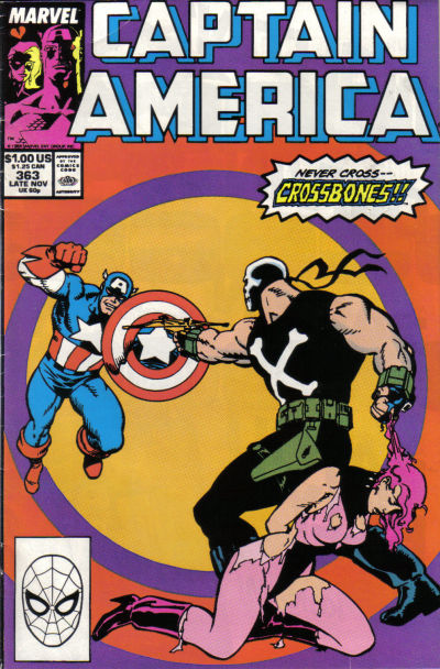
The simplicity of John Byrne’s cover to Captain America #363 is refreshing and I like the color scheme too.
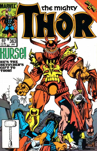
I’ll round it off with another strong Walt Simonson effort on the cover of Thor #363.

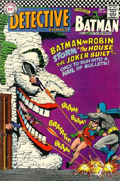
That Detective with Batgirl and Batman unmasking, that’s a great one. Outstanding art, intriguing story idea. And the always-gorgeous early Batgirl. It wpuld be my top choice.
But your Avengers choice is admittedly very sharp, assuming this embossing idea wasn’t on already tried elsewhere and being done to death…So it’s “embossed silver foil,” very effective. And maybe the art could stand on its own, but the embossing is integral to it.
The Barks piece is from a painting done on spec or as a commission. It probably was first collected in 1981 in The Fine Art of Walt Disney’s Donald Duck from Another Rainbow, which included the majority of Barks’ Duck oil paintings. But regardless, it is re-purposed here as a cover this 2011 variant. So I think you are right to disqualify it.
Generally embossed covers don’t do much for me but, this one has definition! Love the Detective and the Four Color is pretty good to! Bag the Bagley and toss it on the rubbish heap with the rest of those ASM covers he did!
I am not into gimmicks, but as they go this Avengers is one of the best.
It is heresy but I am nonplussed by Carl Barks. The Donald is pleasant/amusing but I can’t get very interested.
Similarly the Four Color is clean and pleasant, but completely unexciting. If your grandma might have it on her wall, it is very unlikely a great comic book cover.
The ASM is not worth a mention and the Byrne strikes me as a five minute job. Would you have picked it without the concentric circles? The Thor is a fine piece of art, but as usual I take many points off for a standing around/lying around cover.
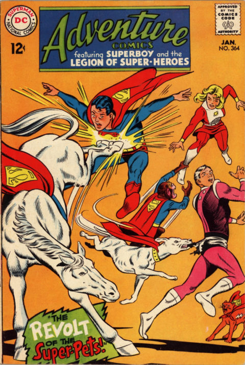
As we are almost at the end I am going to take the opportunity to, one final time, make the JOWA for #364 my pick for the day. Adventure is an instantly recognizable ridiculous cover. It is an expert, super-clean piece of Swan art that has great composition, beautiful figures in action, and a story that pulls you into the book.
As with #363, for some reason we are treated to a number of fine covers. Even though I think the coloring could be better and I don’t see much story, Daredevil is so good that it’s my runner-up. Action is a simply amazing piece by Adams, but it is too static to take the top honors. Next in line for me is the fairly derivative but still very cool FF. Infantino turns in another distinctive Detective, although no competition for #363. Simonson’s Thor is not great but he does a great job in depicting Thor’s transformation into a toad, and his simple Incredible Hulk is still dynamic and effective. Captain America is worth a mention.
Batman is a weak homage to Strange Adventures #207 – if you are going to do this sort of thing you should either improve on the original (near impossible in this case), or add some kind of funny or amusing hook – if that’s here I’m missing it.
OH NO, only two days left!
Embossing, if lit right, looks kinda neat especially in the raw metal (rather than book cover colour embossing). I’m picking Infantino’s Detective over the rest, that man could draw. I believe there’s a collection of his Batman work that I’ll need to track down.
Walt, do you have any Mountie comics in your stock? It’s a well drawn illustration but as Chris mentions maybe not very exciting but funnily enough very “Canadianish” for that reason. Ever watched a CBC “exciting” drama or crime show?
Tim! Nobody watches the CBC except for old Beachcombers reruns. I do have a few Mounties covers in my collection, Canadian Whites mostly.
Thanks for the info on Barks Bud.