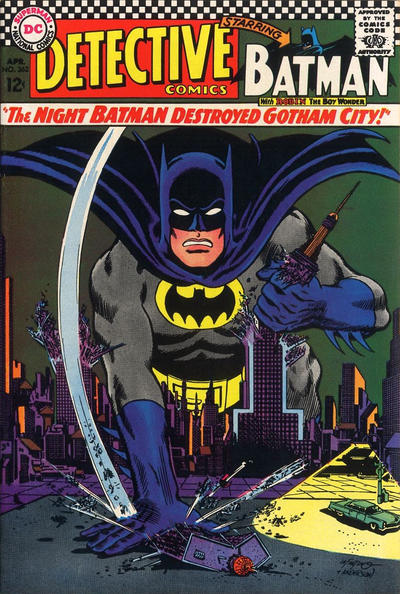
Detective Comics #362, DC Comics, April 1967. Artist: Carmine Infantino.
A great comic book cover matching each day of the year, 1 through 365. Please chime in with your favourite corresponding cover, from any era
There were some good covers today, small things kept me from picking almost all of them though. The one I picked, Carmine Infantino’s cover to Detective #362, just has that clean classic look that we divert back to when not sure of other things.
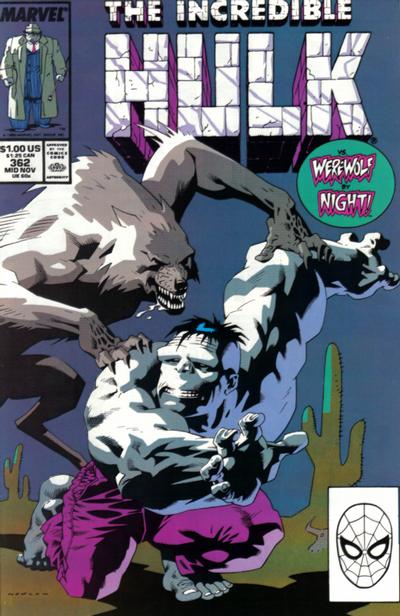
I thought I was gonna pick Kevin Nowlan’s Hulk #362 cover because it was so unique but the more I looked at it the more I did not like the composition, Hulk cowers to nobody!
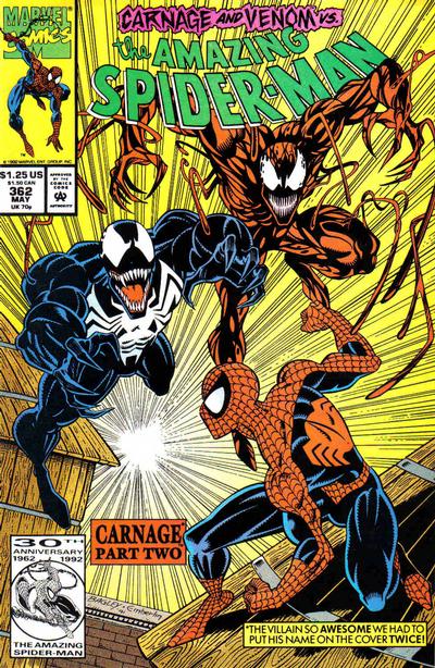
Mark Bagley’s cover to Amazing Spider-Man #362 is an orgy of great characters but I’m not a big fan of Bagley’s Spidey on this cover.
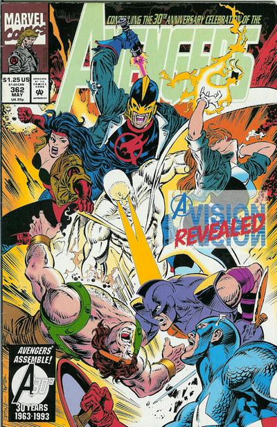
Steve Epting continues to impress with his Avengers run, his cover to Avengers #362 is solid but I think the colours are too muted.
I liked Ed Hannigan’s cover to Batman #362 but the double crotch shot threw me off.
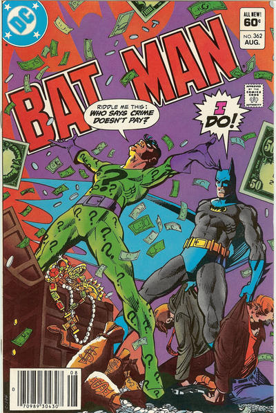

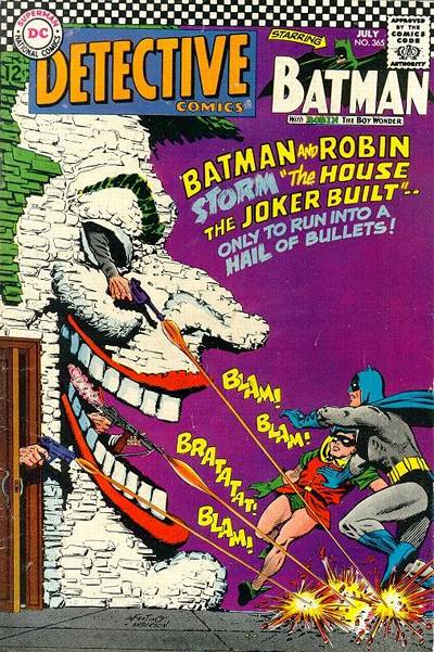
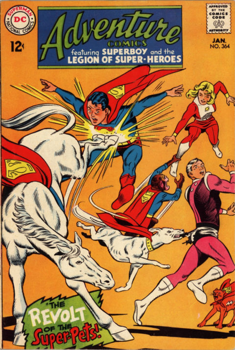
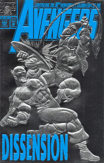
The more I look at the Detective – particularly at the zoom level here – the more I like it. Another one that really evokes mid-sixties DC.
You seem to notice those crotches more than I do.
For tomorrow I’d again go with Detective – another that evokes the period, of course Batgirl, beautiful colors, and a great story opening. I will give FF the runner-up – lots of story and action, great art, and a sort of giant hand – but a bit too confusing with the detail. Action and even the semi-ruined Avengers are my other mentions. I imagine that you might be attracted to whatever’s sparkling on Batman (I can’t figure it out), but no.
I don’t know whose crotch you noticed but it can’t beat those first two covers! The Detective is great and an homage to The Shadow! The Hulk I wasn’t sure if but the more I looked at it the more I liked it! This run of Spidey covers I am not liking at all. Avengers is a bit confusing and the Batman a bit of a wall flower.
Nice group of covers, all right. Top billing could very well have gone to several of these. But not to the Batman. Even with Chris pointing out the side-by-side crouch shots, which are indeed unnerving, its not much.
And the Hulk doesn’t make the grade, either. Its an example of better technique than story…the lighting and almost impressionist effect is interesting—though do I see some Wrightson influence on the werewolf? But the expression on The Hulk is way off kilter for me, too.
Wow, we’re fast approaching the end. While you breath a sigh of relief that’s it’s over…it occurs to me what interesting covers are out there that go BEYOND the 365? Jeez, the Four Color series went to 1200 issues, though you have given it great representation. Many later ones were ohoto covers from tv and film, but I bet there are lots of cool painted covers hiding there.
You, or our buddies here, could choose a few “beyond 365” knockouts for day 366, leap year! Or not!
Well my first vote for beyond will be Four Color 386…
I’ve been thinking about covers beyond 365 as well Bud, I think I will post some right after this is done.