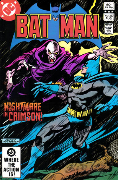
Batman #350, DC Comics, August 1982. Artist: Gene Colan.
A great comic book cover matching each day of the year, 1 through 365. Please chime in with your favourite corresponding cover, from any era.
Here we are Day 350 and it only gave us 22 covers to choose from, none were great but a few were good. This covers exercise has taught me a bunch of things and one of the most important ones is the artist’s rendering of our heroes and villains, its something I kind of took for granted as my eyes only gravitated to the covers I liked before Covered: 365 started. but now I have to look at all the covers and I’m seeing the importance of just simply doing a good job on the characters is. Gene Colan is one of those artists that rarely disappoints and his solid rendering of Batman and foe on the cover of Batman #350 win the day for me.
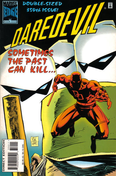
This exercise has also taught me that going outside the box with interesting layouts sometimes work and sometimes don’t, I think Ron Wagner deserves some creativity credits for his cover to Daredevil #350.
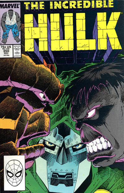
As I mentioned earlier, how our heroes are rendered is a very important ingredient and for me over the past year the Hulk is the poster child for this ingredient. Jeff Purves does an OK job on our Hulk on the cover of Hulk #350, the combination of Hulk/Thing/Doom crowding 99% of the cover is hard to pass up though.
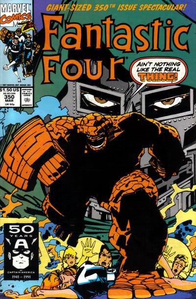
I’ve also noticed that some things are hard to draw and that sometimes the solution is heavy black ink, case in point Walt Simonson’s cover to Fantastic Four #350.
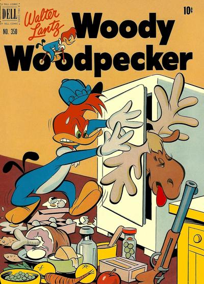
I always check Four Color 1st on a new day, I try not to pick every cover because I don’t want to look like a mushy nostalgic. Imagine my shock at seeing Dan Gromley’s ghastly cover to Four Color #350, I was honestly kind of offended by the cover, I remember a similar feeling with that old Famous Funnies turkey Thanksgiving cover early in the year.
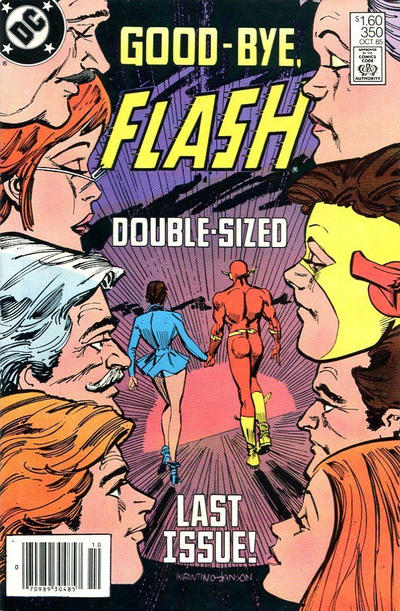
It would have been smart had I started paying respects to title run last issues since the beginning but this has been a work in progress since Day 1. Carmine Infantino shows Flash the door with issue #350

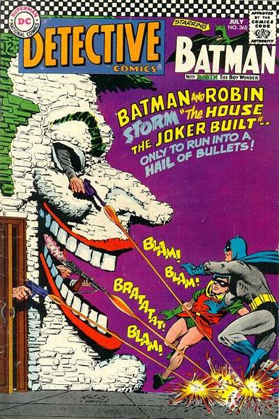
Really liked the Batman #350 cover, but have to agree with the nomination from yesterday and vote for Sgt Rock #350 – I like the scene and there is a lot of good art on that cover.
Found it interesting that 3 Marvel covers each had a close-up of Dr. Doom on their #350 covers – the above cited FF and HULK covers, and ASM #350. None were great, but the again provided another unflattering comparison for Larsen.
Nice group! The Hulk is a good one, I might have chosen it above Colan’s Bats. I don’t think Colan got his due until just a few years ago, though his early runs on Daredevil and Iron Man, back in the Tales of Suspense days, was really extraordinary. I know his Marvel Dracula and horror work of the seventies is popular now, but I was already busy with other things and didn’t pay close attention as it came out.
Both he and Joe Kubert were doing a more “impressionistic” style, before it came into vogue as guys like Frank Miller and Sienkiewicz took it up. It might have also been greater use of the brush, more blacks also, I am not an expert. But I think it took a long time for both artists to get greater acclaim. Except among DC war collectors, and hardcore guys like me, who enjoyed his work back to the 1940s beginning, Kubert was simply not a fan favorite for a long time. It was finally thanks to Bill Schelly he finally got not one, but two books on his careern one an Art of, the other a full career biography.
Colan still has never been thoroughly examined with a full-blown art book or biography. Various publications were thrown together at the end of his life, by supporters, but no major examination of his career has appeared yet.
I like the FF, but the little windows with Reed, Sue (I assume) and Johnny looking out, I find confusing. Is that a floor below the scene or what? And that Woody Woodpecker, no @#&?* kidding, that’s pretty bad taste. Poor moose. I wish the inking and color was deeper and stronger on the final Flash issue. even Carmine seems like he didn’t care much anymore, past creating a well designed homage.
Final issues covers at WOULD be an interesting study. Marvel Family #89, from 1954, with the three of them in white silhouette, is an early and well-known example. I bet I have missed many fun ones. I never saw this Flash before. Long past my interest in the title.
Nova used the tagline, in the corner ‘he’s here.’ The last issue – #25 – read ‘he’s gone.’
I like the DD and the Batman…Flash unfortunately does not measure up in my estimation. While I agree with Bud on the Four Color…I never figured he would say @#&?* about something!
Gerald, the Four Color seemed so weird, at first I was trying to figure out if the moose was still alive. I was camping in the Gran Tetons with my family, walked into a lake and set up camp. That night, ver late, we heard giant clomp-clomp-clomp, and saw a huge moose walking in the shallows, looking for water plants to eat, I guess. It was pretty unforgettable.
I have nothing against hunting, I don’t myself, but I can support it for many critters, but not for moose or for bear. Seems like they should be protected. And I do swear on occasion, I’m afraid..didn’t know my reputation was that sqeakyclean! It’s comic book cursing!
Bud
it’s too bad that Bill Schelly has recently passed away . with all of his wonderful retrospective books that he did , he would’ve been perfect to do one on Mr. Colan !
The Woody Woodpecker cover is shocking, and it does show the extremes some of my hunting pals will go to preserve their Bear, Venison and moose meat. Bad taste for a child’s comic, but an accurate representation in my experience. 🙁
The rest of the covers are flat,dull colors and one dimensional. None would get my attention methinks.
You guys are right…Gene Colon is worthy of a book.
I agree that Colan rarely did a bad job, but I never really liked him. When I think Colan I think Marvel Super-Heroes #12. That puffed out chest, big chin, kind of weird leg shape. This Batman is not bad but neither is it anywhere near great. I think this is another time that you let nostalgia get in the way – if this was not Colan, but just some random artist, would you feel the same way?
I’ll give you that the Daredevil composition is unusual, but I can’t make any sense of the story it is portraying, so I can’t get behind it. I find the other two to be just average at best. In particular the Doom on the Hulk is bad (sorry Bud). It can’t be the same Dr. Doom on both covers, because he has blue eyes on the Hulk, and brown eyes on the FF. That Flash is the worst of all, Carmine should have hung it up by then. That $1.60 price is weird – just charge the northerners $1.50 or $1.75 and leave it at that.
Thanks to Derrick for the support for the Sgt. Rock pick – I still think it was the best of the lot.
#351 has some reasonable candidates. I pick Daredevil as a nicely drawn meat-and-potatoes comic cover with the bonus of DD coming through the fourth wall over the title. Thor is the runner up with a nice Simonson poster (also coming through the wall), but that’s all it is. Captain America is okay but I can’t tell what’s going on.
I’m sure Walt will gravitate towards Donald Duck due to the patterns. Four Color gives us a very nice giant foot. Sgt. Rock is a great ant torture cover – we should all track a nice one down as even a cruddy Mister Mystery #11 sells for four figures.
I was going to give the JOWA to Adventure for Superboy’s trash sack, but then I came across the Partridge Family monster on Superman, and that was that.