A great comic book cover matching each day of the year, 1 through 365. Please chime in with your favourite corresponding cover, from any era.
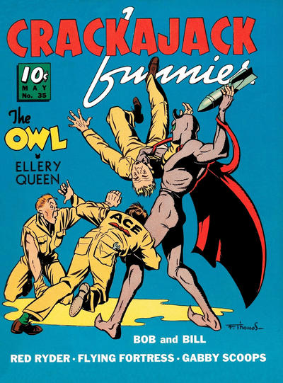
Day 35 – Crackajack Funnies #35, May 1941, Artist – Frank Thomas.
There were a few good #35 pick recommended but I’m sticking with my initial pick The Owl made 12 cover appearances on Crackajack Funnies #31-42, #35 is my favourite.


This is posted under “Minutiae” instead of “Covered, 365”.
Switched over to a new WordPress update and I’m a slow learner, I’ll correct these today.
Walt, I think this concept is great and your execution has been excellent. I don’t “get” this one though. No background, nothing super memorable or unique, other than maybe one of the Ace moving company guys wet himself… Curious to know what you see in this one that sets it apart from all others.
Keep ‘em coming!
This cover was not on my list but I will say that I lingered over it for a moment. The figure composition is very cool, lot of action, and the lack of background really highlights this. Nevertheless I like my comics to be fairly baroque in every respect, so classical is not going to make the top of my list.
I am onto picks for #38s. I have the feeling that it will be harder to identify a lot of standout covers from here on. I won’t always give five picks if I can’t find five truly valid candidates, but we aren’t there yet.
Captain America Comics
Sensation
Sub-Mariner
Superman
Thrilling
Rangers is probably going to be cited, but Thrilling is more than enough misogyny for this set. Once again Superman’s Pal Jimmy Olsen comes through with a crazy cover.
That simple sky blue backdrop really works on this cover, the fact that it is a rare Owl cover wins me over too. To quote Chris’ comment above there is something to the composition of the cover that I find aesthetically pleasing and I’d love a high grade copy of this just to look at and enjoy. Perhaps some of the allure is that it is an outsider as well and I’m trying hard to find striking covers outside the limiting constraints I’ve built myself up to this point.
Not too bad, although, I would have gone for Marvel Team Up with the Human Torch and Dr Strange. A busy cover but nice with the Human Torch in the middle!
Hey Terence, that Team-Up #35 is an amazing cover!
I lingered on that MTU cover as well. My gripe is that layout unnecessarily obscures The Valkyrie. More Valkyrie is always better (says the man who’s backing The Liberators). Kane should have reviewed more GA bondage covers before doing his layout.
5