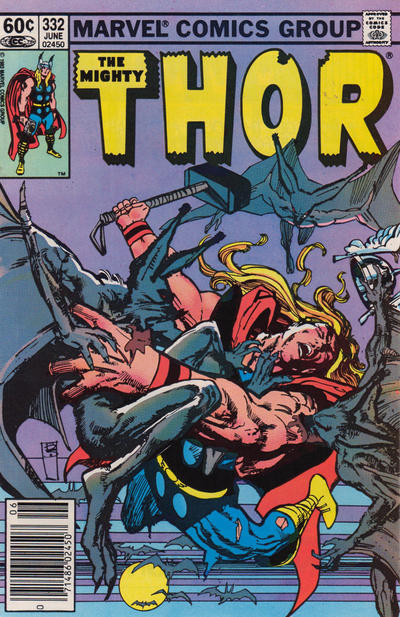
Thor #332, Marvel Comics, June 1983. Artist: Bil Sienkiewicz.
A great comic book cover matching each day of the year, 1 through 365. Please chime in with your favourite corresponding cover, from any era.
The very very talented Bill Sienkiewicz gives us a beautifully drawn cover to Thor #332.
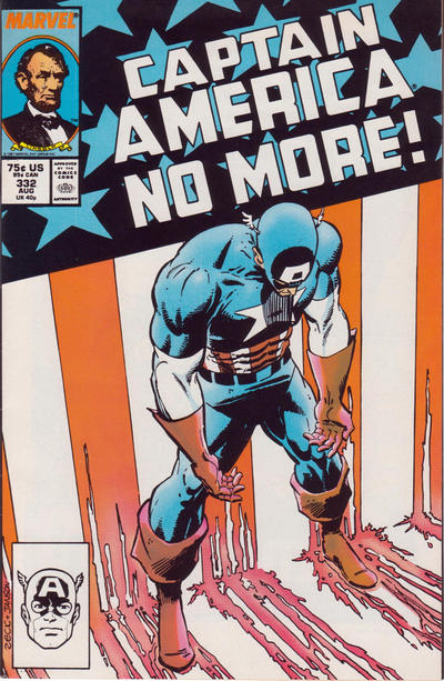
I was thinking of giving the day to Mike Zeck’s Captain America #332 cover but it is a standing around cover…
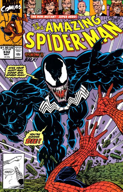
Eric Larsen’s art is good on the cover of Amazing Spider-Man #332 but the full-frontal overload of Venom is great!
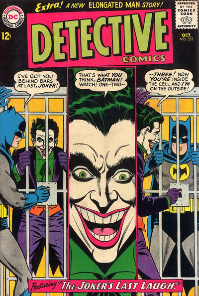
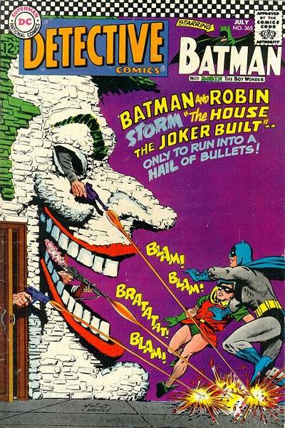
I felt like I almost had to put Carmine Infantino’s cover to Detective #332 up, Joker covers are always eye-catching.

Great set of covers for Turkeyday, well at least for us down here. You Canadians celebrate a bit differently, I just learned. Hope you are still taking the day off. Its perfect down here, we even have snow, which we’ve hoped for, Finally ending our fire season.
But no turkeys with these covers. I like them all. Bill’s Thor cover, it looks a little like Manbat, Jr. with some influence from Neal Adams. Kudos to him for tackling a very tough perspective and pulling it off. That big Thor hand that’s closest to us, it does say “Kirby” to me.
Speaking of good flying covers…i have Just been reading Roger Hill’s Art of Mac Raboy. He points out two very things. First, Raboy drew Captain Marvel, Jr. with very realistic anatomy for a young man, trim, wiry, not bulked up like all the other 1940s superheroes. Second, he was a master at flying covers, making CMJr look natural, dynamic, and weightless. That’s why Fawcett reused so many of his early flying poses first seen on early issues of Master Comics and very early issues of CMJr. And Bulletman.
You guys probably know the the old Julius Schwartz story, that back in the fifties, and maybe sixties, they’d come up with a cover idea AND THEN write a story around it to pull off the event/mystery/escape. The Detective cover seems like one of these, and its intriguing. The viewer and Batman are both are puzzled, how did our Joker pull THIS one off. I like it, and it shows you can do a cover with panels and make it work.
Good selections Walt, as I thought day 332 gave a surprisingly good number of cover choices.
Although not a Larsen fan, he found success with his Venom covers so I have to give him credit for an outstanding cover on ASM #332.
Also a treat to find another good Thor cover this late in the process, and Zeck nails the intended effect with the Captain America #332 cover.
And you can never go wrong with a Batman & Joker cover – and 3 images of the Joker steal the show on any cover.
Also, thought Our Army at War #332 was worth a mention.
Goodness, I forgot to extent Happy Thanksgiving wishes to our friendly neighbors to the south, I hope everyone gets their fair share of stuffing and football.
Four color 332 is as cute as a Thanksgiving button on a PLYMOUTH pilgrim Walt…sorry you missed it
https://comics.gocollect.com/uploads/collection/9/images/pub/204600_bc817f3cb01ebf23e1ad131db3bcb334d11ab00c.jpg
I looked hard at the Thor but I can’t support it. I find it too visually confusing. You really have to work to figure out what is going on. On the other hand I passed on the ASM but I can support it, just. Great composition but Venom’s steroidal anatomy is overdone.
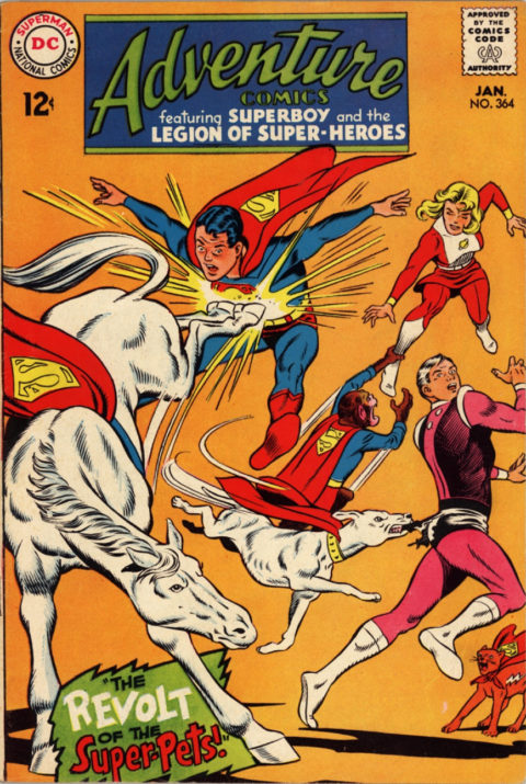
I see three solid choices for #333. I have to go with FF – who can pass on a simple but well done FF vs. FF battle cover? I don’t know the story but I would probably dig it. Adventure is a similarly cool Legion vs. Legion cover, but there is no fight and one side is just standing around. Finally Incredible Hulk is really ominous.
I go for the Thor… Cap…and Batman! Larson should go back and see where he messed up when he studied anatomy from his Burne Hogarth books… he missed a few chapters I think! However I do give thanks to my daily dose of CBD!