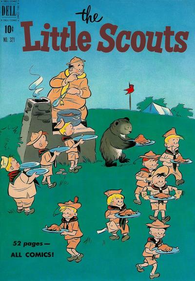
Four Color #321, Dell Publishing, March 1951. Artist: Uncredited.
The cover to Four Color #321 brought such a huge smile to my face, for some reason it reminded me of an old Far Side cartoon where two Polar Bears are impersonating penguins. My smile turned into laughter when I noticed the fat kid at the end of the line with 2 plates!!
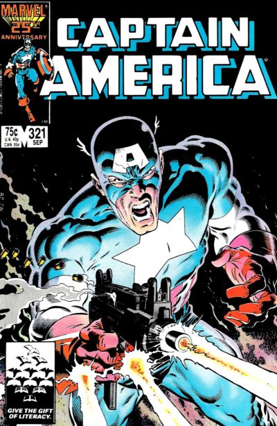
Mike Zeck gives us a fantastic cove to Cap #321, I like is attempt at the motion across while firing.
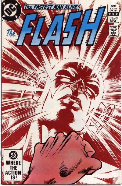
Carmine Infantino’s cover to Flash #321 does not work the way it should, the two images seem disconnected, one is of Flash sleeping on a park bench and the other is a guy showing us how tight a fist he can make.
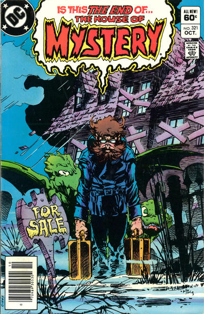
Mike Kaluta had me fooled, for a sec I thought it was Bernie Wrightson. Sad to see House of Mystery ending, the title gave us some of our best covers.
A great comic book cover matching each day of the year, 1 through 365. Please chime in with your favourite corresponding cover, from any era.

The scout master looks like he helps himself too Walt…!
Damned nice Zeck! But I appreciate your sense of humor. The Four Color is a good one.
I appreciate this lot Walt! I agree there is something awkward with Flash! You would have thought with the varied subject matter that was presented over the years DC would have kept the HoM title around!
Just to follow up on demise of House of Mystery… the same year 1983, also saw the end of Adventure and Brave and Bold. Yet DC began publication of Batman and the Outsiders… which could have been in either B&B or HoM…Sword of the Atom and Green Arrow, either which could have been in any of the titles… and Thriller which is basically HoM with a different name. Since none of the latter three titles lasted too long… they could have easily fit into venerable titles. It wasn’t the title that got the publications cancelled but the content. DC did revive HoM but as a vehicle for Elvira, which didn’t even need the HoM moniker attached. Makes you wonder what was said at the editorial meetings!
On the 4 color, you can just feel the little bear thinking, ‘Pleeeeeease, don’t notice I’m a bear!’
Cap should have won the day Bud but that that little bear and the kid at the end of the line made me want that FC cover in my PC.
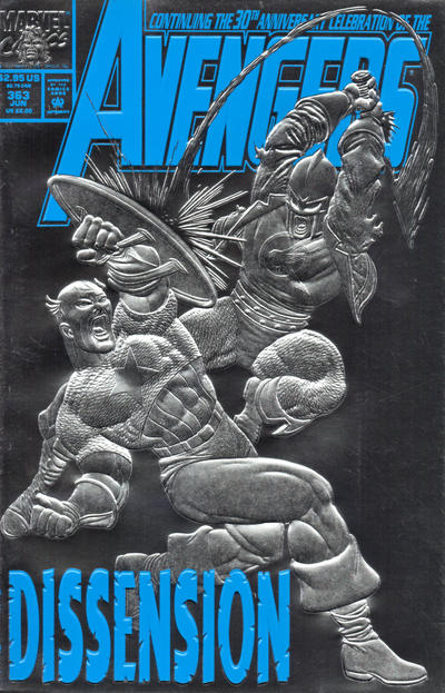
I overlooked that Four Color – it is pretty good so I can accept. But your title says Captain America. That one I can’t accept – no “my” Captain America. Looks more like the 1950s Captain America from that 1970s story line. The other two are simply not good.
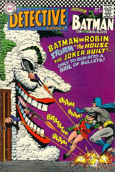
For tomorrow it’s Detective. Maybe the story is bad, but it is a very striking cover. Thor is crude but still good. ASM could have made a run at the best if it wasn’t for the coloring, but as is it is too visually confusing.
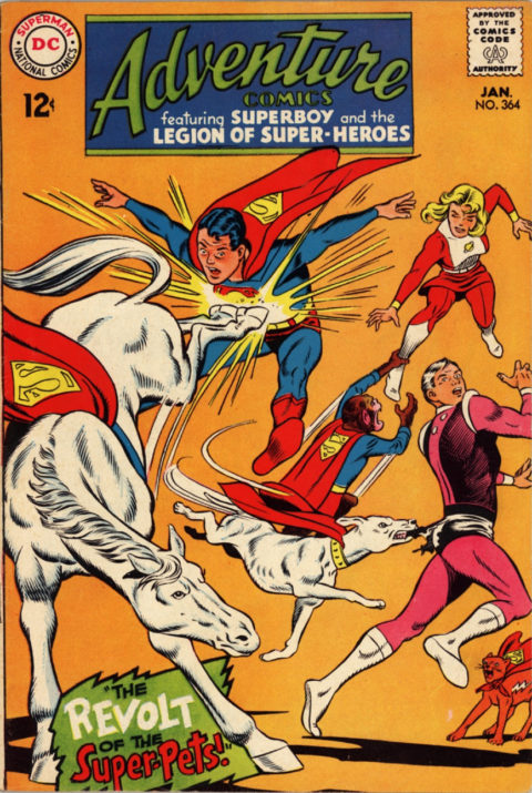
Adventure turns in a solid gold JOWA. A Superhorse is a Superhorse of course of course…
Gah, apologies, I’ve fixed the title to read Four Color – nice catch Chris.