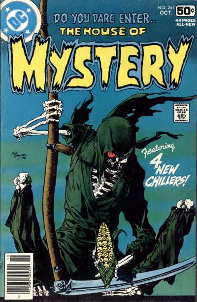
House of Mystery #261, DC Comics, February 1978, Artist: Mike Kaluta.
Today had 2 strong contenders for the top spot. I should call it a tie. I’ll start with Mike Kaluta’s masterful cover to House of Mystery #261, the imagery is amazing but the skulls on the corn cob put this over the top. You know it’s an amazing cover because you never see it in the HOM bins, why would anybody sell this.
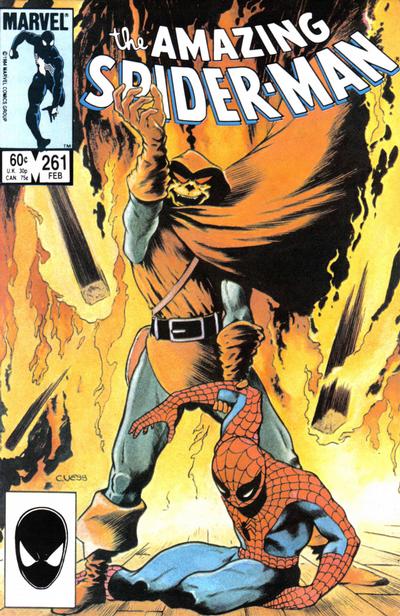
Charles Vess deserves the tie today for his stunning cover to Amazing Spider-Man #261, this is a favourite for many in this part of the run.
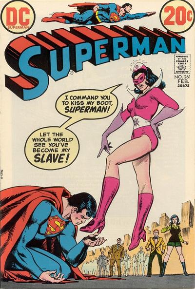
Sexual overtones on Nick Cardy’s cover to Superman #261 make it a sought after issue, nice cover too.
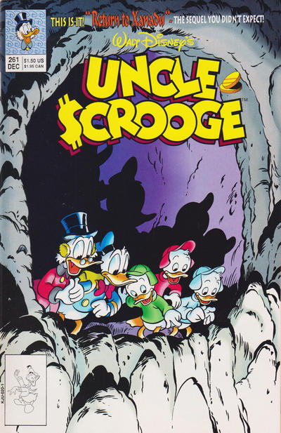
I love Jim Mitchell’s use of light and shadows on the cover of Uncle Scrooge #261.
A great comic book cover matching each day of the year, 1 through 365. Please chime in with your favourite corresponding cover, from any era.

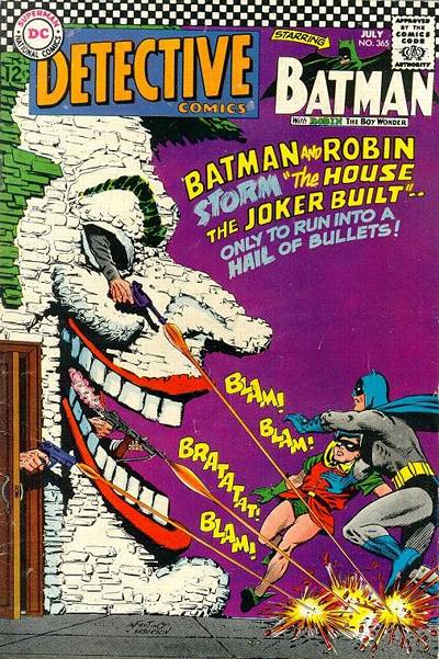
Like all of the day’s choices. My Spidey Fanboy goggles have me favoring ASM #261 over HofM #261, but really like both covers.
I am surprised how much I like the Uncle Scrooge cover, but the effect is really well done.
As for Superman #261, I am teetering on whether to call JOWA, but the “allure” of the cover that Walt mentioned above is keeping me from making that call. Perhaps it can be both.
I spent some time looking at that HoM, and I agree that the skull kornels are eye-catching, but it’s just another poster inferior to a million Wrightson posters. I went with the ASM but I think you are very charitable to call this “stunning”. I like the Uncle Scrooge for the light effects, but if you miss the text at the top you have no idea what is going on.
Which is a good segue way to my pick for #262, which is Uncle Scrooge. I am not arguing this is a great cover, but I think it is the best of the bunch, and now we get to see what is going on, so no text necessary. If the light effects of #261 were combined with the composition of #262 we might be verging on great.
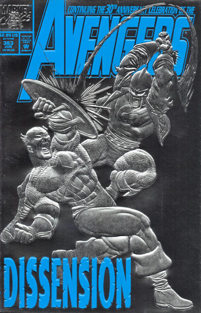
Captain America is my runner-up. It would be my pick except the setup is very confusing – again you have to read the text to understand what’s been depicted.
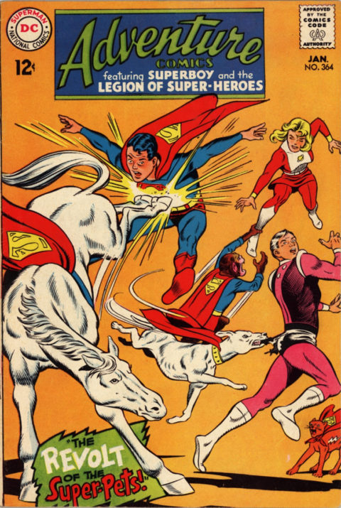
Other covers that I like: Action (simple, strong colors), Adventure (my third place – good thing Ace wasn’t from Krypton, he really would have been a handful in this situation), FF (just for all of the Byrne faces), Thor (really good for floating heads).
Incredible Hulk teaches us that people who live in glass houses don’t build those houses with shatterproof glass.
Hmmmm…. I suspect a super foot fetish regarding Superman #261…Im onto you Mr Durajlija.
I gotta admit its more palatable then Chris’s big Hands cover fetish… 😀
Better big hands than small hands.
I really love the HoM cover and approve of the others as runners up. If the text were any bigger on Uncle Scrooge I might not like it as well as I do.
By the way… buying small gloves does not make your hands any bigger….
Im just jealous 🙂
FYI, David is a hand model.