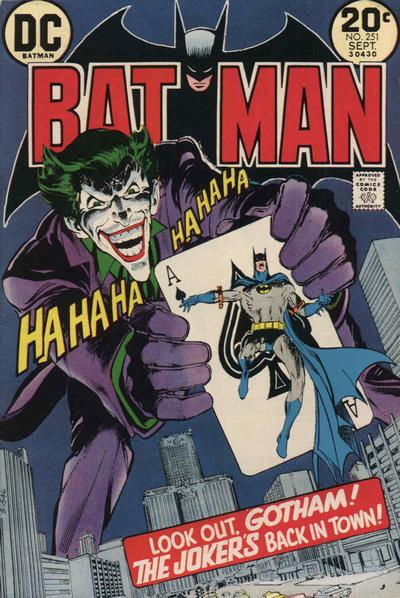
Batman #251, DC Comics, September 1973, Artist: Neal Adams.
We all knew it was coming, Neal Adams’ Batman #251 cover is one of the classic Joker covers, ever.
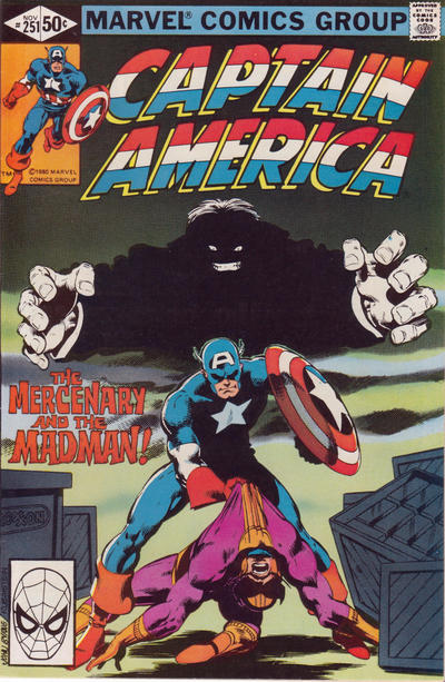
I like the way John Byrne’s Cap looks on the cover of Captain America #251.
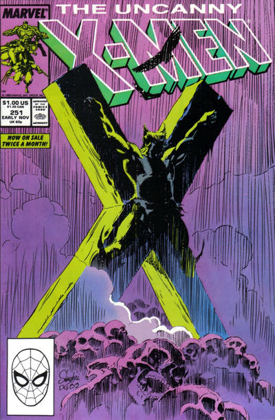
I wasn’t really a Marc Silvestri fan back in the day but this covers exercise has shown me the light. I think Silvestri’s cover to X-Men #251 is simple but visually full of impact.
A great comic book cover matching each day of the year, 1 through 365. Please chime in with your favourite corresponding cover, from any era.

Okay! They all three are good strong covers! Byrne DOES capture the Cap we grew up with, very nicely. The X-Men is dramatic sans text.
Good selection and as expected for Bats. I forgot to mention Uncanny yesterday, but it was on my mind.
Day 252 I’ll pick Superman wraparound by Neal Adams. I only take issue with the Shining Knight being included in the ‘Greatest Flying Superheroes’ grouping because he clearly needs the Pegasus to fly. But I digress.
Runner’s Up include a nice sideways FF by Byrne, ASM classic cover by Frenz/Janson, Batman is hokey but alright, and even Milgrom did a nice job on Captain America with Rubinstein inks, even though it may be over a Ed Hannigan sketch. Wonder how they know that.
JOWA goes to Action for Superman’s super-inappropriate comment to Supergirl. “Great Guns!”, oh what are you referring to Kal-El?
WWWP?
Great Batman cover, I wouldn’t have to look twice to pick this one up! Like the others too. Are the stories inside as good as the covers imply? I’ve started using this column to add comics to my want list.
I should have mentioned that Captain America, by Byrne and JOE RUBINSTEIN. Rubinstein, Austin and Layton all added immensely to Byrne’s pencils, each with a very distinctive style.
The X-Men is much better than the last Silvestri but it is a hanging around cover.
I wondered if you were going to count ASM as a giant hand.
I am with C.K. 1000% for #252. DC-13 is one of my all-time favorite books for very personal reasons, similar to the other early 100 Page Super Spectaculars with Adams covers. I would still pick it nevertheless.
The runner-up is an Adams cover that I had never seen until reviewing the #252s, House of Mystery. This might be a hovering around/standing around cover, but come on – it is just an amazing monster. As I said before, people normally think of Wrightson when they think of monsters, but I think Adams has the edge.
Action is a great cover and a classic, but if it wasn’t such a key I think the similarities to the other Superman/Superboy covers of this period would be more striking. I really dig Batman for the way the colors complement the art. FF is a cool Byrne poster but maybe shouldn’t even make the short list. I like Thor for its luridness.
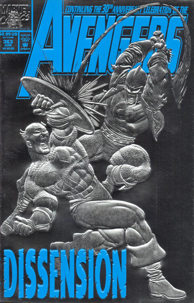
Avengers keeps the streak going with a giant fist.
Blackhawk really has me interested – is this a reprint or a reappearance, or something else? The idea that DC would restart the series only to immediately fall back on the ridiculous vehicles is depressing.
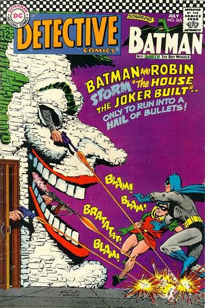
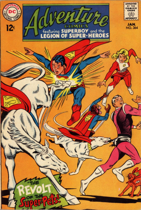
A number of JOWA candidates – it could have been the mob trying to dislodge the hovering Superboy on Adventure, or the weird stretchy Flash, but I think it has to be The Creature from The Green Lagoon on Detective, the comic cover equivalent of a guy in a rubber monster suit.
Superman never uses guns… he should have said “Great asteroids!”