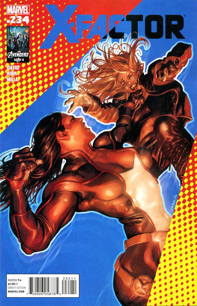
X-Factor #234, Marvel Comics, June 2012. Artist: David Yardin.
David Yardin wallpaper, I’d buy some. Mr. Yardin has a style to his own, have a look at X-Factor #234, really good stuff from David Yardin.
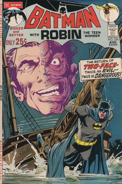
Neal Adams flushes out the floating head for Batman #234, it leads to different effect than on his Batman #232 where he melted the head into the background.
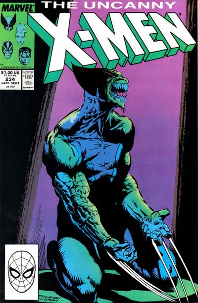
I really did like Marc Silvestri’s jarring cover to X-Men #234.
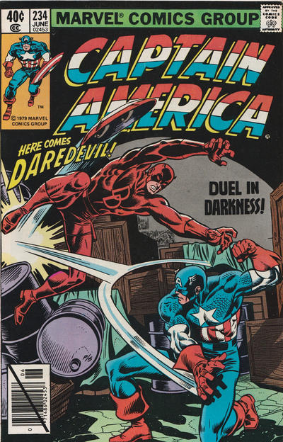
I also like Keith Pollard’s cover to Captain America #234.
A great comic book cover matching each day of the year, 1 through 365. Please chime in with your favourite corresponding cover, from any era.

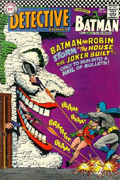
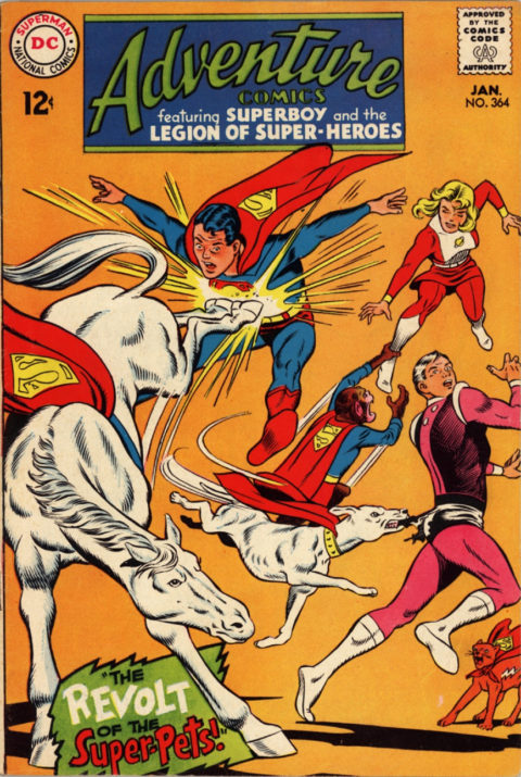
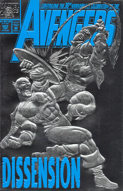
Hey, some pretty nice covers here Walt.
I still will go with Batman but that Yardin – I mean X-Factor – should have been on my list. I am not putting his #235 on my list because it is very static, but he again displays mastery of a different style. That guy is an animal.
I remain against the crowd on that Uncanny X-Men, to me it’s just a kneeling around monster cover. Not interesting.
The Captain America is a very nice meat-and-potatoes comic book cover, but hardly “great”.
So many good #235 candidates! No complete standout but in contrast to #234, I love Captain America #235. Leaving Daredevil to fly an airplane is a bit of a JOWA indicator, but otherwise a fabulous and action-packed composition.
The X-Men Legacy Johnson cover as runner-up, very cool.
The rest: Batman, Daredevil, Flash (87), House of Mystery, Our Army at War (maybe not to everyone’s taste, but just look at what Kubert turned in here!), Superman (a panel cover, but beautifully executed by Adams as usual, and it really makes you want to read the story), Tarzan (another Kubert that I will have to defend as a well-done throwback to the late Whitman Jumbos), X-Men Legacy (Finch).
I won’t put up Detective as a candidate, but I really dig this cover for “The First Batman!” and the (hard) background color.
Not Spectacular Spider-Man, but I won’t be surprised if Walt picks this one.
I wanted to pick Flash as JOWA for Vandal Savage’s unsportsmanlike conduct, but how could anything beat World’s Finest?
Well, I like everything except the X-Factor…its that digital airbrush look again. I got in too late to make a comment yesterday about the Neal Adams cover. I really don’t understand why everyone liked it so much. Adams is a master and his X-Men, Green Lantern, Batman, Deadman and all show incredible dynamism. The Superman cover shows about as much dynamism if a stick figure! If he had shown a twisting motion so we could see Supes breaking not only the physical chains of Kryptonite… but the psychological chains as well it could really been a great cover. Instead we are given this which doesn’t even compare with the 40’s chain breaking logo it’s undoubtedly supposed to emulate. Nuff said!
I’m caught off guard with today’s pick. I saw it, thought it was nice, but something about the colors just doesn’t ‘do it’ for me. No time to predict anything for tomorrow, too late of a look in. Going to be a surprise!