Superman #215, DC Comics, April 1969. Artist: Neal Adams.
There is definitely a pattern of usual suspects developing on these posts, Adams, Kane, Frazetta, Wrightson have dominated the past 20 posts at least. I have to try to dig out some gems coming out of left field… starting tomorrow!
Superman #215 is such a strong visual with great colours and strong composition from Neal Adams.
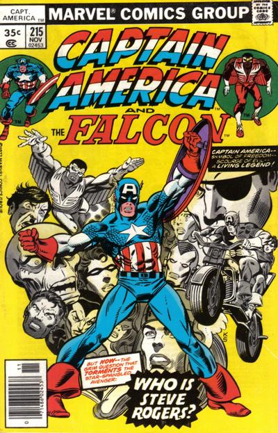
Gil Kane comes through again with fantastic work on the cover of Captain America #215.
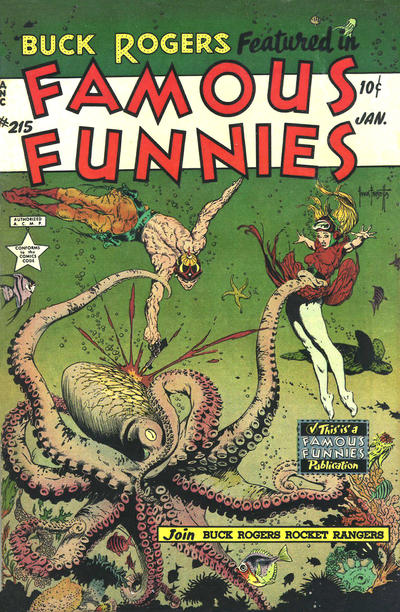
Frank Frazetta working magic on the cover of Famous Funnies #215.
A great comic book cover matching each day of the year, 1 through 365. Please chime in with your favourite corresponding cover, from any era.
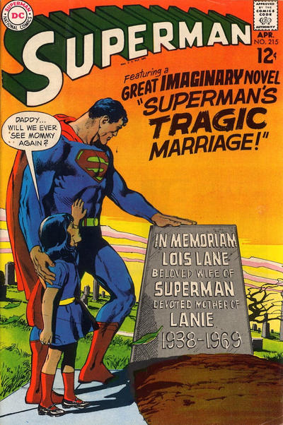

Walter, these work for me. Great Adams, and a mystery you want to read immediately. Interesting to see they were still doing “imaginary” tales as late as 1969. Always liked them, and have enjoyed re-reading and newly-reading a bunch lately. I like those late fifties/early sixties Superman family stories.
That is a sharp Gil Kane, its got Chris’ action in plenty. Kane faces. Forties-style Cap.
Nice work by Frazetta, still great, but in comparison to his others in this run, it falls short. Suddenly Buck IS musclebound, but still with skinny legs. I think Frank is still having trouble with anatomy. Wilma…I assume its Wilma…has a ballet dancer’s legs, not bad in itself, but they seem disproportionately long compared to the rest of her. Great Octopus! Great detail. He must have loved doing these covers, it shows.
You have a good eye Bud. Buck Rogers has my upper body attached to Walts legs. What a revolting development. 😀
Despite its flaws I like it better then the others, though they are nice covers too.
Marilyn Monroe’s upskirt scene in the seven year itch, or this cover…which came first? Both dated 1955
Agreement again. Superman is a “grieving around” cover, but the beautiful color job brings it in line with FF. Love the spicy calamari here:
https://www.sonnys.com/
#216 a really terrible selection. This particular FF tells me nothing, so I can’t really pick it as a candidate. If I had to pick anything it would be Strange Adventures, but this is about the weakest Adams yet of the run. So I will leave it to you to pull one out of the hat.
Captain America another one of those unflattering angles.
Blackhawk at least gives us an honest-to-God JOWA to enjoy.
Calamari is squid… I vote for the Octopus…much smarter! But I agree… where did Buck get those muscles? As for Superman… the cover would have had more impact without stating it WAS an imaginary tale… they weren’t giving the kids enough credit to figure that out!
Oh…just to add… there is Kane faces on that cover of CA Walt. What they mean is Kane had a preference to view faces looking up into their nostrils! Used to bug me but I seem to have gotten over it!
We’d have a disproportionate top half Dave, those spaghetti arms of your’s don’t go well with that pea brain up top…
And you are right Bud, something about both figures on the cover that threw me off the Famous Funnies.
I see what you mean re the faces Gerald.
I’ve got a trick up my sleeve for tomorrow Chris.
😀