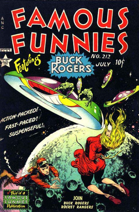
Famous Funnies #212, Eastern Color, July 1954. Artist: Frank Frazetta.
No contest, Frank Frazetta’s floating girl is … well, it’s a work of art. Famous Funnies #212, the colours, the motion, a master at work.
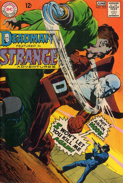
Neal Adams’ cover to Strange Adventures #212 is one of the strongest in the run, interesting angle and strong background colours.
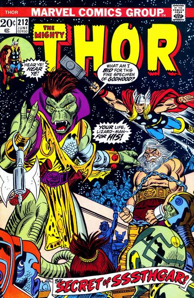
Thor #212, great cover, three faces by Kane and they all look great!
A great comic book cover matching each day of the year, 1 through 365. Please chime in with your favourite corresponding cover, from any era.

I am trying to get you to understand my point of view, and I am going to beat the same old dead horse. Just as Frazetta’s Death Dealer would not be a great _comic book_ cover (it would be a sitting around/standing around cover), and would not beat this one as a pick, so this one doesn’t beat the Strange Adventures. But would you rather have the original art to this cover, or Death Dealer? The market has spoken. My point is that the market values Death Dealer more highly as a piece of original art, but that doesn’t make it the better _comic book_ cover. Similarly I am not contesting the talent displayed in this piece, but I am just pushing the point that the comic book cover aesthetic is not just about artistic prowess.
Specifically I will point at tiny little Buck Rogers. Are you really excited about this ninety-eight-pound weakling with his little puff of smoke heading out to save the girl? This is probably a fine 1930s pulp cover, but as a comic book cover it leaves a lot to be desired. To me this is similar to a Lou Fine cover but without the exciting, athletic hero. I am sorry to intrude on the lovefest but as always I calls ’em as I sees ’em. I have to say that I think my judgment might be a bit more objective for not having been in the business for decades. On the other hand you could argue that it’s really that my taste isn’t as nuanced.
Less controversially I will say that Thor just missed my cut because I find it a bit too busy.
I am going to fight the power yet again for #213 and pick Conan. Val Semeiks. Just wow. I used to read Conan. Now I don’t give a hoot, but I might start collecting high grade copies of these later issues, the covers are just extraordinary.
I will let you have Famous Funnies as runner up, but the cowering protagonists are really a buzzkill. Next is Uncanny X-Men, followed fairly distantly by Spectacular Spider-Man.
I might have switched Buck and the saucer and made him larger for more dramatic action, but I think Frazetta’s focus was on the woman’s figure. That said, I always wished I could draw 100th as well he could even in his early days. It’s funny eBay keeps telling me where I can buy these things : )
Strange Adventures is an eye catching angle.
I think the focus was on the woman Tim, for me the composition works. Chris I do hear what you are saying but this art seems to have comic book context in that it fits nicely as a comic book cover depicting an action scene perhaps alluding to the story inside. I also think you may be on to something re my superior nuanced tastes.
It’s not a perfect cover, but for when it was published, its a knockout. This is the cover I think of first when I think of Frazetta’s Famous Funnies run, startling black of space, flying saucer, aliens, beautiful girl, heroic space hero…. This would have gotten a lot of kids’ hearts a-pounding back then!
Yeah, Buck does look a bit diminutive, apparently it was a challenging perspective for our young Frazetta. Neal’s cover is fine, but I stick with Walter on this one. Thor, well, not a close 3rd in my eyes. Great coloring and detail, but I’m with Chris, its crowded and center of focus is lost.
I for one would rather own this Famous Funnies cover rather then Death Dealer which I always considered to be a rather boring composition.
Yeah but you could sell Death Dealer, buy this original art, and buy a house in which to display it.
Ok… your absolutely right Chris…sigh.
Foreshortened figures and flying, floating, defying gravity are challenging to draw without looking absurd so kudos to Frazetta for trying that.