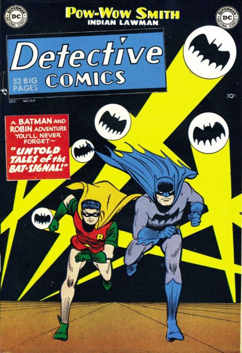
Detective Comics #164, DC, October 1950 – Artist: Win Mortimer.
Finally a runaway winner. With Detective Comics #164 Win Mortimer whips up a classic Batman and Robin cover that’s seen renewed demand in this cover crazy market.
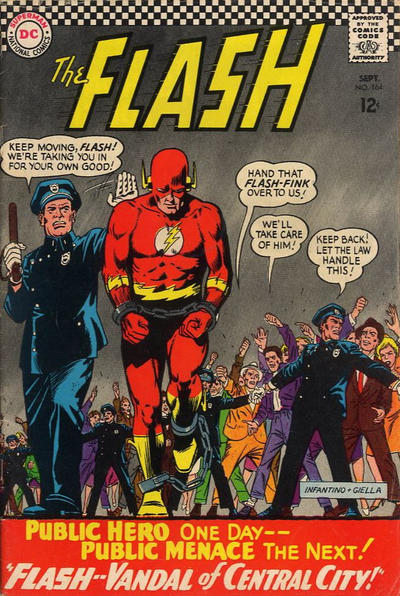
I’m telling you a runaway second goes to that fantastic Carmine Infantino cover to Flash #164, have a look at the pic below, amazing.
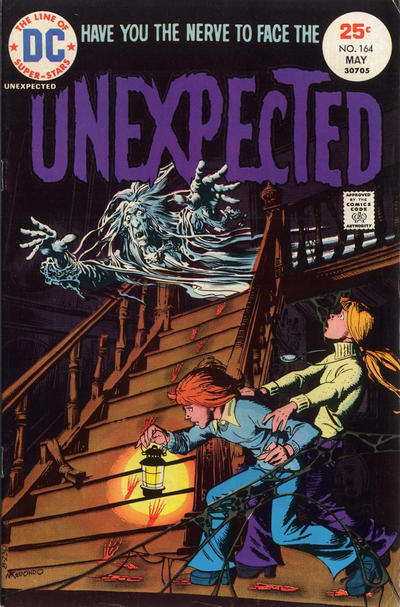
Four Color #164 has that magic funny animal art I love so much. That Unexpected #164 (pic below) is really good but I felt it would have been even better if drawn three short years earlier, something about those very early 70s horror covers.
A great comic book cover matching each day of the year, 1 through 365. Please chime in with your favourite corresponding cover, from any era.

I can accept the pick but I am not a fan of two of your runners-up.
That Flash cover is downright boring. Sure Infantino can draw figures better than I can, but that doesn’t make this a great cover. In general when I think Infantino I think of some ad agency guy from 1960s with the hat and raincoat – Infantino’s superhero stuff is really boring. He worked for Strange Adventures etc. because these were tales of normal people in weird circumstances, not heroes/superheroes. I remember everybody got excited when he came back later and drew Spiderwoman etc., and I think that was better because of Marvel’s editorial direction (“Jazz it up, Carmine!”) and him being allowed more to flaunt his individual style. Still I don’t feel any need to go back and reread that stuff.
The Unexpected cover looks like a book cover for “Ghost Tales!” that can be purchased at the fourth grade book fair. Not scary at all. Otherwise I like it but it would never get me to buy the comic, so hence not “great”.
Four Color nice but out of character for Bugs. He would never go exploring on purpose, particularly to a “Frozen Kingdom” where carrots are likely to be in short supply.
I actually really like Action #165 so I will make it my pick, but basically by default – no runners-up – and I can’t argue too strongly for “great”. The time for just passing on the day is drawing nigh.
No shortage of JOWAs: classic Batman giant hand, another Blackhawk winner, goofy World’s Finest. I give the top pick to the bizarre Strange Adventures.
My point on the Unexpected was that it would have somehow turned out a lot better had it been drawn in 1971, some styles seem to be of certain times and when that time is past you can tell. That Flash cover is great, we looking at the same book Chris?
What a fantastic cover on Detective #164, and a classic cover issue that I have chasing for some time.
I also thought you runner-up list was good, but I had the order reversed: I came across the Flash #164 first and added it to the list but when I saw the Bugs Bunny cover on Four Color #164 I immediately moved it into the runner-up position. The Bugs cover is outstanding ,but also reminded me of one of my favorites Bugs episodes, where he went to Alaska and painted some rocks with gold paint and tormented Black Jacque Shellaque
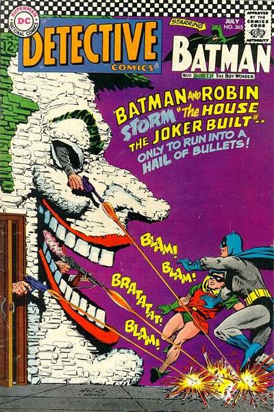
Also, X-Men #164 was a favorite, and I have always liked Batman #164.
And I see The Living Dream making another cover appearance on Millie the Model.
Re Unexpected I don’t think it is so much the time as the art. That ghost is halfway to Casper. If it had a skull face it would be much more worthy.
I am looking at “Vandal of Central City”, where Flash is arrested for spray-painting “Superman is really the fastest man alive – ask Lois!” on a thousand walls in Central City in a millisecond. I believe the next issue is “Offender of Central City”, where we learn the real origin of his heroic appellation.
I thought that was Marley’s ghost on Unexpected…is it a Christmas issue?
It was a May issue Gerald so not a Christmas issue. Back to my point about the art, I’m arguing the time is the art – you just draw something different in a different time. A Beatles song in 1965 sounds different than a Beatles song in 1969. There seemed to be a heaviness and weight to the stuff happening in 1971 versus say 1975.