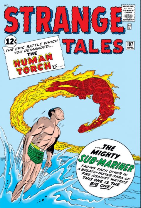
Strange Tales #107, Marvel Comics, April 1963 – Artist: Jack Kirby.
Simplicity can be overwhelming when executes nicely and Jack Kirby hit a nerve with this cover. Strange Tales #107 is one of the most iconic covers of the early Silver Age for a reason, its a great cover.
I also had my eye on Blackhawk #107, Lone Ranger #107 and Captain America #107. The Hulk #107 volume 2 where’s he’s battling Hercules was on the shortlist as well.
A great comic book cover matching each day of the year, 1 through 365. Please chime in with your favourite corresponding cover, from any era.


Yessir, Kirby nailed it here. An up-to-date take, in 1963, on the Torch/Subby battle covers of the Golden Age. Still a classic.
Blackhawk #107 is doofy but doesn’t hold a candle. I love the Blackhawks, at least the Crandall/Bill Ward Quality and early DC versions, and there are far better covers from their title, before and perhaps even after #107.
The Cap #107 is a good one too, but you still chose the best here.
The iconic nature of the cover justifies the choice, and I agree that the Kirby touch perfectly straddles the move of both Namor and the Torch from GA to SA. I still have a lot of admiration for the Kubert art & action of Wolverine #107, and also thought Captain America #107 was an outstanding cover.
No question that this is a great cover, but I think making it the pick is based in large part on meaning rather than the cover itself. Early Marvel; classic title; Kirby; Sub-Mariner (just back from rehab); Human Torch (but of course not the Sub-Mariner’s old Torch buddy); Stan’s hyperbole. There isn’t really much going on, and if you didn’t know Kirby you wouldn’t have a sense of how restrained this one is. You also wouldn’t know the complicated backstory that injects the tension into the characters’ approach. Compare to the Famous Funnies pick where (almost) none of us knew the story line. If this had been a Famous Funnies cover with a no-name artist and unknown characters, would it have been the pick, or just in the running?
Not to say that I don’t let meaning influence me – I am just pointing out that this seems to me to be a pick where David Mackay’s earlier critique has some weight.
Blackhawk is goofy and even better given the seriousness of the presentation. This issue is also something of a minor key as Whirly-Bat prototype (Blackhawk December 1956 vs. Batman December 1958).
I really liked Lone Ranger but I continue to complain that this kind of art doesn’t strike me as a comic book cover, more like a Hardy Boys cover. I looked at Captain America for awhile, but I came to the conclusion that this is fairly standard busy Kirby composition. Hulk vol. 2 is beautiful but misses on my storytelling criterion. The Hulk fights with everybody so that doesn’t count.
For tomorrow some interesting possibilities but nothing dominant. I will go with Action because the use of colors is particularly good.
Others:
Blue Bolt is engaging but too jumbled for my tastes.
Ghostly Tales is really powerful and teaches you not to trust Lucifer as he can “foreclose” “eternal” commitments. Always read the fine print.
My Romantic Adventures – Creepy!
Roy Rogers – Say what you will about photo covers, but I want that shirt!
I completed my superhero run of the title a couple years ago and this among my top favorite!
Funny how the 1960’s Marvel Torch/ Submariner battles never took off Like their 1940 inspirations. I assume sentiments had changed?
The shirt in question…https://d1466nnw0ex81e.cloudfront.net/n_iv/600/766721.jpg
Too Funny Chris I think I recall Walt wearing somethin similar on his Dads farm… 🙂
Pure Kirby Magic!Always one of my favorites!