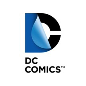
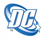
Last week I was on Twitter and I saw a post from DC about their new logo. Of course I clicked the link to see what this was all about. I was very surprised to see that DC had made the change to a new style logo.
From what I have read, the whole idea of changing DC’s logo is to give them a new look that is easily “customizable depending on the brand and to be adaptable to all forms of media” (source).
I don’t think this is a good idea.
First off, I like old DC’s logo.
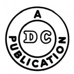
I preferred the old style bullet logo, but the later DC logo still had elements from previous logos. It still had the letters D and C. And the logo still featured the star. It still had brand recognition that when you looked at it, you knew it was a DC comic. I had to look at this new logo closely to figure out what it was. After squinting at it like a “magic eye” picture for a while, I finally realized “Hey, that’s a C there!”
Secondly, is rebranding yourself and finding a new mark even worth it?
Why not release a new logo 5 months ago with the release of the new 52?
Everything was being relaunched at that time, why not go whole hog and release a new logo at that time?
Releasing a new logo now just looks like DC is saying “Hey, you thought the new 52 and day and date was great, well look at this, we’ve got a new logo… and this summer… hologram covers!!!”
The only benefit I see from the change is DC is getting attention from the media. Other websites have reported and talked about it. I guess I’m talking about it now, so maybe there was a reason for the change in logo.
I said earlier, that I did the “head-tilt-eye-squinty” thing with the new logo. I have come to one descision… the basic logo sucks. In my opinion, it isn’t something hip, new or radical. It looks like something that would’ve come out in the 70’s (it reminds me of the logo for a shoe store I remember at the mall when I was a kid in the early 80’s). I thought that a logo coming out in the 21st century would be something amazing and mind-blowing. This isn’t.
Big corporations don’t normally change their logos. Once they find something the public likes and recognizes, they stick with it. There is only one other big corporation that I can think of, that has changed their logo several times, and that is Pepsi. The current Pepsi logo looks very different from what it did even just a few short years ago. But the same theme is always present with Pepsi’s logo. It’s always round and has red, white and blue for its colours.
DC’s new logo is a radical departure from its previous incarnations.
Now it’s only a week since the release of the new logo. And I’ve only seen snap shots and pictures from other websites. Once it is seen in actual ink on a comic book, my opinion may change (there is a picture floating around the interwebs of Superman being featured in the logo, I don’t mind that one).
This new logo is supposed to be used in all branches of DC’s media empire. I am interested to see if it will be used at the beginning of The Dark Knight Rises that’s coming to theatres this summer. That would be the best place to showcase, the new innovative ways DC plans on animating their logo.
I guess if this new logo is successful for DC, I don’t think it will be too long before Marvel follows suit with an update of their own.


Mr Ed, it’s interesting to read your comments. I’m surrounded by designers all day so it’s refreshing to read a critique from outside of my profession.
Essentially I agree with your assessment. The “basic logo” (or the primary form) is void of any meaning. The customization is nice but it’s just a gloss coating… and as coatings go…, I don’t see why it couldn’t be applied to something more meaningful?
But, DC is a bit like the Grand & Toy rebrand that I worked on… Do people really buy comics because it’s DC or because they want to read Superman and Batman? This is a case where the products in and of themselves are more recognized. So I don’t believe that brand recognition is a huge hurdle in this case.
I’ll just mention a few other points:
• Change is difficult to accept. It’s human nature so give it time to sink in.
• The new logo is incredibly high maintenance and expensive to implement. But, if anyone can pull it off, it’s DC because of their vast creative resources. Can you imagine IBM trying implement this kind of program?
• People are saying that the strength of this new logo lies in the animation. That’s BS. With DCs talent pool, I’m sure the animation will look awesome and I’m looking forward to seeing it… but any logo can be animated, so this is just another coating or layer that all good logos can potentially have.
• Is rebranding necessary? Is advertising necessary? Is marketing necessary? Heck yes! But don’t judge a rebrand by it’s cover. A true rebrand signals a more fundamental change… But change is difficult and it will take time. You can buy yourself a new wardrobe but how easy is it to change your habits or behaviour? Even then, how easy is it to sustain it. Honestly, the odds are against DCs initiative, but corporate DC gets credit for recognizing the need change.
• “Big corporations don’t normally change their logos.” Ed, look around you bro! Big corporations are always changing their logos. Hilton Hotels, Kraft Foods, Cable and Wireless, Towers Watson, Symantec, PricewaterhouseCoopers, Starbucks, Jenny Craig, Belkin, StateFarm, Blue Jays, AOL, Ivory, the Comedy Network, Cigna, Heineken, Cheer, Toastmaters, Swiss Air… just to name a few from the past year. Most are evolutionary so they go by unnoticed but rebrands keep a slew of business from ad agencies to PR firms to financial institutions and trademark/copyright registries in full time operation around the world.
^_^
BTW, when are you guys gonna remove that black box around the CBD logo? It’s still there from the old blog. With the gradient background, it should be rebuilt as a PNG… and isn’t “.com” understood.